Caedes
Upload Images
Welcome guest
Log In or Register
User Stats
- 2 total users online
- 36 users active today
- 259167 total members
- +show users online
Photography
Discussion Board -> Photography -> Post Process Another's Photo
Post Process Another's Photo
Comments
Post a Comment - Subscribe to this discussionOverflow mode, hiding 62 messages. [View]
I wanted to try a method of converting colour to B & W, employing the Calculations command. Like the Channel Mixer, the Calculations command is designed for blending channels but contains several more options.
Here is a simple B & W conversion of Rebecca's image using an adjusted/edited image of her original, wherein I tried to deal with the lens flare first.
Then, here is the conversion using the Calculations command ... "Pastural Morning".
Additionally, I used a High Pass filter technique for the sharpening. Something a little different from Smart Sharpening.
Rebecca's original image is, once again, a wonderful composition that she graciously posted up for us to try our hands at some edits. Thank you to Rebecca.
I know of four other methods for conversion, and of the five in total ... liked the results that this particular one produced. So, I went with this one.
Namely, and you can google these to find out the how to's, they are:
1) Dual Hue/Saturation Adjustment Layers - a technique made famous by Adobe Evangelist Russell Brown.
2) Conversions From Channels - "All digital photos are based on the combination of separate channels. Images using a standard color model are broken into RGB (Red, Green, and Blue) channels but there are also other channel combinations, such as LAB (Lightness and AB color channels) or CMYK (Cyan, Magenta, Yellow, and Black) that can be used to construct a color photo. Sometimes the grayscale information found in a single channel contains good color mapping and therefore good grayscale tonal separation."
3) Mixing Channels - "Taking the idea of using channels as the source for conversion further, Photoshop contains a dedicated utility called Channel Mixer (Image>Adjustments>Channel Mixer). When you click on the Monochrome box it is possible to create conversions based on various mixes of the grayscale information from the color channels. The only thing to remember is that if you want to maintain the density (overall brightness) of the original photo then the values of the combined channels should equal 100 percent.
4) Painting With Converted Channels - This method is the most time intensive. However, it does give you much more creative control over the final result.
"Sourcing your conversion details from a single channel or playing with different mixes of all the channels (via Channel Mixer) produces really interesting results, but the conversions are applied globally. Both these techniques apply the same conversion settings to all parts of the photo. For most images this may be okay but what if one set of channel values works well from the foreground information and another set suits the background? When you go this route you can paint in the conversion values that best suit the image. This technique, which owes its heritage to the work of both Jeff Schewe and John Paul Caponigro, provides just such flexibility."
5) And finally, the one that I used for my 'edits' ... Calculate A Conversion.
I like the added colour you brought into the fence Pierre. It does add some value and brings that element of Rebecca's wonderful composition to the forefront a bit more. Another visual reference point of interest within. Well done.
And of course, the boost in colours throughout are nice as well. Good colour contrasts.
The lens flare? Wellll ... this might appear to be a strange approach, but it is effective to a degree if you don't wish to spend time cloning ... and instead, spend time mixing colours. Sherree; aka danika pointed me to a tutorial that was aimed at correcting flesh tones ... found here.
I extrapolated on the method and employed it in my rework.
If I may be bold, I do like the 'polarized' sky ... very much in fact, just think that the vignetting in the upper right might be better if it was relegated to only the sky and didn't extend to the landscape.
On the positive note, once again, some value added with bringing in some more colour contrast with that element.
Really nice. And Rebecca, of course ... earns a curtain call as well for her original photo. :o)
Thanks for sharing your creative efforts and knowledge with us.
EDIT: Just wanted to add that in using the mixing method mentioned and linked to above, to deal with the lens flare, you do have to make a selection of that area of the photograph and not apply the changes globally.
After seeing Les' great conversion to b&w, I thought perhaps a sepia conversion would bring some warmth into it.
I also noticed a comment left by another user that the sky looked a bit bland once the blue was lost in the b&w conversion, so I decided to pop in a more dramatic sky here.
So, what's the verdict on the end result? I think I am still partial to the color version that Pierre did, I just love the green and blue. But I really enjoyed playing with this conversion!
As with the previous images that were post-sweetened, it is interesting to have them side by side for comparative purposes ... which I am doing at the moment.
The clouds or switching out of the skies, done very well I might add by you, adds a great element to the image. And the toning/colouration creates some very nice highlights on the landscape itself. Balancing the two facets of lines and shapes that make your image very appealing ... as it was in it's original presentation.
My own caveat? Might have been tempted to play around with the mixer some more ... and more of out curiosity, in an effort to find more of a middle ground between your version here, and then my own edits. Simply personal tastes and takes.
Yeah, mine looks a tad stark. An extreme, I suppose.
In my own defense, the method I employed and choices within, were done for that reason. How can I state this ... I liked the 'silence' that the scene conveyed, or at least that was an artistic aim. Perhaps, a bit foreboding and not necessarily as inviting as your image here Rebecca.
Pierre's gets the slight nudge from me as well. Conceptually, I think it is a better fit for the photo and in it's final presentation. The quintessential pastural image.
Allll that said, I do like that between us ... and our individual edits ... we presented three very different versions.
And once again, wish to thank you for allowing us this opportunity. :o)
HERE is my rework
I worked mostly with highlight/shadows. I stayed away from color correction. It messed with the greens for me too much. I loved the setting sun and even left the solar flare in to keep the image 'less' than perfect..lolol
Good composition on your part Rebecca. Again, thanks!
My rework on Rebecca's image.
I decided to stay with a colored version & actually did not do that much editing to the image, but tried a few little experiments.
Opened image in PSP X2
Made a duplicate layer ... I felt the image was a little dark & wanted to bring out the greens more, but yet make the sky somewhat more blue.
After not having much success in Channel Mixers ... I simply decided to try the RGB editing feature. I sometimes get overly anxious when working with the Channel Mixer.
RGB ~ Red -29; Green -18; Blue -9 (don't know how I came about with all negatives, but it worked ... what can I say.
Merged copy (screen? at 26%) & background image. Thank you Les for the info on blending modes as I tried most of them.
Still somewhat darker, but I will mess with that later.
I wanted to brighten up the shadows some to bring out the textures of the grass more.
Highlights/Midtones/Shadows
Highlights +5
Midtones +10
Shadow +8
I wanted to sharpen the image slightly, but still retain some of the softness to the background. So this was my experiment ~ made a duplicate copy of backround. Then on the copy did a highpass sharp at 24%. Merged the copy as an overlay again ... wasn't sure about that one.
Note ~ In the beginning I was attempting the Orton technique, but was having problems. I think the image wasn't the best candidate for that process.
Cloned out the lens flare ... carefully. :-)
The image was a little darker than I wanted to see as an end result, so simply increased the brightness to "4" without changing the contrast.
Lastly, opened the image in NeatImage to remove some noise in the sky.
That's it! A round-about way of doing things ... but again a learning experiencing.
Thanks again Rebecca. ;-)
To my eyes, quite successful in presenting a portrait of an emerging sun at dawn. I particularly like how the light is coming and entering the image at the left.
Perhaps, and as a humble suggestion ... dial back some of the 'darkness' of the sky and it would be spot on. Creatively, and as a suggestion ... introducing some light rays to illuminate that portion might work well.
A delicate touch insofar as the edits are concerned, and appropriate to my mind as well. Given that the original image of Rebecca's did not need much of an assist.
Sherree's edits on the same image:
First, let me say this ... that I think our 'readers' are fortunate to have had someone rework Rebecca's image in PSP. :o)
The sky is very clean now. Really enjoy that aspect of your edits. Suggestion, select the sky ... and bump up the contrast a tad. The clouds have lost a touch of their brightness. Nothing major, mind you.
Colours are very pleasing and very natural. A big well done on that.
The len's flare? Larger brush next go round, would be my suggestion. Indeed you were successful in removing the flare, however, I do detect the 'patterning' that has resulted and could be attributed to the small brush you employed. Just a thought, nothing more.
Perhaps, even some randomized, kind of sort of ... use of the Burn (Spot Healing as another? to correct for exposure et al) tool might aid in making that portion less 'clean' compared to it's adjacent areas.
On that note, here is a great summary and 'translation' of commands et al, in going from Paint Shop Pro to Photoshop and vice versa:
Photoshop to Paint Shop Pro Term Dictionary
Nice work Sherree. The results are very pleasant to view and natural. :o)
Now...someone else post an original image! :)
@Noah ... some suggestions for hosting larger files:
mediafire.com - "MediaFire is the simplest free file hosting service for businesses, professionals, and individuals to share files and images with others."
/\ Gets the thumbs up and approval from PC Magazine, PCWorld and c|net.
I suggest you google for others and then ... google any names that come up for a review of the service and to check if 'you' get spammed after the fact. Or ... worse.
For example, however, not as in a 'worse' case scenario ...
badongo.com - Files as large as 1 Gb are allowed and apparently, no limitations.
Review of Badongo Buddy 3.3 on c|net.com
Raw files would be great, having said that ... might have to walk people through the conversion process before the image can be introduced into Photoshop et al. For example, and not limited to ... Photoshop, by default ... applies certain 'corrections' which can be changed. And so forth.
About a 86mb zip file. Contains about 8 images (both RAW and JPGs) from the same day/place.
Contains images like these:
1
2
As for post processing .. well, you'll figure out your own style. :)
On a side note: mediafire was good on my end. Not sure how it will work for downloads though.
Working in RAW in Photoshop CS2
For Corel Paint Shop Pro Photo X2 users:
"RAW Image Editing
One of the major additions to the Corel Paint Shop Pro Photo program in recent years is the ability to edit RAW image files. Unlike compressed image formats like JPEG, RAW images record more color, greater dynamic range (more shadow detail and more highlight detail), and allows you to easily change the white balance during post-processing in case you used the wrong white balance when you took the photo. X2 supports a wide range of RAW image formats including �unofficial� support of the Adobe DNG open standard RAW format.
Unfortunately, the RAW image editor built into X2 is not as functional as it could be. Corel currently only supports RAW image formats from a handful of cameras, and we also discovered during testing that not all DNG images could be opened by this application. For example, X2 couldn�t open a DNG format RAW file from a Pentax K10D, but it could open the PEF format RAW file from the same camera. Beyond this, X2 also lacked the functionality to change the white balance settings before opening the image. So, if you �need� to edit a variety of RAW images then X2 may not be the best program for you to use at this time."
Now then, just downloaded the file Noah ... with a high-speed cable connection it took 6 minutes and 51 seconds, averaging 214 KB/sec..
o_0
Lol, ok more 'stuff' then for the novices, regarding the NEF files contained in the .zip file. From Adobe:
The Adobe Photoshop Camera Raw dialog box doesn't open when you open a Nikon NEF image (Photoshop CS2 and CS)
Nowwwww, I can say ... thank you Noah. :o)
Appreciate you availing those of us that wish to try their hand at some more editing of your work/photos.
Note: Not all the files in the .zip file are NEF. Looks to be an even mix of jpg and NEF files.
And please correct me where I am incorrect on any of the above ... 'stuff'.
For Corel PSP X2 user's, like myself, NEF (RAW) is not supported. Since I have been shooting mostly in the NEF (RAW) format, I do my initial post-editing in Capture NX, save image as a JPEG or TIFF, & then open the image in PSP X2 if any touch-up's are needed.
I will be checking out Noah's images ... thanks again for this opportunity.
Les, thank you for your critique on my rework of Rebecca's last image ... also the above links. Very helpful indeed. :-)
Honestly, i never edit the raw files. Only recently have I gotten the ... whats the word ... oh yes, power, to handle them. But I still see no reason to use RAW. I also haven't gotten/tried Capture NX yet - though, i hear 'good things' about it.
And, one of the images in the zip file doesn't have a RAW version.
Also note, I like to underexpose. >_>
And also .. also note that the examples I posted are heavily enhanced. Expect more noisy, dark, contrast-less, grey photos.
...ok ok, just joking. I have fiber, not dialup.
And on the note of 'power'? Finding out now that I might have to delete a couple of games to make some room, lol. More of a disk space issue with moi.
I happened to get Capture NX for free with my D300. At first I thought it was just a trial, but I found the "product key". Yes!
You say "underexposed / less contrast/ etc." ... that will give me a chance to play around with the "D Lighting" (shadows / highlights / contrasts) feature some more. Normally I can change it right after I take a photo (saving a new image) with "Active-D Lighting" on at all times. I like how it preserves the detail in shadows & highlights, but works the best in high contrasty scenes. I'll see what happens.
Should be a fun challenge. :-)
Noah's original image ... here.
'Stuff' to follow.
p.s. I came this close --->.<--- to successfully uploading a 10.9 Mb image, before I was timed out. Had to resample it down to 8 and change.
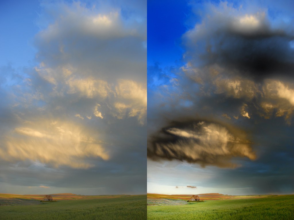
Stormy Monday Blues
Stormy Monday ~ B & W
Thank you Noah for allowing me to post process your images.
Opened RAW image in Capture NX (Nikon).
D-Lighting ~ This editing feature reveals details in shadows and highlights, correcting for underexposure, backlighting, or insufficient flash without harming the properly exposed areas or introducing unwanted artifacts. D-Lighting can also help reveal detail in overexposed areas in brightly lit scenes. Noah's image was not by far underexposed, but I wanted to try it to see what would happen if I darkened the shadows & bring out the highlights more. Also give it a color boost.
D-Lighting Adjustment of 12 (I wasn't seeing much of a difference between 0 - 24)
The lower the number = less detail in S/H. & the image itself will appear darker ... opposite for higher numbers).
D-Lighting Color Boost of 50
Color Boost increases the saturation throughout the entire image.
Basically I wanted to over-saturate the image ... I later reduced the Color Boost to a value of 30.
Next it was Color Balance
Contrast = 0; Red = -24; Green = -49; Blue = 5
Yep, I had a color scheme in my mind ... ;-)
Distortion Control ... this was a fun feature I wanted to try even though I felt there was no pincushion and barrel lens distortions in Noah's original image. I discovered that I got rid of some artifacts or objects on the right edge that I planned on cloning out later. Whatever works. :-)
Unmask Sharp ... I did sharpen the image slightly, but then deselected it later on. Decided I liked a somewhat softer look & the sharpness looked fine on the original.
Please note ~ the one thing I found nice about Capture NX is in the Edit List one can deselect any of the editing features or reselect them from the list & fine tune the image.
Somewhat oversaturated ... probably so. Les will be shaking his head on this one.
This was more or less an experiment to see how far I could push the elements using a RAW image. Probably learned some lessons here as Noah's original was excellent to start out with & I can see some drastic editing I would have changed or omitted.
I also converted the image to B & W, cropped, & framed it. This was done in Photoshop Elements. I did sharpen this version slightly & darkened the shadows as well for effect.
Both images were saved as JPEG.
That's it ... a fun experience. :-)
*stands ... applauds enthusiastically*
Thank you very, very much Sherree for your detailed explanation of your approach and use of the Capture NX (Nikon) software. An excellent primer for those not familiar with the utility.
Now then, your two edits ...
3) Stormy Monday ~ B & W;
Going to give this one the slight nudge, as I feel it is a more interpretative and personal edit of sorts.
To my eyes, the B & W conversion really enhances the leading lines present in Noah's original image and unmistakenably directs/guides the viewer's eyes to the character and focal subject of the photo ... the barn.
As well as, the surrounding grasses and small wild flowers. Which are a nice touch and element of visual interest.
Nice crop too, think it works well in adding some value to your final presentation.
No problem with the 'darkness' for me ... I am curious though, what would happen visually, if you opened up the background shadows a tad in terms of adding some possible depth. Not a slight in the least, as I haven't had an opportunity to explore Noah's original myself and is merely some creative food for thought.
Subtle, yet classy framing/border treatment ... most appropriate. Excellent work. And I thank you for sharing your creative take and efforts with us. Take a bow on this one.
3) Stormy Monday Blues:
Just viewing Noah's original and yours side by side now.
Opening your edited version full size, it doesn't appear that any noise or grain was exacerbated ... well done on that note.
The saturation? Lol, no worries. As Noah said and made mention of ... 'we' will all find or develop our own style.
My own caveat in this regard, albeit minor, would have been to play around with the Mixer and/or Colour Balance some, in an effort to create some separation of the small wild flowers from that of the surrounding grasses if possible.
Whereas in your B & W version, those elements provide some 'pops' of visual interest (yeah, I make up mine own 'stuff' at times :oP) ... somewhat lost in this instance.
Still, good separation of the focal subject from that of the sky. And the colour contrast is pleasing.
Nice work and a great example of a couple different creative approaches to the original photo of Noah's. :o)
A big thank you again to Noah for this opportunity ... a fun editing project it was.
Done in PSP with various filters and Virtual Photographer. I won't post details as I do not expect it to be very well received. :)
Was fun doing it though.
I think it's great that everyone is enjoying trying their hand at editing some excellent quality photos. It would be greatly appreciated if you could provide some of the 'hows' and 'what you did's' ... in an effort to further aid those that may not be as familiar with whatever image editing software you employed.
"Explain, in detail, how you got to your final product."
You don't have to write a book and not doing so, doesn't mean you are not invited to participate either.
The real goal and objective is to share with one another our knowledge and experience, so that we ... and others ... may all learn and hopefully improve upon our skills. :o)
ok
Using PSP
(a) Isolate land areas
1. using AphtoPhoto plugin Exposure/Contrast set Exposure to 72, Contrast to 80
2. Fidda Filters - Luminosity adjustment
(b) Isolate sky area
3. Photo-plugins/Contrast Mask - adjustment (did not note details)
4. PhotoTools plugin/Gradient Sky/Highlight correction
(c) Undo selection
5. Optic Verve Labs/Virtual Photographer - convert to sepia and adjust until desired shades
6. Crop Image
7. Add borders to create 1600x1200 image
RESULT
Truck backed up enough Les? :)
... funny, I feel just the opposite. :)
Opened the NEF file in Adobe Photoshop Camera Raw's editor.
On the Adjust tab:
White Balance ... "As Shot" ... the image had a Temperature of 4650 and a Tint value of -7. I chose Custom, with the following approximate settings ... 'cause I, er, forgotz and deleted some 'stuff'. :oD
Auto placed it at 5350, the results were a very 'warm' looking image. Something you might see just prior to sunset.
I took it down to 4500 with a tint of +7 ... the results were a little 'cooler' looking. Blues more prominent and now a touch of salmon pink in the cloud fringes.
Exposure ... out of the camera ... +0.35
Shadows ... 5
Brightness ... +49
Contrast ... +22
Saturation ... 0
Changed to: Auto, with some fine tuning. Some. The shadows were a little dark to my eyes, and trying to bear in mind the adjustments in Photoshop proper later on that I had in mind ... I decreased that setting to ... 5. Exposure is now at 0.00.
On the Detail tab:
Increased Sharpness from 20 to 25.
Luminance Smoothing ... slight boost.
Colour Noise Reduction ... also, a slight boost. Having worked with a couple of Noah's images thus far, and again, bearing in mind further edits in Photoshop proper ... yeah, gave it a kick up a notch or two from 25 to 30.
On the Curve's tab:
I quite like this adjustment/edit function. Along the Curve's line certain points have already been marked and you have a choice of a couple of default settings, such as Medium Contrast, Strong Contrast, Linear and then Custom. Started out with a change to a Medium Contrast Curve, which then changed to Custom. Bringing the Curve into a very mild 'S' shape with more pronounciation at the top of the Curve then the default setting.
Annnnd ... clicked Open, to open the 'adjusted/edited' image in Photoshop proper.
One important thing to bear in mind is that by following the above, the image you now have open is 16 bits/channel. Which does change a few things. If you wish, for whatever reasons, to have 'full' functionality in Photoshop ... simply go to Image >> Mode >> and select 8 Bits/Channel.
Prior to allll of the above, I did attempt an HDR merge of three differing exposures. But, was sent packing by my rig ... 'cause I didn't have enough disk space. :oD
Next time then, after I get rid of a few unneccessary files and do a spring cleanup on the HDD. Decisions, decisions ... decisions. :oP
Looking at Noah's original, seemed obvious to my eyes where a lot of the appeal rested ... with the cloud formation. So, I thought I would crop and work with the anticipated challenge of noise, detail et al with a much smaller portion of the original. Just to give a different take more so and let others play around with the visually 'grand stuff'. Yeah, I'm good like that. ;o)
And on the above note, and referencing Cindy's edits ... I much prefer her final composition than mine. Think I rushed things a bit, although the swooping curve of dark to light separation that exists in going from the lower left-ish portion to the upper right ... was a desired artistic aim. Leaving 'Noah's Barn' sheltered from the impending storm and illuminated somewhat from above.
So ... the file size, as is ... quite a bit larger than what I am used to working with. Found that out soon enough, being prompted that my 'scratch disks were full' a number of times. Not having performed my spring cleaning as of yet, involved cropping and resizing the image to a manageable mark.
Smaller? Constrain Proportions ... checked ... and employing the Bicubic Sharper algorithm as suggested and advised.
Fast forwarding a bit here, Shadow/Highlight adjustments a la Phil's tutorial "Faking the HDR thing" ... however, not accepting the default settings ... High Pass sharpening method ... which worked well in this instance and didn't add any artifacts, as the proponents of that method will tell you and is evident I believe in the final results.
Adjustment Layers ... Levels and Channel Mixer.
Hot Tips:
Use or employ Adjustment Layers as opposed to Image Adjustments. Layers are a non-destructive editing approach that does not change the original photographic data. Works like a filter, if you understand me here.
Don't like the results? Call it up again, fine tune it ... or simply delete the layer.
Additionally, by placing your cursor between two layers, one of the image or selection of and then the Adjustment Layer ... holding the Alt button down and clicking (Windows) will lock those adjustments to that one layer. Then simply the ordering or stacking of layers can be addressed as to how those changes affect the final results.
Channel Mixer ... and I quote from an article on Shutterbug;
"The only thing to remember is that if you want to maintain the density (overall brightness) of the original photo then the values of the combined channels should equal 100 percent."
Some other 'stuff' ... and then resized the image once again, as I did not meet with success in trying to upload a 10 and change Mb file to the site.
Annnnnnnd ... done. :o)
Right, sorry Lyn ... forgot to put on my beeper for backing up this 18 wheeler of a menace of words from moi. Next time then. ;o)
Thank you very much for your 'stuff'. It is greatly appreciated. :o)
3) Lyn's edits:
Quick take on your offering? The final results are not as bad as you might think. At least, not to my eyes anyways. The choice of a sepia tint and what with the inherent noise and grain ... works ok. Nice framing treatment and a complimentary colour matte.
Reading along with your steps and stuff ... yeah, fiddlin' with the contrast is just going to exacerbate any noise and grain. Addressing that element first, and/or ... using another one of the images that already have been reworked if you are unable to work the NEF files or the jpg's are too problematic for you could be an alternative approach. I certainly don't mind if you were to use mine.
Just be forewarned, as always ... working with a re-jpegged image ... has it's own inherent challenges.
Allll of that said ... glad you had some fun with this round.
And again, a big thank you to Noah for allowing us this opportunity. And I could be mistaken here, however ... a thank you to those that took the time to download Noah's file and then post the images to imageshack. Believe that that certainly aided some in having access to the photos. :o)
The other 'stuff' for the other two posted versions from yours truly?
Another day. Think you have enough to read with just this one alone. Make a pot of coffee or tea ... get comfy.
I needs sleep now and my teddy bear is lonesome. :oD
Original on Left, Rework on Right.
Processing Details:
Cropped to straigten horizon. My initial thought was to leave the tilted horizon, as I liked the unusual viewpoint, but then I realized I would really like it to be obvious that the barn was leaning and not just appearing that way because of the titled horizon.
Levels adjustment:
Input levels 12, 1.07, 248
Output levels 26, 255
I wanted to bring a bit more brightness into the image and add some depth
Contrast adjustment +24
Felt the image could use a bit more definition, especially in the clouds
Color Balance:
Highlights +9 Cyan/Red -6 Magenta/Green
Shadows -6 Cyan/Red -13 Yellow/Blue
Trying to bring a bit more depth of color and warmth into the scene
Cooling Filter:
Color RGB 150 193 250 at 26% density
Applied to land and barn only. After I did the color balance above, I felt the land/barn was a bit too yellow/orange.
Finally a Despeckle filter to soften any noise created from all my fiddling :)
There you have it!
Eve ~ Nice effect with the water in the foreground. I'm especially drawn to the darker sepia one ... I love the aged look you have given the image. Fits the image perfectly.
Just curious on how you created the water & what program / filter you used? Flaming Pear's Flood is a great filter for creating such an effect also.
Rebecca ~ Thanks for the side by side comparisons. I would say you succeeded in bringing out the lighting in the image.
Cropped to straighen the horizon? I presume you used the "straighten tool". I do like how the barn leans in a bit more ... gives it much more character.
Colors / sky look great.
It has been an interesting project & I have enjoyed everyone's interpretation on the image & their editing on how they got there.
Thanks again to Noah ... I do appreciate you sharing your works.
I plan to contribute in the future to this project ... spring is finally here & well, that means "road trip". ;-)
I would be interested as well to know how you created the water effect. It works well and is a nice creative touch.
Particularly on "Not Bright" ... who's title ... I am guessing ... is a reference to yours truly? :oD
A tad less sharpening would be the only real caveat I have on that offering from you.
Nice work though and it is a post worthy image in my eyes.
Rebecca's edits:
First, glad to have you back in the land of living pcs. :o)
Now then ...
Interesting approach insofar as leveling the horizon.
And forgive me here, as I could stand to be corrected ... think that you need to rotate the image a tad more. The correct line or at least the line that I see ... is one that is more or less even with the top of the grasses?
That aside, as it's no biggie ... a very 'warm' image. And a pleasant one to view.
And something that has been on my mind, a question or two to the originating author ... Noah? Care to share any thoughts as to the whys you shot as you did et al?
Looking at the two linked images when you first made it known that these were available ... curious if you shot these photos with an end creative goal in mind? Feel free to elaborate. :o)
Road trip? Someone say ... 'road trip'?
Shotgun !!
Shall pack some munchies for the journey. Peanut butter chocolate chunk cookies work for you Sherree?
:o)
Original image, unedited RAW and then saved as a .png ... found ... here.
'Stuff' to follow.
You both asked how I created the water effect in my versions posted above.
First I added a deep border (white) on bottom of image then cloned the bit of land directly above it into the border.
Next I isolated the cloned area and flipped it to make the reflection the right way up.
That was the tricky bit - it took me a few efforts to get that right.
Then the easy bit - a Plugin called VM Natural/Lakeside Reflection. With it you can adjust the horizon, the intensity of the waves etc.
You can download the plugin here - it is part of a set.
http://www.grafnet.com.pl/photoshop-filters-gallery.php?kolekcja=filtry/VM_Natural
Rays in sky achived in PSP - Flood Fill tool.
Details -
Gradient 'Bronzed Goddess'(Style:Radial,Angle:45, Repeats:5). Blend Mode: Overlay.
Opacity: 26
(I converted to the uncoloured version after I had done all the other adjustments. I think the rays are more effective in that one.)
Thank you very much Lyn. Greatly appreciated. :o)
Lyn? Do I detect some 'layer' lingo? ;o)
Thanks for the tip.
Les - nope! never done a layer in my life :) I just messed around with the different choices for adding the gradient - soft light, hard light , normal, luminance etc etc. Overlay was one of them :)
My brain just goes blank at the thought of layering - those rastors and vectors sound like rodents.
Noah, thank you dear boy - my day is made. I gave someone a tip !!
grinning goofily :)
For myself ... Layers? ... I do them using a copy of the background. Creating a new rastor & vector? ... have experimented some ... end of story. :-)
Eve, I enjoyed viewing your reworks of Noah's Barn.
... and yes, Les, peanut butter chocolate chunk cookies sound great to me. Better pack a couple extra dozen though ... yep, that should do it for now. :-)
2) "Moonlit Barn":
'K ... you are all probably getting weary from having to read my 'stuff' ... so, I took the stuff to the next level and uploaded the .psd file for "Moonlit Barn" on mediafire.com.
Available for whoever wishes to play around a bit with the file which can be found here:
Moonlit Barn - DSC_0058Moonlit2.rar
Just over 11 Mb. Not that big really, unzipped/unpacked ... just over 25 Mb.
The layers have had their visibility turned off ... as this cuts down on the size of the file for one, and two ... you can have some fun turning them on and off.
Some are, er ... completely superfluous and all are ... notoriously unnamed. :oD
Had a quick look at this thread,
Noticed Noah's Barn, that was free for PP,
So I had a go;
Noah's_barn_(timvdb)
...
What I did was opening up the JPEG in Capture NX,
Placing some color control points here and there,
Increasing the contrast/decreasing the saturation and playing around with brightness on those color control points (this assures you only adjust parts of the image, determined by color/brightness of the place you put the control point),
I'm sure you can figure out where I de/increased what,(~8 (at least I hope so 8~)),
All this too around 5 minutes,
Hope you'll enjoy this one Noah,
Thanks for letting us play with it,
Kind regards
Tim
PS; If you need the full size image separately, I can send you by e-mail
Suuuuuure, make us feel bad Tim. :oD
Just kidding, of course. Thanks to you, I delved a little deeper into the processing of RAW images. And I did find a couple of interesting tidbits of information, those being these:
"Photoshop's RAW format isn't the same as Camera Raw format. The names sound almost identical, but Camera Raw files can only originate from a digital camera, and Photoshop cannot change the file at all. Camera Raw files are locked because they are designed to contain only the information that came from your digital camera; therefore, they cannot be directly modified after the photo is taken. Think of it like the files on a CD. You can open them, but you can't save back to the CD because it's locked. That doesn't limit at all what you can do to the images; it just means that you have to save the changes to your local hard drive instead of the CD. With Camera Raw files, it means that changes have to be saved in a different file format (like TIFF, Photoshop, or JPG). Photoshop's RAW file format, on the other hand, is mainly used to export images so they can be imported into unusual software that can't handle common file formats (it's something I doubt you'll ever have to use)."
Quoted from an article by Ben Willmore on The Photoshop CS Camera Raw Dialog Box. Somewhat dated, however, some more information for those not familiar with it.
And that given the proprietary nature of Nikon's Capture NX ... it has been suggested that there are some advantages to using that software as opposed to Photoshop's RAW processing options when processing photo's taken with a Nikon camera.
Now then ...
3) Tim's edits:
I really like the end results of the land and barn itself. And I suspect that if you so desired, and with a somewhat larger investment of time in the editing chair ... you could tame that sky as well.
Your mention of the 'color control points' was invaluable to me. Lead me to playing around with the eye dropper tool in attempts to correct the white balance as well and the results I saw in that foray were much more pleasant than the image I had posted.
It finally came together for me. I ... er, think.
And your image, with the side by side comparison will be of assistance to those that have been following along with the discussion.
Glad you found some time to join us and share your knowledge. Thanks again for your participation Tim. :o)
Btw, you ... uh, making any progress on those 1400 images? Need a hand or something?
:oD
I see there are codes; #1, #3
Les; Glad you liked my edits on Noah's image,
As for the color control points, I would provide some screenshots to help understand how it works, but as my computer is down I will do this somewhere in the future,
Do I need a hand, well, I think I could manage, all I need is time, (~8
Still, I stumbled upon an image (communion series) of which I'd like to see how you PP-experts with much more PS knowledge than myself would Post Process the picture,
The parts of the image I'm not happy with in my edits is the people in the back and some lost highlights on her hand,
Here's the RAW image data,
I will share my edited image (haven't thought about a title yet) after having adored your edits,(~8
Truly curious,8~)
Hope you'll have fun PPing,
Kind regards
Tim
:o)
Thank you Tim for availing us another opportunity in the editing chair(s).
Now then ... need to stretch and warmup ... it's an important part I found in the post process ... er, process. :oD
As it might not be possible to open the .NEF file in your preferred editor (it does in mine though), I have converted the file to TIFF(16bit) and JPEG,
Also uploaded another version of the .nef file, here
Looking foreword to see your edits,(~8
Thanks for your efforts
Best regards
Tim
Thanks very much for your time and efforts. They are greatly appreciated. :o)
Just opened it up and checked it. 'The eagle has landed' ... although, Iris has not ... as of yet. :oP
Anyone interested in reworking/editing Tim's photo in RAW ... once again, and to make things simple ... here is the link to Tim's NEF file of Iris.
Opened the NEF file in CS2's RAW editor ... and indeed some of the photographic data appeared to be clipped. Particularly, in the red channel.
White balance was changed to Custom (As Shot; temperature of 5200, tint -7) with a settled/decided on temperature of 3750. Tint was knocked down to -48.
Flying by the seat of my editing pants on this one. And I did have an end goal in mind.
Further, Exposure was adjusted to -1.75, as well as, contrast taken down to -26. Brightness increased slightly.
Chose a Strong Contrast Curve ... and increased the values in the highlight tonal range (output) ... slightly, and then decreased the output values in shadows similarly from those of the default curve settings.
Wait a second ... take a look at this explanation of the Curves function. A most definitive explanation of how to approach using Curves.
On the Detail tab, still in the RAW editor:
Sharpness - 5
Luminance Smoothing - 5
Colour Noise Reduction - 10
And into Photoshop we go ...
Lots of 'stuff' done here. I originally thought I would try another B & W conversion, playing around with different tonal mapping conversion techniques ... and this is where things changed from my original vision, if you will.
Two tone? Possibly? Or thereabouts, caught my eye and of the various versions that came out of my time in the editing chair ... this is still the one that appealed to my eye the most. For a number of reasons.
And rather go on at length, I'll let you decide whether the final results are pleasing.
In particular, I did try to knock down the highlights on Iris's arm for one ... take a look at the folds of her clothing to note the differences. The people I kept in the composition, as they added some realism ... in my mind ... to a rather surreal image and posturing/placement on Iris's part within the frame and composition.
Finally, I did try to bring out more of the texture and detail of her wonderful Communion outfit.
So, yeah ... lot's of 'stuff' done, that may or may not be apparent in viewing the two; original ... then the edited version side by side.
This was a challenge for me, an enjoyable one for sure ... however, challenging nonetheless. Not knowing Tim's artistic intention in taking the shot and then presenting a different and acceptable take from my side of the editing chair.
I suspect that Tim was looking for a straight edit on his photo, taking into consideration and dealing with the two issues he points out in his above posts. Perhaps he can fill us in on that note, time and opportunity permitting.
Thanks again Tim for your time and efforts. I do have a more 'traditional' version/edit. I may wait to see your results first before posting that one.
Once again ... unedited original (JPEG) ... and then, my edited version.
#3
I like your edits, the B&W is different from what I had in mind, but it does work,(~8
The skin tone and brightness is wonderful,
I'm amazed by the great White Balance adjustments, I didn't see anything critically wrong with it on first sight, now I see,
It's great to see all the settings you used, very interesting,
I myself have been working on the image too, will post it tomorrow,
I have captured 12 screenshots to illustrate how it works, and to enhance the visibility between two separate smaller edits,
Thinking about making a flash movie of it, perhaps not as it might make switching back and forth between two shots a little more difficult,
Hope you all enjoy editing,
Kind regards
Tim
Looking forward to seeing your results. Always interested in seeing the 'original' original vision of the author of the image.
Kudo's from me to you :=)
First I would like to thank Tim for the opportunity to edit his image of Iris.
It was fun, challenging, & I was a bit critical with my own work at times, but that is a long story.
Here is my edited version of Iris
Opened NEF (RAW) file in Capture NX
D-Lighting ... I wanted to lighten up the image to bring out Iris' facial feature's. D-Lighting set at 60 & Color Boost set at 60 also. A much brighter image, but I haven't lost any color. So far so good.
Color Balance ... Red -8; Green -8; Blue 18; Brightness 4; & Contrast 17
At this point I did convert to B & W, which I liked & then converted back to color. Did try out some tint filters & actually came up with something similar to Les' edited image. For some reason, I liked the color.
I noticed the red in the left nostril, so I tried to remove it with Capture NX "red eye color point" ... it worked & I think most of the reddness was removed.
Cropped the image ... not sure why, just did.
Saved image image as NEF (in case I need to open it up again to make any adjustments) & also saved as a JPEG, since PSP X2 doesn't support NEF.
Opened the JPEG in PSP X2
Cloned out the contrail & made some minor color adjustments in "Color Balance" as I was still noticing a yellowish green cast. Temperature 4650; Tint at zero.
The red on the hands & there's some noticable on the face ... I was going to try what Les had mentioned in an earlier post on "Selective Color Adjustments" ... then I found this tutorial Red Skin Tones. PSP didn't have those exact adjustment capabilities or I wasn't aware of them, though I could of found another way around them. Guess what's on my wish list next ... CS3
So with that it was time to put the editing to rest. Not much to it, but I really enjoyed the process involved. Any suggestions would be greatly appreciated.
Oh, and ImageShack kept timing out when I was trying to upload. I got to watch the sunrise though. :-)
Les ... I plan to comment on your edited image ... soon.
#3 Sherree
I like your edits on Iris, the blue is a new input that I didn't expect,
D-lightning works fine on this one, where I used selective brightness through color control points, about the same effect,
One thing that I find a bit awkward is the blue tint on the sand, not sure about that, what do you think,
Nicely done,
Thank you for all your time and effort to have a go on my image, truly appreciated,
#2
I promised I would do an edit as well, so here goes,
The original,
And of course, the result
I posted the image here for those interested in reading/leaving some comments,
I opened it up in Capture NX,
Look here for an overview of the program with the image loaded,
then I applied my standard settings, sharpening to none/USM to optimal settings, saturation to normal, and a predefined custom curve,
Here's an image of the custom curve being applied,
Then the color control points come to play,(~8 8~)
I started with the sky, thought it could use a darker look so I turned down brightness on three color control points,
Darker sky,
Then I started brightening up Iris's head(-saturation) and hair(+contrast),
Brighter head,
Look here for settings on the head edits,
Then I selectively added brightness/contrast to parts of her upper dress, making it stand out more, oh, I also turned down the saturation to make this part B&W so that there isn't any possible color cast visible,
Look here for the upper dress,
Then the lower dress, I turned down the saturation hugely again, and cracked up the contrast hugely as well,
Look here for a view of the lower dress,
Look at how the whites below the black lower dress have max contrast without blowing out completely,
My edits on the sand are up to your guesses, I'll just say it's some contrast/sat/brightness,
here's a before - after of the sand alone,
Now I'll try to explain how colcr control points work,
Firstly,
here is an image of the selection, the control point in particular will only affect the white parts in this view, the selection is based on color/brightness/etc, around the point you selected, it is possible to enlarge/decrease the selection area,
Here are some settings on her upper dress,
Here you can find the settings for her lower dress,
Pheew, that's it, nothing more, (~8
Can you believe it takes a lot longer to write it down here than it does to do the actual edits,8~)
So in short all I did is adjusting some microcontrast, some microbrightness, and some microsaturation,
Hope you can enjoy my edits aside the others',
Kind regards
Tim
PS; don't hesitate to make an edit yourself, I am still thrilled to see all your variations,
Ain't that the truth. :o)
However, I have to express my sincere thanks to Tim and Sherree for taking that time to share with us their step by step processes and thoughts along the way. I am sure that the information you two have imparted will be invaluable to the readers and those starting to familiarize themselves with editing/post sweetening. Well done. :o)
Ok, Sherree's at the plate first, Tim is on deck:
3) Sherree's edits of Iris:
The first thing that strikes me is that the end results are wonderfully clean Sherree. You mention being self-critical ... wellll, now I am starting to see some further adjustments that could have been made with mine as well.
However, back on track ...
Clean. Doesn't look to my eyes that you ran into as many trials and tribulations with the element of the sky. Posterization and noise notably.
There is a softness to the look of yours, and reading through your words no mention of sharpening. Not a bad thing at all, no ... not at all. A different take, a different look. And in conjunction with the cleanliness that I perceive ... think it works fine with Iris herself.
I do or have a slight preference and suggestion, to sharpen the sand and grasses a tad though. The detail on her outfit is good, think that some depth is lost by not attending to the ground's elements. My humble opinion of course.
Conversely, Iris really does pop out of the frame as a result of your edits. So, perhaps six of one, less than half of a baker's dozen of another. :oP
Just kidding a bit.
You were successful in bringing out more of Iris's face, as well as, taming the redness on her hands. Something I completely overlooked having become enamoured with the light in her hair.
There is a slight pink/red cast to her outfit. Perhaps now, in retrospect and with Tim's sharing of his knowledge you can address that should something similar come into play in the future.
Tim mentioned the brightness (a good thing :o) ) on my edit. I would say you kicked up that element even more so. Bright, clean ... you captured the essence of the celebratory nature of the moment very well. Or, I should say ... your post sweetening brought out that tangible and intangible feel and look more so.
Well done and a fine effort from me.
3) Tim's edits of Iris:
Going to go in reverse here. As that which you left to our collective and editing imaginations ... the sand, that is ... is something that is subtle and not so subtle in addressing a couple of things I believe.
First, you relegated the people in the background to a very minor element. Something you stated as a consideration/objective in your original thoughts. And two, I like the 'path' and leading lines you created as a result of your post work.
Being hypercritical here, and on that same element still ... would have preferred you tapered the portions where they meet up with the horizon some more. Simply stated.
Carrying on ...
Most certainly, Tim's presentation is the richest and deepest, insofar as colours and contrasts are concerned.
And I would rank Tim's as number one, followed closely by Sherree's in the handling of the 'redness' of the hands. The skin tones are much more natural and even.
If I may be bold here, perhaps a better balance with that of Iris's face would be my own personal preference.
Hmm, interesting ... you left the contrail in. For me that was sort of an afterthought to an extent to remove it. And for whatever reason, something pushed me to take it out, almost as a last minute item.
Iris's top of her outfit is wonderfully white now. It may be a perceptual thing, in that that element's contrast with her face fools my eyes a bit in seeing a darker skin tone than my stated preference above.
Annnnnd ... I best stop here.
Rest assured that with each, Sherree's and Tim's ... having the final results side by side, with the accompanying narratives will be a great learning aid. A big well done to you both on that note and wonderful edits. :o)
And last but not least, thank you Tim for providing those screenshots of your process. The more I research Nikon's Capture NX ... the more I find out how proprietary that software is and as such, ends up as the preferred utility/software to employ with photos taken with a Nikon camera. At least in the intial edits/post sweetening.
Les' edits ... I like your version very much. As I mentioned earlier in my editing mumbo jumbo ... while playing around with the image I did come up with something close it & I thought it looked very pleasing.
Skin tones look natural & I would say you succeeded in bringing out the textures in her clothing. What I like the best is you brought Iris front & center stage without any distractions.
Very nice work Les.
Tim edits ... since we both use Capture NX, I found your editing with the use of the color point controls very helpful. I haven't played around with them much & now I know I will be using them more. Thanks for the screen shots also ... helpful indeed.
I do like how yours turned out in comparison to mine ... the colors are more vibrant in your image of Iris. I was a little bit more consevative as far as saturation & contrast goes. You also did a great job in bringing out Iris' features. She is a lovely girl.
In regards to my editing ... I can already see what I should have done differently. Tim ... you mentioned about the bluish cast to the sand. I think I was focusing so much on Iris ,,, I overlooked that part.
Les ... good eye regarding the softness. Originally, I did sharpen the image a tad, but something just didn't look right with Iris' face & it was bugging me. I did save my original edits in Capture NX as a NEF, so if needed I could change anything after the fact. I re-adjusted the sharpness several times, then finally decided to exclude sharpening totally. Softness? ... I failed to mention that in my editing process. Upon saving the image as a PNG I did soften the image up some using the bubonic advanced settings.
Once again it was a fun learning experience & I enjoyed seeing someone else's edit with Capture NX.
And I quote; "The balance is sweet". (Re: Tim's photo of Iris.)
:o)
So ... I did. :oD
Here is the end result(s) of my post processing his photo.
Reader's Digest Version of the stuff done?
Used Phil's; aka philcUk tutorial "Faking the HDR thing ....". Towards the ends of adding some dimensionality and bringing some more photographic information out from the shadowed areas.
Additionally, used the crux of Tony Kuyper's tutorial on Luminosity Masks to tame some of the overexposed areas.
Some sharpening (High Pass Filter method), a Selective Colour Adjustment layer to remove as best I could and to my eyes, the yellowish colour that was present. And then cropped some. Some. This towards putting you, the viewer, more so in the moment. Er, I think.
Annnnnd ... done. Hmm, pretty sure that is about it. Maybe?
Just kidding. Kind of, sort of?
'Cause, I ... well, didn't take notes as I went along. :oP
Nothing drastic, mind you, if you compare his original to that of the post processed one. Could be considered a cleanup job of sorts at best and I did not attempt to correct any imperfections insofar as scratches, grain (kind of liked it in, to tell the truth) and the like, were concerned.
Oh, last thing ... don't forget to enlarge the image once you are on the images' page on my imageshack account.
Click on it, and you will get a larger version that you can then download for a closer and more leisurely side-by-side look if you like.
This is a excellent rework and I am glad you left the high tech watering system in the shot.
Tick*
I've got a photo that I've worked on, and I'm interested in seeing what other people can make of it before I post my version.
Here (4 MB file)
I know it's not the greatest shot. It's what I see when I walk out my door on a summer morning, only there were sun rays that the camera didn't catch.
Most of the other pictures on this thread are JPG.
I like the picture and enjoyed working with it. :-)
The raw format is really more usefull for a rework...
That turned out pretty nice, John. Do you have notes on what you did?
Here's my version.
I probably did more extensive work that anyone else is going to want to bother with! Here's the breakdown (done in Paint Shop Pro):
1. Cleaned up left top corner using mask layer. I'm not very good at this yet, and I'm not quite happy with how it looks.
2. Cloned out branch - a lot of work! I'd like to "clone it out" in real life, since it's dead, but it's hanging over the hill and I can't reach it.
3. Took a dark green from the foreground and added a new layer, blend mode Overlay.
4. Added Orton effect:
Levels adjust - Channel RGB, Input Levels 0, 20, 255, Output Levels 0, 255
Duplicate layer
Gaussian Blur - Radius 20
Blend Mode Multiply
5. Highlight/Midtone/Shadow adjustment: Dynamic adjustment method, Shadow 15, Midtone 0, Highlight -25
6. Added 3 sun rays - drew yellow triangle, copied it twice, Gaussian blur (200 I think), lowered opacity
7. Added another layer, filled with Pastel Rainbow gradient - Blend mode Multiply, Opacity 30%
8. Brightness/Contrast adjustment - Brightness 0, Contrast 5
Now I'm interested to see your work, Tootles. I suspect it'll be colorful!
I like the effect - it almost looks like an underwater forest.
As you can see, however, I handled the over-exposure in the upper left by cropping out the whole upper section. I felt this could be done without losing the integrity of the original picture.
The blown highlights said to me, join us. You cannot win. And so I made half the picture pure white. Fantastic.
Nice job, Noah! Although, even though I neglected to mention it, I also did like the softer Monet treatment assigned to it by Hannah.
Seriously though, I do like it.
As soon as my dad gets back in town I'm going to have him bring his chainsaw to bear on that dead limb in the foreground. I actually got a pretty good picture recently from the other side of the tree to which the limb belongs. It blocked the brightest light. I may post it soon.
And hello again everyone.
:o)
Noah?
Good good effort. The crop works well to my eyes.
However, 'fantastic' as a descriptor/superlative should only be relegated to photos such as this one:
"Wedding Photo .. of dandelions"
As for that picture being described as fantastic....... Looking back, I honestly don't really like any of the photos I've taken and would score my favorite picture a 6/10. The reason I stopped taking photos was because I could no longer improve my photography skills at a satisfying rate.
But it was fun while it lasted!! Also, thanks for complementing my photo.
Or, perhaps and more appropriately ... your bank account?
And you are being far too harsh on your photography work where assigning a number is concerned.
If memory serves me correctly, and I believe that it does in this instance.
:o)
You could always post one, as sort of a lookback through 'The Noah Photographic Time Machine Lens'..
Meanwhile (thousands of miles away).. Somebody should post a picture for me/us to edit since I haven't done this type of thing in a while and editing pictures in gimp is fun since I'm not really experienced with that particular program and it's good practice and this is a runonsentence.
Towards the ends of creating/stirring up some new interest.
Hmm, let's see ...
We could just ramble on between ourselves and keep this one at the top of this particular forum!!
... ...
... ...
Done for the moment here. Your turn, Noah..
(*tags Noah in their respective corner of the post-processing ring ...*)
:oP
Hope I didn't interrupt anything. :-)
But for this thread, you can:
1) Post your own image that you want to see other people post process (eg: 'photoshop'). Make sure it is not an image that has already been post processed. For example, link to RAW files (hosted on a separate site) or 'untouched' JPGs/PNGs. Resizing is allowed to save space on whatever site you upload your 'unfinished' photo to.
2) Post process (edit, photoshop, or whatever you like to call it) another's photo. Explain, in detail, how you got to your final product. This can go into however much detail you want; you can go overboard and create a video of it, create a photoshop action, etc. Try to keep your edit within 'good taste' boundaries; avoid (but it's still allowed) simply opening a program and putting a 'sketch' filter over the image.
3) Provide constructive criticism. Feel free to be mean. But not too mean (that part applies to me too).
You can do either 1 or 2 or 3 whenever you feel like it, so specify if if you are doing a 1 or 2 or 3 with a "#1" or "#2" or "#3" at the top of your post (I know, it too sounds wrong, but it wasn't my intent) and who it is directed at. Well, you get the idea...
Linking is easy (if you choose to host your image on a separate site) though hosting your reworks (in the reworks gallery on Caedes.net is encouraged:
<@ href="[copy and past the link here, including the http://]">Blue Underlined Text</@>
...and replace the "@" with "a"