Caedes
Upload Images
Welcome guest
Log In or Register
User Stats
- 1 total users online
- 46 users active today
- 259180 total members
- +show users online
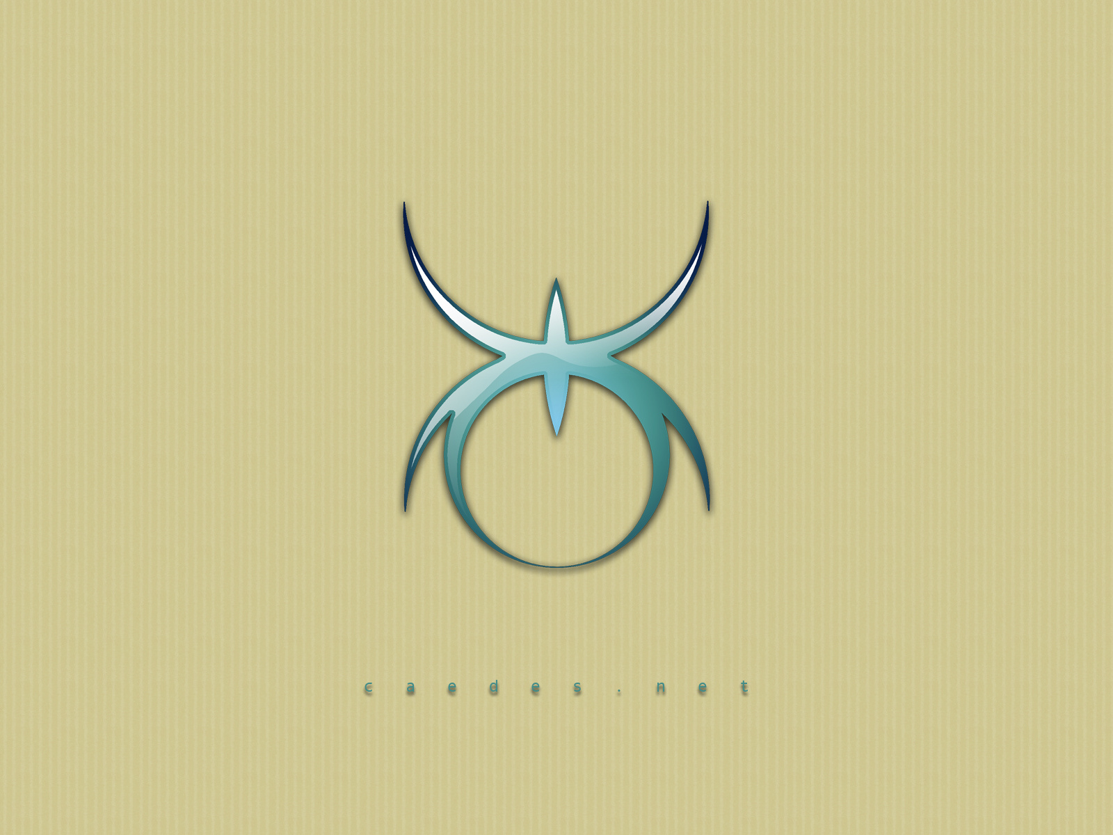
Spider jewel
© Samatar
(copyright information)
Uploaded: 04/24/06 2:29 AM GMT
Spider jewel
Views: 3659
Dlds: 707
Status: active
Dlds: 707
Status: active
Gallery:
(Main) Caedes
This isn't really a spider that looks like a jewel, but rather an attempt to use Nathan's Jewel technique on the spider logo. I turned out fairly well I think, but I suspect I could experiment with the technique a bit more to get a better result with these sort of shapes.
More images and prints available in my Deviant art and Redbubble galleries.
Comments
Post a Comment - Subscribe to this discussion
&nmsmith

04/24/06 3:25 AM GMT
I think this is downright elegant. I like it - a lot.
0∈
[?]
Good design. Good job on the reflectin.
0∈
[?]
Art is the perception of the creator. Meaning is the perception of the viewer. acceptance is the perception of society.
the design does look good Sam.. even tho it doesnt take on that jewel look, it did turn out nicely.. the colors on the spider and the background work well together.. i think the text doesnt need the drop shadow tho.. it makes it a bit difficult to read.. tho, of course we all know what it says..
Dj
Dj
0∈
[?]
And everytime I feel that my lifes a waste..
I just cant rid myself of your bitter taste.. - Me (Option21)
I agree with Nathan...Simple and elegant! Great composition!
0∈
[?]
"Let us forever cherish and hold sacred these moments...for it is our undoing ...should we forget..." -William Shakespeare
Definately elegant... love the colour... nice work Sam
0∈
[?]
"A sense of humour is as important to life as shock absorbers to a car.. It helps us over the bumps im life" / P.K. Shaw
I agree about the shadow on the text. Maybe try integrating the text with the backdrop instead?
0∈
[?]
-caedes
The colour scheme to me rocks!! Luv the logo too, butter smooth with just enough reflection bouncing off!! Splenderific Sam!!
0∈
[?]
Yes, the colours are gorgeous and the logo looks great! The text could be a little bit larger... Great job nevertheless!!!!
0∈
[?]
Beautiful in it's simplicity, and earth/sky coloring. I'd suggest increasing the font for Caedes.net as well, because it's very hard to read. Overall a very pretty desktop!
0∈
[?]
"The promise of tomorrow is not a guarantee, so I shall live for today and live for me." -- Smoosh
Very nice design good color as stated above the text is a bit small but all together wonderful job
0∈
[?]
ILY!
Slick and smooth. Cool.
0∈
[?]
"For him in vain the envious seasons roll/who bears eternal summer in his soul."-Oliver Wendell Holmes
an attention soother
0∈
[?]
these pictures of my brand of folk art are done with only a mouse. No pen pad or what have you.