Caedes
Upload Images
Welcome guest
Log In or Register
User Stats
- 1 total users online
- 38 users active today
- 259160 total members
- +show users online
Alloy
© Shiznet
(copyright information)
Uploaded: 02/26/04 3:41 AM GMT
Alloy
Views: 6019
Dlds: 2368
Status: active
Dlds: 2368
Status: active
Gallery:
(Main) computer
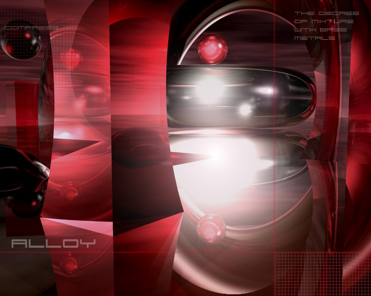
I dont know what to say about this i thought the bryce image was good but i didnt know what to do with it in PS.... Couldnt get any body opions on it b4 i uploaded it oh well..... Tell me what you think i may post a new one with the changes you suggest......
Comments
Post a Comment - Subscribe to this discussion
::Piner

02/26/04 5:06 AM GMT
Really neat render, but a bit too bright towards the center. :c)
0∈
[?]
The work of art may have a moral effect, but to demand moral purpose from an artist is to make him ruin his work.
(Johann Wolfgang von Goethe - 1832)
Very nice picture... the colors are wonderful! Keep up the nice work... 10/10 ;-)
0∈
[?]
"Life is a privilege... not an option"
Nice colors. I like the image, but the "squeezed" cube coloumn in the left center, needs some work on the perspective. It looks kinda out of place there.
0∈
[?]
Opinions are like a$$holes. Everybody has one.
very great again. 10 and in my favorites
0∈
[?]
Sous le soleil, toutes choses doivent finir un jour /
Under the sun, all things must finish one day ( Legolas Lord of the rings )
Nice work - I think you should remove the writing and grid lines. Make the pillars solid
0∈
[?]
I agree with MBigDo11....remove the writing and grid lines. I think you should add some intense purple lightening and then rename is Alloy Underpressure. :)) Just a wacky idea. But, this is cool for starters.
0∈
[?]
I disagree with MBigD011
--I like the pillar how it is: making it solid would take away a lot of dimension that exists in the image. realistically, if it was solid it would cast a shadow towards the viewer because the light source is mostly behind it. what would it be then? a big monolith that would be somewhat of an eyesore that's blocking a view instead of presenting two new, alterered views of the scene. I'm actually impressed with what is shown through the (glass?) pillar, it seems true to form for looking through an object of that sort.
--in the midst of a surreal and intangible world, the grid lines lend a touch of something concrete and defined that people are familiar with. this brings a certain offset balance that, while leaving a person in the imaginary, also gives the person something to stand on. the rigidity of the lines give a small sense of structure to the image. to me, the grid lines almost seem to be a signature feature of some of your works.
--the writing is done tastefully, seeing as the writing in the upper-right corner is transparent enough to keep it from being a distraction from the rest of the image while still giving meaning to the world Alloy. the only problem I see with the text is that the definitition is a little bit hard to read, I had to look closely (and open a larger res. version of it) to tell that it says "degree" and not "decree." I wish I had a suggestion for how that could be done differently to fix that, unfortunately I don't.
hope you like the book-size comment I wrote, it's what happens when a very detail oriented person gets bored, haha!
0∈
[?]
Not too bad! A little bright, but the rest of it is done quite well. Keep up the good work.
0∈
[?]
~FLAMES~
Smile God loves ya'll
I like the column as it is, but were the globes on the center right meant to be so indistinct? It seems they are for a different image. I think they should be a similar color as the column. The text fit in very well.
0∈
[?]
The colors and the contast of the white caught me to click on it. So I think it works. Not much else to say.
0∈
[?]