Caedes
Upload Images
Welcome guest
Log In or Register
User Stats
- 0 total users online
- 48 users active today
- 259179 total members
- +show users online
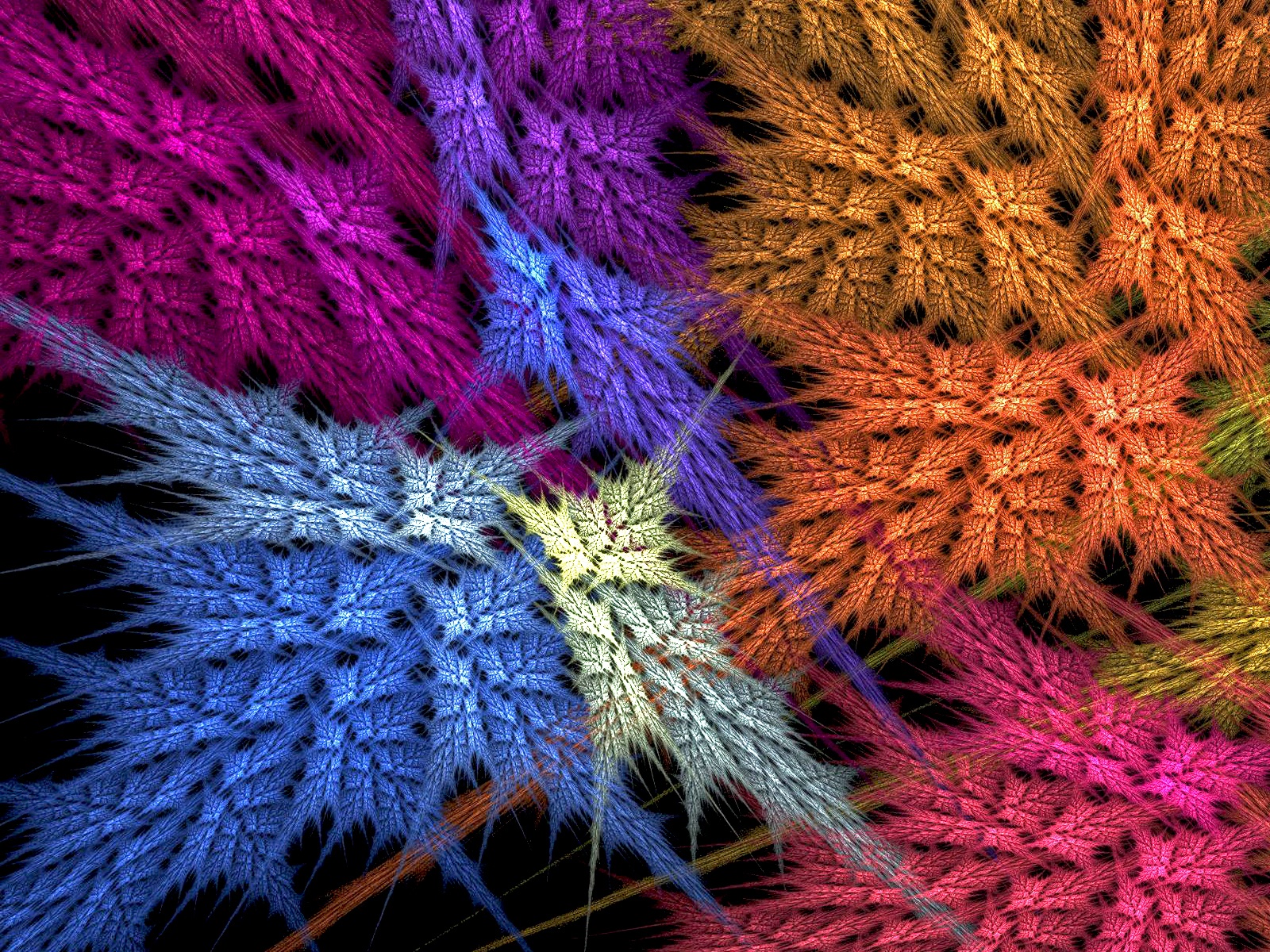
Deep Within the Thicket (Re-Rendered)
© WENPEDER
(copyright information)
Uploaded: 11/01/05 12:17 AM GMT
Deep Within the Thicket (Re-Rendered)
Views: 10764
Dlds: 5638
Status: active
Dlds: 5638
Status: active
Gallery:
(Main) Abstract->Fractal
I decided to re-render this Flame because there was a slight blur on the original that bugged me.
Comments
Post a Comment - Subscribe to this discussionA "mood?" LOL! No, actually I'm working on an 50th Wedding Anniversary video tape for someone and, as effects and titles and such render, I'm looking through my files on this computer and tossing some and fixing others. Yes...the blur in the top pink part bugged me. It's still there a little, but it's better. If I could have simply substituted the new render for the old, I would have, but that's not possible and I didn't want to delete the original from the permanent gallery....Glad you were able to see the difference. <G> Wen
0∈
[?]
I like the rework and the colors, seem different yet to me they seem better here, great job.
0∈
[?]
I love this. Don't think I saw the original, I'm sure I would have remembered it.
0∈
[?]
Well I notice that there is more of the blue showing on this one, and less of the tips of the other colours...right? IT seems like the pink is sharper...all the colours seem sharper....I like this one better, yes
0∈
[?]
"It is not the language of the painters but the language of nature to which one had to listen."Vincent VanGogh
Thanks, folks...yep, that's the only real difference...it's rendered at a higher resolution so that it is, hopefully clearer/sharper...I also knocked the exposure/brightness settings down just a tad. Wen
0∈
[?]
Wen, this has always been one of my favorites of yours! Just beautiful! Vic
0∈
[?]
This is a very beautiful and elegant picture. Organic and vibrant.
I didn't even need to think about it - definitely a 10.
I didn't even need to think about it - definitely a 10.
0∈
[?]
What nourishes me, destroys me
What you need is a jewel thief .. one who is world-class .. hanglides in under the cloak of darkness, dodging the laserbeam traps that caedes surely has in place (smoking helps here, one of the few times that it does) ... does that indiana jones thing with the weighing by hand before making the switch
and then .... =.=.= RUNS like heck
and then .... =.=.= RUNS like heck
0∈
[?]
Wax on - Wax off
excellent job on both, and to add to the others, i too think this one's better.. not to say that the other one wasnt good, cuz it was really good.. just this one's better with the purple blur fix and rendering at a higher res.
Another Great Job! thx for sharing :P
edit: purple --> dark pink
Another Great Job! thx for sharing :P
edit: purple --> dark pink
0∈
[?]
I would rather it was real ferns that were touched up, it doesn't look realistic to me.
0∈
[?]
The top left corner looks much better in the rerendered version. I both like and dislike the colors at the same time. They're very eye-catching and vibrant but they seem like they should look more realistic. Overall great job though.
0∈
[?]
_Fastgrass Gallery .
very interesting, i like some fracs. but most get boring after a while this one though, i will like for a long time. :)
0∈
[?]
beautiful use of color. reminds me of leaves falling in autumn. good work. I don't do fractals myself, but I think they are awesome!
0∈
[?]
buttersweet
nice colours and very good pattern.never saw the original but this is good,
0∈
[?]
Awesome, unique, fascinating, and those are only a few words to describe this. Nicely done!
0∈
[?]
Famous last words: "Hey, watch this!"
My Gallery
♫♫♫|׺°”˜`”°º××××Magnificent Job××׺°”˜`”°º×|♫♫♫
0∈
[?]
єvєrч dαч ís α gíft.....thαt ís whч ít ís cαllєd thє prєsєnt!
Happy Halloween !!