Caedes
Upload Images
Welcome guest
Log In or Register
User Stats
- 2 total users online
- 39 users active today
- 259176 total members
- +show users online
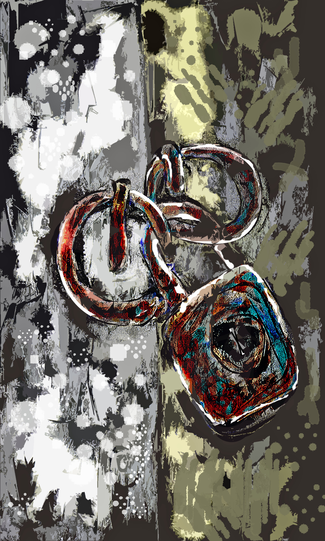
Lock The Door
© bfrank
(copyright information)
Uploaded: 08/16/18 1:52 AM GMT
Lock The Door
Views: 208
Dlds: 83
Status: active
Dlds: 83
Status: active
Gallery:
illustrations
Haven't unlocked this door in a long while. Just playing around with an idea.
Comments
Post a Comment - Subscribe to this discussionYou sure are creative, really nice, and different. tigs=^..^=
3∈
[?]
Nature in all her glory is my uplift on life and so is my love of photography. sandi ♪ ♫
I like the contrasts here, and the glittery look on the lock. Good work!
3∈
[?]
Caveats?
Visual weight/balance.
To my eyes as presented.. the two links are of equal visual weight to that of the lock.
This may just rest with me.. however, the result of the above is that my eyes kind of wander.. with no clear focal point of interest (bit of an exaggeration here).
So..
I would've made those two links smaller.
The textures, colour palette are all good good and visually interesting.
Just need a place to 'rest my eyes', so to speak.
And..
But, of course.. thanks for sharing your creativity with us, Frank.
... ...
Curious as to what you are using here? In terms of software/program?
Is it still Krita?