Caedes
Upload Images
Welcome guest
Log In or Register
User Stats
- 1 total users online
- 39 users active today
- 259159 total members
- +show users online
Out of Site Out of Time
© capturer
(copyright information)
Uploaded: 04/27/06 1:58 PM GMT
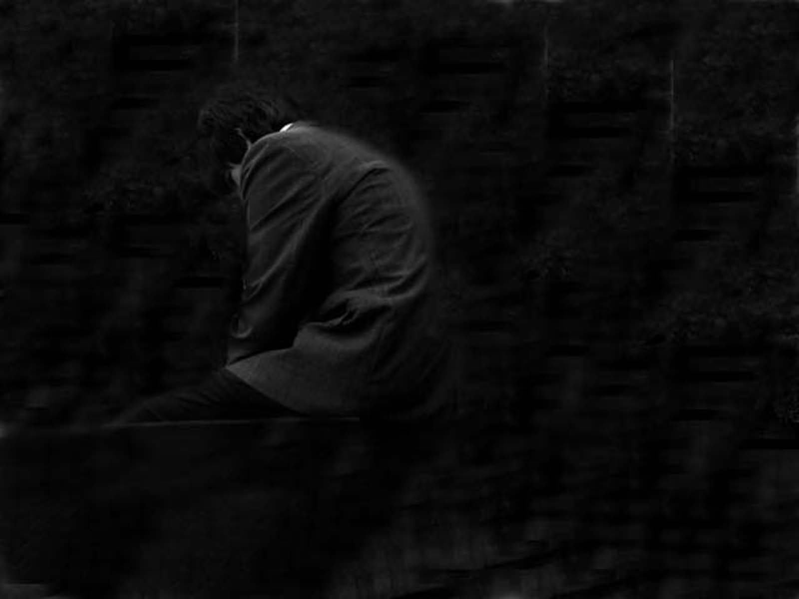
Out of Site Out of Time
Views: 898
Dlds: 67
Status: active
Dlds: 67
Status: active
Gallery:
photography->people
I was all dressed up for a funeral so I took a picture and it came out good. I didn't like the background so I used my friend the clone stanmp and the background turned out to be very cool. Hope you guys like it. Tell me what you think.
Comments
Post a Comment - Subscribe to this discussion
::tenthz

04/27/06 2:50 PM GMT
This picture is really dark. I can barely tell if that's a person or the bottom of someone's foot. I came here from the voting booth, so I didn't have any of the information you provided when I made my first impression. I think this image really benifits from the title (I can never think of good titles like this!) and the description that you gave. If you were up to it, you might think about posing for this shot again, and make sure you have better light. I think it could be very effective if it is a bit more obvious what the subject is at first glance.
0∈
[?]
I do like this from a perspective point after reading your narration. Overall the image is on the dark side, but maybe that is what you intended it to be. Very creative work.
0∈
[?]
Do not go where the path may lead, go instead where there is no path and leave a trail.....Ralph Waldo Emerson
I like the fact that it is dark and one must strain to see what is there, I think it makes a stronger impact this way. Very dramatic, well done and high marks from me David!
0∈
[?]
God is Love
Nice work! I agree the background did come out well! What makes it for me is that tiny fleck of white... can't stop my eyes from getting drawn to it as it's the only escape from the darkness! Good job :D
0∈
[?]
thats a really good pic! i love the mood of it.
must say imo the background i s a bit repetetive or whaterver but no big matter.
i don't think the light is too dark it suits the pic well.
it's sad that your pictures are always so pixalated in the bigger sizes. i think you should only upload 1152x864 or even 1024x768, cus in smaller size they are good!
0∈
[?]
i like it. i like the darkeness of it and how well you can still see his image with the dark on dark.
0∈
[?]