Caedes
Upload Images
Welcome guest
Log In or Register
User Stats
- 1 total users online
- 47 users active today
- 259185 total members
- +show users online
NYC IV
© groo2k
(copyright information)
Uploaded: 07/17/05 6:26 AM GMT
NYC IV
Views: 4796
Dlds: 1709
Status: active
Dlds: 1709
Status: active
Gallery:
(Main) Photography->City
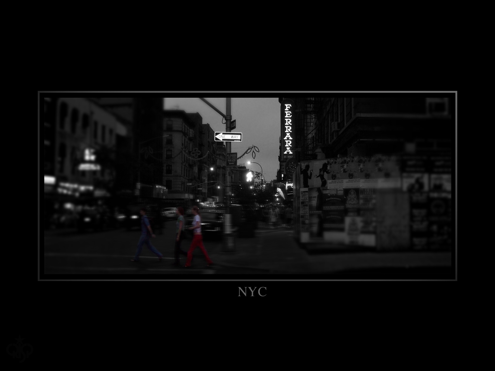
Ferrara's of Little Italy just down the block.
Comments
Post a Comment - Subscribe to this discussion
co2metal

07/17/05 8:34 AM GMT
wow, really cool.. the contrast is perfect and the capture really gives a sense of the atmosphere.. i also love the subtleness of the frame.. very well done and high marks
0∈
[?]
click here for pure excellence
I like this one a lot , good contrast , its clear were it has to be and the motion is perfect.
great pic
great pic
0∈
[?]
have a nice day and read more fantasy.
Great job! I am immediately drawn to the strong bond (for lack of a better word) between the one way sign and the three people highlighted that are following it. The name Ferrara is a bit distracting from the rest IMO and could have been blurred. The action on the three people up front is my favourite part of this image though:-)
0∈
[?]
Darryl
Impressive! The framing works extremely well with this photo. Great job!
0∈
[?]
another excellent shot Rob.. i agree with Darryl about the 3 people.. i was drawn to them as well when i viewed fullscreen.. nicely done..
Dj
Dj
0∈
[?]
And everytime I feel that my lifes a waste..
I just cant rid myself of your bitter taste.. - Me (Option21)
Brilliant, Rob. Where do I start on this image? The use of black and white contrasted with the color of the foreground subjects really draws the eye to them while the business of the image allows the viewer to not be distracted by them. Damn! I have to study this piece. You even blurred the edges of the image to let the viewer focus on the sign that stands so prominently in the background. The frame is gorgeous, and I will use bits of your method in my future works. OK I found something to bitch about: the "One Way" sign is overexposed. There - criticism!
0∈
[?]
ж Regmar ж
It seems directly coming out a Paul Auster's novel. A great atmosphere. I just LOVE your NYC serie. Great great work !
0∈
[?]