Caedes
Upload Images
Welcome guest
Log In or Register
User Stats
- 0 total users online
- 44 users active today
- 259180 total members
- +show users online
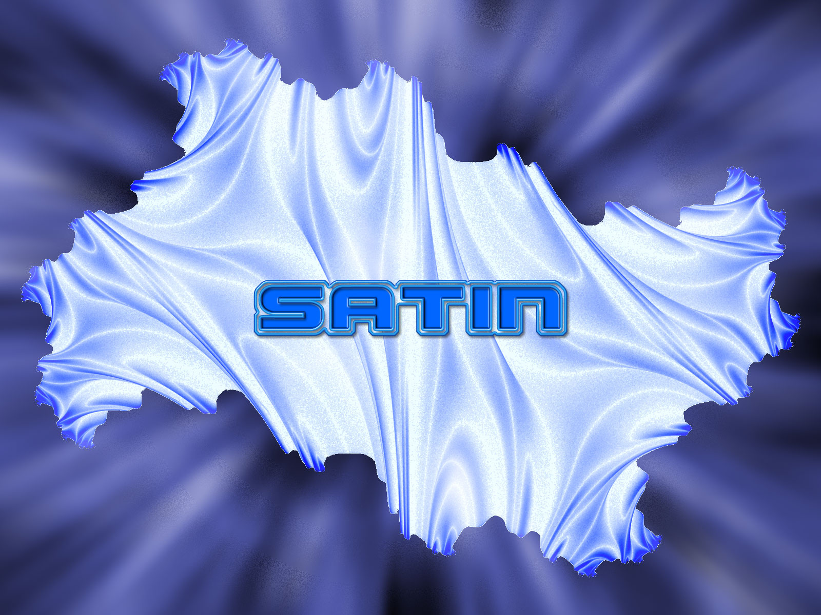
Satin
© houstonaxl
(copyright information)
Uploaded: 10/28/06 9:37 PM GMT
Satin
Views: 620
Dlds: 20
Status: active
Dlds: 20
Status: active
Gallery:
computer
another one from my Textual desktop series. This was done with chaoscope & PS CS2
Comments
Post a Comment - Subscribe to this discussionMany thanks. You are the first to leave me such a detailed feedback. I have never really don Text as a focal point before but here lately I have been on that kick for some reason. I am sure I will out grow it soon. Anyway thanks for the tips!
0∈
[?]
Don Haney |
Mt. Vernon Studios |
www.mtvernonstudios.com |
houstonaxl@houstonaxl.com
Back a couple years, at DeviantArt .. Text and "micro-text", lines, and symbols were all the rage .. they generally refered to it as "2D" .. sometimes one guy would do the 3D piece and hand it off to a guy that had a knack for 2D
here are a few examples
Undone by ~xyv
Ultranic by ~xyv
Last Local by ~underground-is-good
when something becomes popular, it is a trend .. when you follow that trend in order to be popular you are a trendwhore (their word, not mine)
note .. this last statement is NOT directed at you, just a little history
0∈
[?]
LOL Ok thanks!
0∈
[?]
Don Haney |
Mt. Vernon Studios |
www.mtvernonstudios.com |
houstonaxl@houstonaxl.com
Keifer sure gives great advice and helps alot of folks out. As for me, I just like this image - mainly because of that satiny texture feel - and that's what its all about . I also like the naturel appearing folds in the material, and the dark blue tips. The purple shaded background shows off the satin beautifully. I agree with Keifer, I think this would be better without the text on it. I do think this is a wonderful display of texture Don, and thanks :*>
0∈
[?]
I'm going to be browsing for images..commenting when able.
I need to catch up on things.
a couple points .. first .. the edges of the center texture are 'jaggy' .. this can be eliminated by going around that piece with the blur tool to soften the edge .. if you are going to duplicate that layer for the sake of blending and effects, you'll want to incorporate that step into your early work-flow
creating the piece double the size and resizing down for upload using PS's bicubic method will help to smooth issues like this as well
second .. and this is a personal thing for me .. text on a desktop image is undesirable for the most part .. it can be done eloquently .. but most people (i.e. ME !!) will read it over and over untill insane ... let the TEXTure speak for itself ... let people see it for what their mind wants to see it as (above and beyond the name of the image)
for example ... If I wanted to see it as the alien metal from the crashsite at Roswell
Thanks for sharing .. :o)