Caedes
Upload Images
Welcome guest
Log In or Register
User Stats
- 1 total users online
- 39 users active today
- 259165 total members
- +show users online
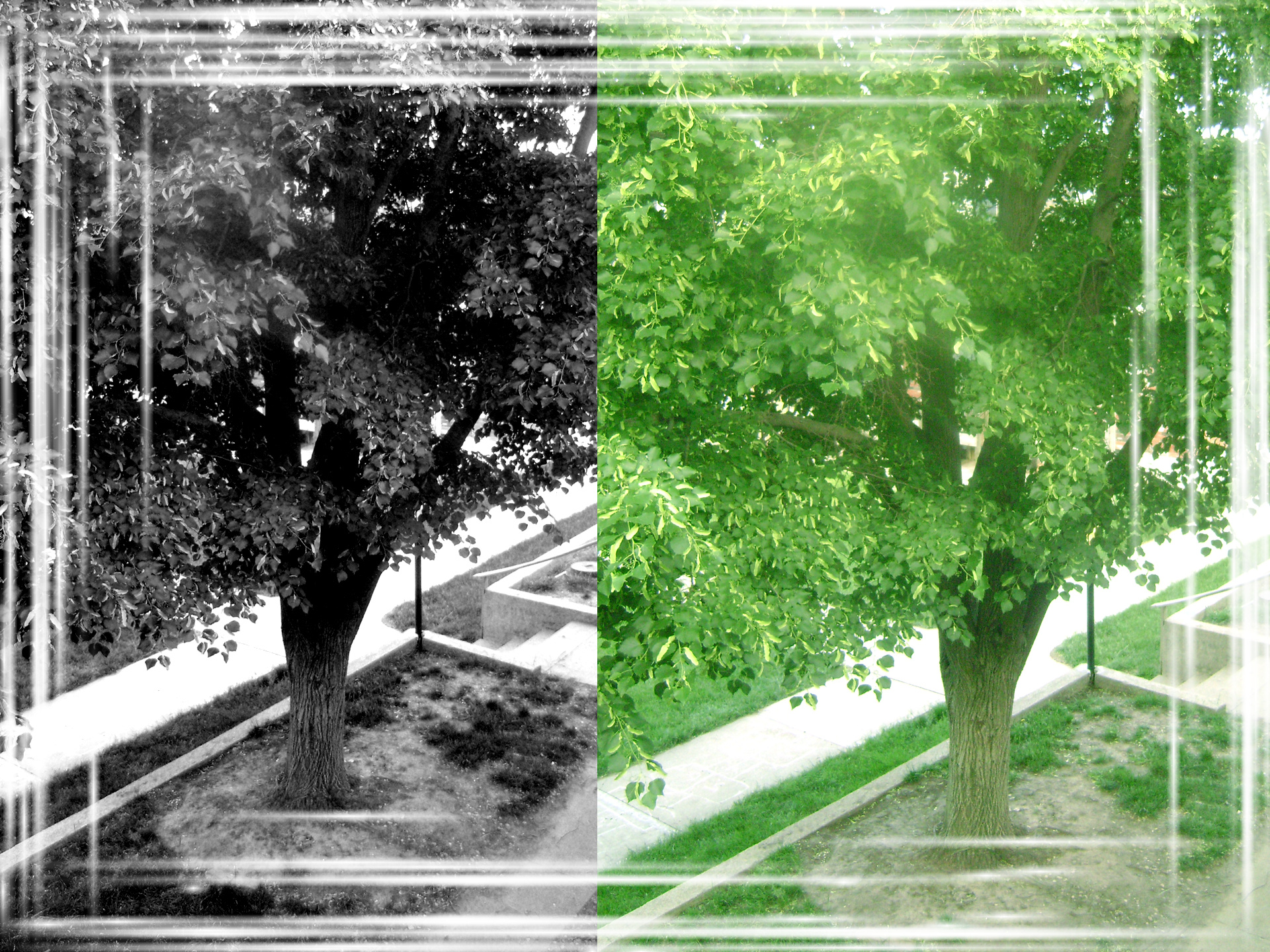
Red Trees Redone (per request)
© lokigrl616
(copyright information)
Uploaded: 06/12/08 4:49 PM GMT
Red Trees Redone (per request)
Views: 437
Dlds: 34
Status: active
Dlds: 34
Status: active
Gallery:
Photography->Manipulation
a few people have suggested that i try to redo "Red Trees" as the original color or Black and White, so here is both! enjoy!
Comments
Post a Comment - Subscribe to this discussion
.nancymcarney

06/12/08 5:40 PM GMT
My fave is the green. Great work!
0∈
[?]
Is it just me or is that an optical allusion. It looks like the green one has a little more space of the two shots or is that just becuase the color.
<PicScout>
<PicScout>
0∈
[?]
Why do you have to "put your two cents in"... but it's only a "penny for
your thoughts"? Where's that extra penny going to?
I really like how you put the two together, very unique idea! I think I like the original more just because it's so different :)
0∈
[?]
carissa =D
OMG!! 'We've' created a Photoshop monster!!
Just kidding. :oP
Now then, your image ...
I prefer the B & W myself. The green is nice, could use a tad more contrast as the lighting appears too even or flat. I suspect that you might have employed another filter. Looks somewhat similar to the use of the Diffuse filter/treatment/effect.
Not unpleasant, not at all. Just bump up the contrast a tad.
The B & W has a good amount of visual intrigue and drama in my humble opinion.
And a suggestion, duplicate the Background layer ... change the Blending mode of that duplicated layer to Overlay. Then with that layer selected ... go to ... Filter > Other > High Pass. The Radius setting will depend on the size of the file/image you are working with. Experiment a bit. Something in the order of 0.5 to 1.0 would probably be sufficient enough.
This will sharpen your image some and add a touch of contrast. So, perhaps, you might be able to do the proverbial two birds with one step/stone. As in, add some contrast and sharpen your image.
Once again, alllll that said ... :oD ... I think you enjoyed your time with this one.
And a final word, some times ... some times, less is indeed more. Some food for thought, that's all.
Oops ... 'final' final word then ... but of course, thank you for sharing your creative efforts. :o)
0∈
[?]
"Think what a better world it would be if we all, the whole world, had cookies and milk about three o'clock every afternoon and then lay down on our blankets for a nap." - Robert Fulghum
Ere yes well I um ere .. echo yes echo Les brief comment above lokigrl
And put a bit more tomato ketchup on it next time. Lol
And put a bit more tomato ketchup on it next time. Lol
0∈
[?]
Big brother's watching you :o) A mistreated dog should try to leave a deposit on their masters best carpet, after all it's important to establish who's boss ... Help I'm being repressed !!
Awsome work hun! I could tell you put a lot of effort into this one and got some great feedback. Thats what makes a great photographer into an incredibly awsome one. Keep making me proud!
0∈
[?]
Dani.
How the Heck, Did you do this
Fantastic...
Really Fantastic
From Sunny South Africa With Love
Jacko
How the Heck, Did you do this
Fantastic...
Really Fantastic
From Sunny South Africa With Love
Jacko
0∈
[?]
Nature in all her glory is my uplift on life.