Caedes
Upload Images
Welcome guest
Log In or Register
User Stats
- 1 total users online
- 44 users active today
- 259176 total members
- +show users online
Caedes Graffiti
© pharcyded_designs
(copyright information)
Uploaded: 06/21/07 2:14 PM GMT
Caedes Graffiti
Views: 1642
Dlds: 37
Status: active
Dlds: 37
Status: active
Gallery:
(Main) caedes
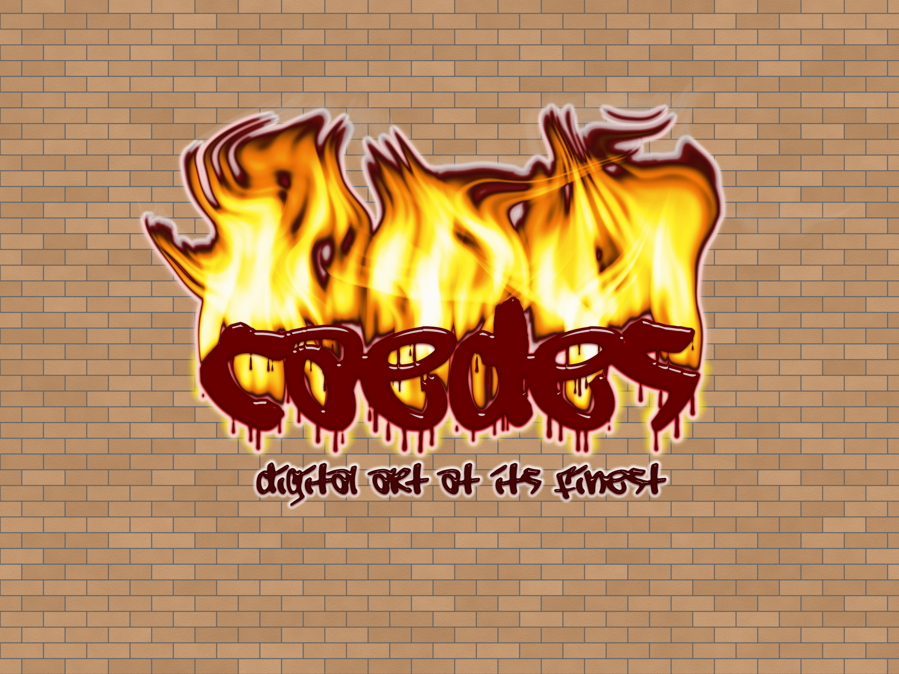
Caedes graffiti on the wall...not really much else to say. :)
Comments
Post a Comment - Subscribe to this discussion
.antmark

06/22/07 12:10 AM GMT
i think caedes should be a different color, maybe white.
0∈
[?]
I think that the maroon gives a nice matching effect with the color at the top of the flame. Nice job!
0∈
[?]
Actually, it was originally white text but it just didn't fit the picture as well as the darker shade. I appreciate your comment though! :)
Also, thank you for the comment nature_faerie I am glad you liked it!
Also, thank you for the comment nature_faerie I am glad you liked it!
0∈
[?]
imo, your sterotypical graffiti letters are a solid color in the middle with a big border. i agree the inside should be white and a thick maroon border would work nicely. and on top of that....it might look really kewl if u did a slight transparency so as to "pull" the texture out of the wall so that it actually looks like it was sprayed on there.
and mebbe the brick texture should be larger too...the bricks are really small..if they were bigger it would give better dimensions i think.
otherwise, nice colors, and nicely done on the fire...it aint easy.
and mebbe the brick texture should be larger too...the bricks are really small..if they were bigger it would give better dimensions i think.
otherwise, nice colors, and nicely done on the fire...it aint easy.
0∈
[?]