Caedes
Upload Images
Welcome guest
Log In or Register
User Stats
- 2 total users online
- 39 users active today
- 259167 total members
- +show users online
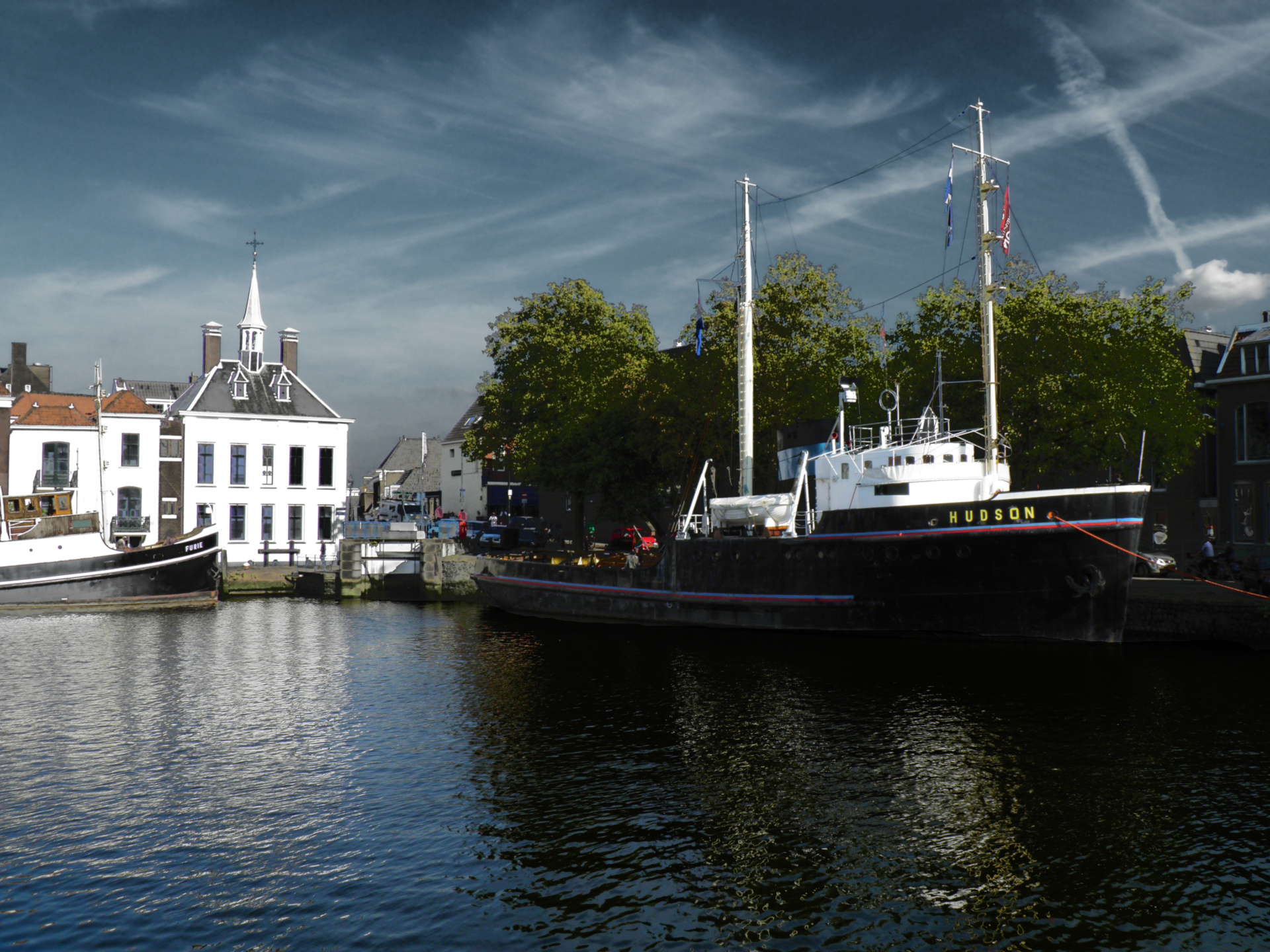
Hudson
© rvdb
(copyright information)
Uploaded: 11/01/11 6:33 PM GMT
Hudson
Views: 458
Dlds: 55
Status: active
Dlds: 55
Status: active
Gallery:
photography->boats
Maassluis Harbour the Netherlands a Paint.Net manip the effect was done in layers the base image was a picture with a metaal effect and the original picture layer on with some different blurs along the way. Thank you to all my Caedes friends for all the great comments lately.
Comments
Post a Comment - Subscribe to this discussionI love the darker tones too,makes this scene Dramatic.Wonderful work,Rob.
2∈
[?]
Another stunning looking photo and i love the colours and layout of this photo too.The light and ripples on the water is great.
3∈
[?]
I am not sure what you maniped but that is the sign of a master at work. This is beautiful. I like the layering you did it made the depth unreal.
3∈
[?]
Billy
Rob - What a challenging contrast of black in the shadows and white in sunlight. Great work to tame it all. Thad
3∈
[?]
If I could tell the story in words, I wouldn't need to lug around a camera. ~Lewis Hine The Earth without art is just 'eh'.
I like the darkness versus light ... excellent capture, Rob. Wonderful details / composition too.
3∈
[?]
"Packers Rock!"
Fan of Karl Klug (DT) ... Tennesse Titans
An interesting effect and look in this capture, Rob. Nice lighting and colours in the scene. The black colour seems a little flat in places.
3∈
[?]
The difference between a bad artist and a good one is: the bad artist seems to copy a great deal; the good one really does. ~William Blake
I really like the darker tones.
TicK
(Viewed Full Screen)