Caedes
Upload Images
Welcome guest
Log In or Register
User Stats
- 1 total users online
- 39 users active today
- 259161 total members
- +show users online
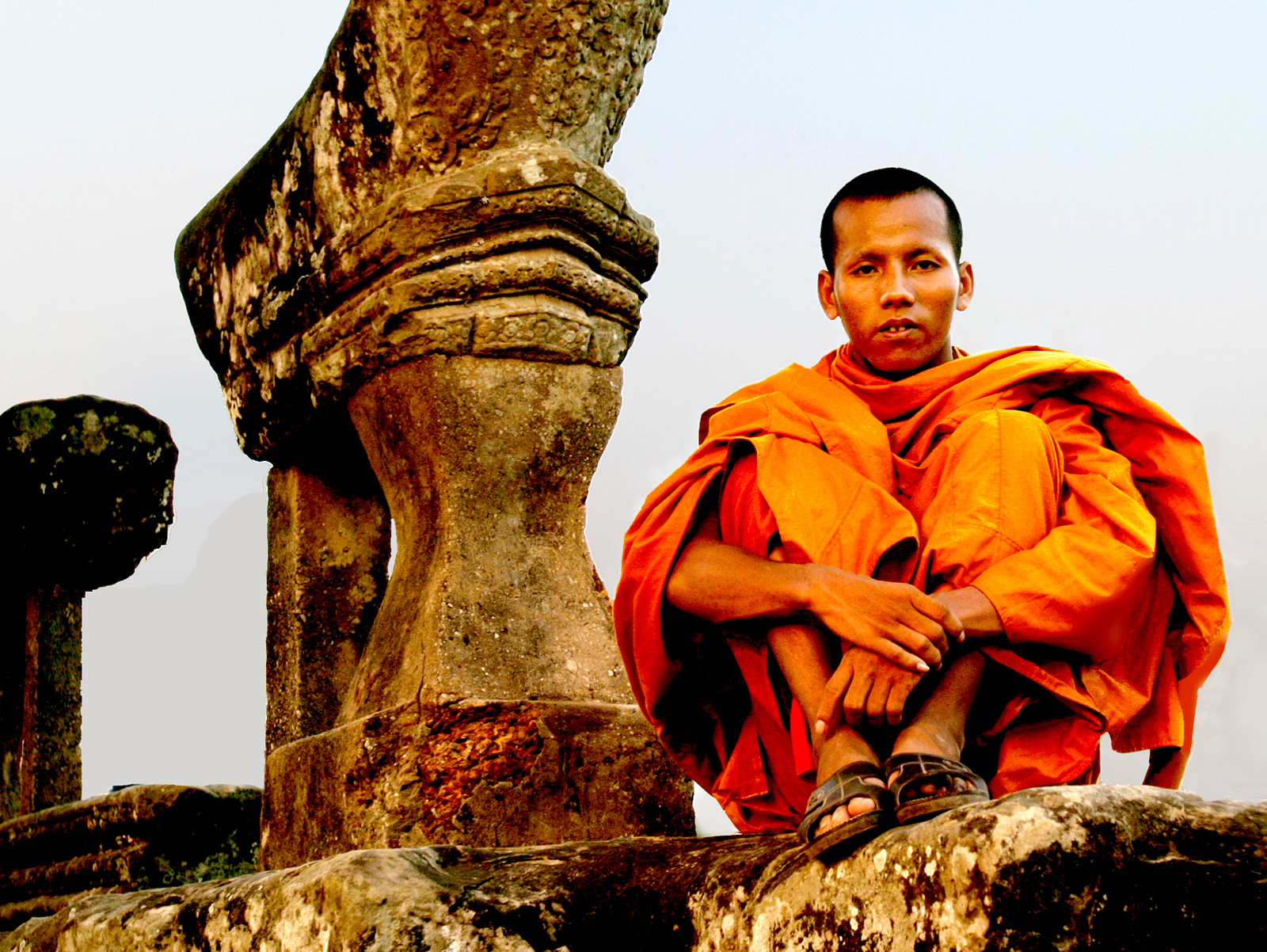
cambodian monk
© jeenie11
(copyright information)
Uploaded: 03/04/06 5:37 AM GMT
cambodian monk
Views: 3515
Dlds: 801
Status: active
Dlds: 801
Status: active
Gallery:
(Main) Photography->People
a cambodian monk wearing saffron robe. taken at angkor wat.
Comments
Post a Comment - Subscribe to this discussion
.farmgirl_pml

03/04/06 6:50 AM GMT
Amazing colors & composition. Nice detail. Great job.
0∈
[?]
Nice capture...good "life theme"...
0∈
[?]
"Let us forever cherish and hold sacred these moments...for it is our undoing ...should we forget..." -William Shakespeare
Love the composition. Nice close up. Good color. Overall just excellent.
0∈
[?]
The colors in this one are just amazing. I'm taken aback by the orange -- it's perfectly balanced right on the edge of "overpowering." It's just enough to captivate the viewer without overwhelming your composition completely :)
0∈
[?]
Nothing can separate Us - Romans 8:38-39
Very nice! I love the color and would like to know if the wearing of the Safron robe means anything in particular like a specific ceremony or day.
0∈
[?]
Since we cant change reality. Let us change our eyes in which we percieve reality.
Nikos Kazantzakis.
Stunning image Jen! Excellent capture!
0∈
[?]
O taste and see that the Lord is good; How blessed is the man who takes refuge in Him! Psalms 34:8
Great portrait and nice composition!
Rye
Rye
0∈
[?]
Its as simple as life. Plz take a look at my gallery! :)
Really wonderful capture! I really your shots like this, they are always so vibrant and interesting! Excellent job once again!
0∈
[?]
In this is love: not that we loved God, but that He loved us and sent His Son to be the atoning sacrifice for our sins. 1 John 4:10
Angkor Wat! Now I'm jealous. I love the detail in the time worn stonework and the color is fabulous of course. More from this spiritual place please.
0∈
[?]
The color in this picture just stands out in a beautiful way!
Amazing capture!
10/10!
Amazing capture!
10/10!
0∈
[?]
Great job! My friend is obsessed with Monks... The composition and the gold/orange color is amazing. Awesome capture : )
0∈
[?]
You had a pretty picture, you had a pretty smile, you had a heart of ice and you put me in denial. You broke my heart a thousand times, you broke my heart just once, you made me see all i need is me and not some stupid... girl.
The monk's look is rather captivating. Like he has a lot to say but never says it. Really good shot :-)
0∈
[?]
I like this a whole lot. I think that the color balance is a little warm though. You might just cool it down a bit in photoshop.
0∈
[?]
Joey
Amazing photo! If a picture can say 1000 words, this one says at least 2000. Thanks for sharing!
0∈
[?]
�When people say to me, �I don�t like poetry�,
I tell them that, to me, poetry is like weather�
and you wouldn�t say �I don�t like weather�, would you?� �David Kirby
National Geographic worthy. Really, this is a wonderful blend of culture and color. Great shot!
0∈
[?]
I already saw this image when I was visiting the 'Photography->People' gallery. I like it a lot.
Reminds me my little monk (link) and the interesting discussion about the colors saturation.
I know that many people don't agree with me, but I think that a strong saturation in the red (here the orange) is a little disturbing.
Your thoughts?
Reminds me my little monk (link) and the interesting discussion about the colors saturation.
I know that many people don't agree with me, but I think that a strong saturation in the red (here the orange) is a little disturbing.
Your thoughts?
0∈
[?]
-Pierre-