Caedes
Upload Images
Welcome guest
Log In or Register
User Stats
- 0 total users online
- 32 users active today
- 259282 total members
- +show users online
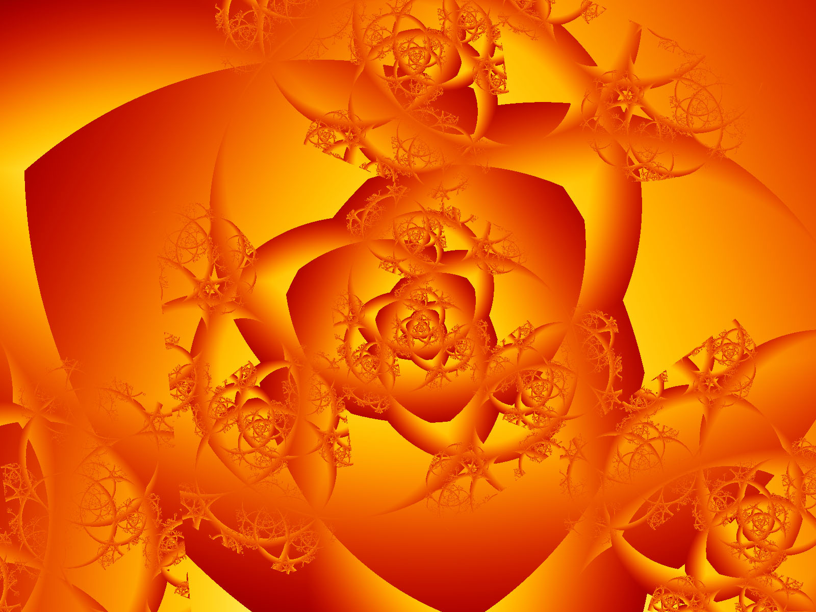
Hot spice
© Donna68
(copyright information)
Uploaded: 02/25/07 11:08 PM GMT
Hot spice
Views: 579
Dlds: 155
Status: active
Dlds: 155
Status: active
Gallery:
Abstract->Fractal
Thanks for looking :-)
Comments
Post a Comment - Subscribe to this discussionOuch ouch burny burny yikes holds up hands "I can feeeeel the heat" and my laptop is sahhhmoookingggg. In other words excellent fractal, awesome job.
Shell
Shell
0∈
[?]
Wait..."blink, blink"....
I can't quite see right, but these letters I'm typin look Orange and yellow. :-)
Very Cool!! Love it!
I can't quite see right, but these letters I'm typin look Orange and yellow. :-)
Very Cool!! Love it!
0∈
[?]
http://www.Digitaldreamart.zoomshare.com
Hot!!! those colors are juicy-fruity-spicy-hot. and the structure is very pleasing. fantastic.
0∈
[?]
My mind tends to wander; but being a small mind, it never wonderfs far. ~Douglas Adams
Hot and Fantastic..Super design,Wonderful colors..Magnificent work..Love it..
0∈
[?]
I see roses here - rose within rose within rose. The way the petals are darker on the outside accentuates this, I think, and you can see the thorns even if they don't _usually_ grow within roses themselves. It's like having a flashback to a larger version/bigger picture/more complete context overlaid on a detailed close up. Neat effect!
- cfr