Caedes
Upload Images
Welcome guest
Log In or Register
User Stats
- 1 total users online
- 26 users active today
- 259197 total members
- +show users online
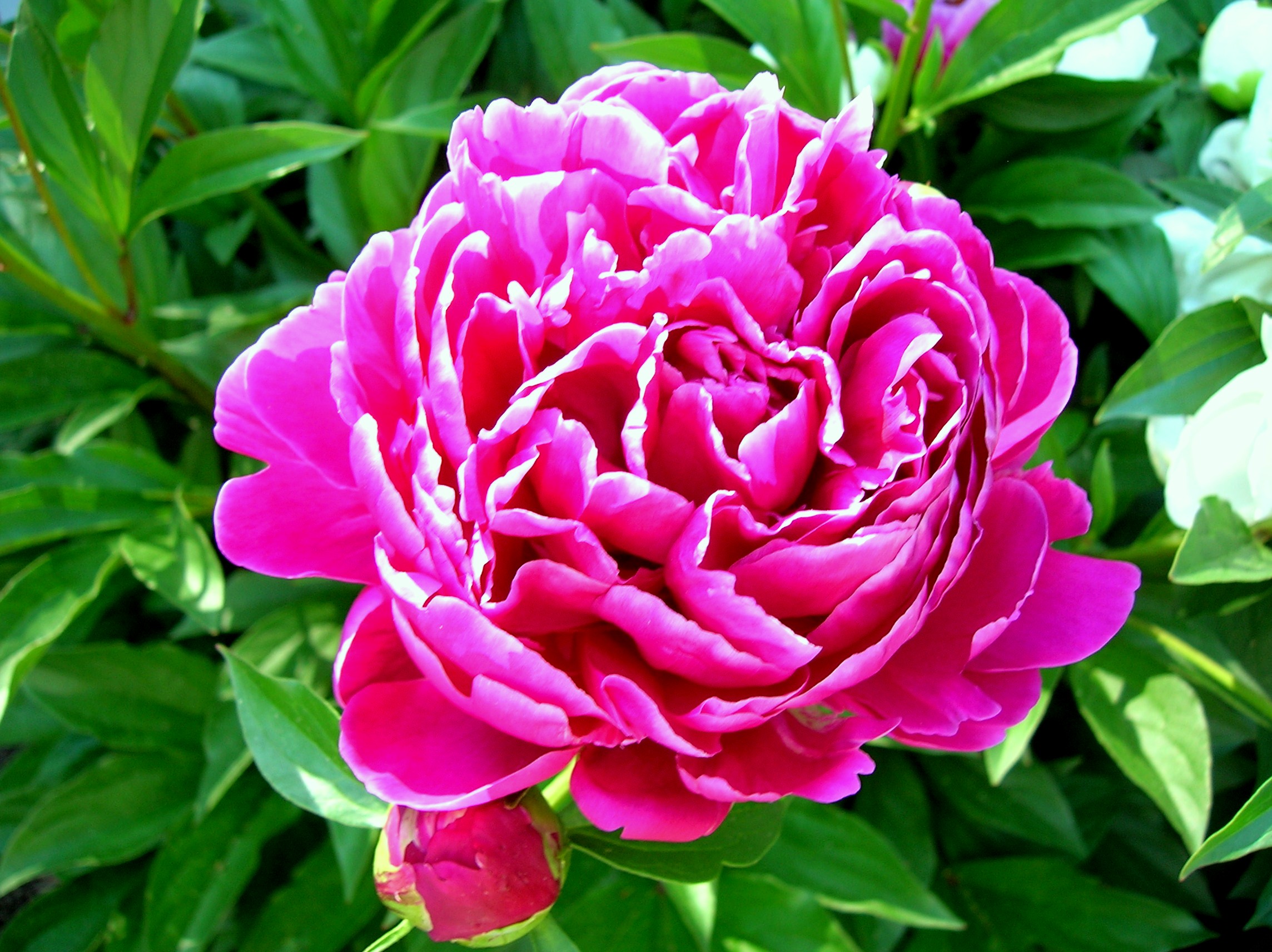
Summer Peony
© ElCapitano
(copyright information)
Uploaded: 03/22/10 8:49 PM GMT
Summer Peony
Views: 499
Dlds: 45
Status: active
Dlds: 45
Status: active
Gallery:
Photography->Flowers
peonies blooming in the garden.. only stay for a few short months
Comments
Post a Comment - Subscribe to this discussion
.537les

03/25/10 1:46 PM GMT
The color is the strength here. The lighting seems a bit over exposed in the top area and the focus on the petal seems a little soft. The green foliage makes an excellent background.
0∈
[?]
some pictures say a thousand words... others speak silently to the soul
I like "Pane and Sorrow", "Jersey Shore" and especially "Down Came the Rain" much better. The colors are a little too brilliant (maybe because I have a slight headache) for my tastes. And just between the two of us, I never cared for peonies. The photo is cropped very well. If you change the peony to another flower and tone down the colors a bit, I'd like the photo even more.
0∈
[?]
Big, bold, brash and beautiful! Great capture and focus, the flower head appears in 3D!
0∈
[?]
Life is Sweet!
(Terms & conditions apply)
thanks very much for the comments! i will definitely take the time to edit this one!
0∈
[?]