Caedes
Upload Images
Welcome guest
Log In or Register
User Stats
- 1 total users online
- 37 users active today
- 259269 total members
- +show users online
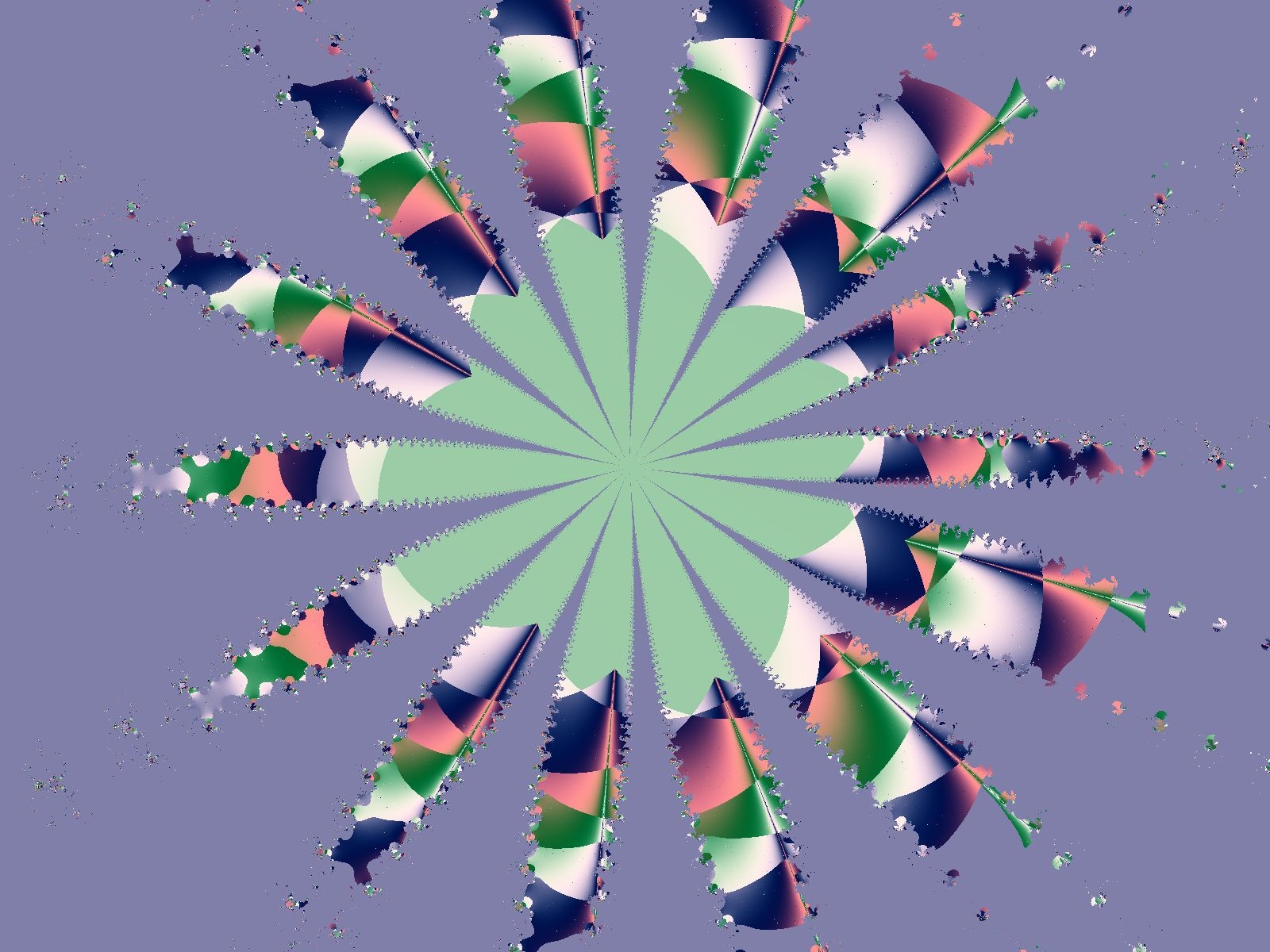
Fractal Burst (Coloured)
© Kinam
(copyright information)
Uploaded: 06/15/06 5:44 PM GMT
Fractal Burst (Coloured)
Views: 514
Dlds: 23
Status: active
Dlds: 23
Status: active
Gallery:
Abstract->Fractal
As requested by someone concerning my latest fractal...I remixed it with some colours. Hope you like ^^
Comments
Post a Comment - Subscribe to this discussion
.FutureResident

06/18/06 1:54 PM GMT
Awesome effect and colors... maybe if the circle wasn't clipped at the top? Cool overall image, thanks for sharing :)
0∈
[?]
Work hard, play harder.
The colors give it a more happy playful attitude. Reminds me of childhood, playing with my kaleidoscope :)
0∈
[?]
Colors show
After the moon
I should go
See you in June
I think this image is a little bit weak. It seems very basic and empty. The colors you used work nice together, but the composition needs a little work.
0∈
[?]
~Casa
This reminds me of Indian feathers....good color combination and I like the design. I wish it were all visible but that is just me :=) Thanks for sharing this with us :~)
0∈
[?]
~mimi~
well this was a re-work, and it was the best centering I could do with it ... fractals are kind of hard to re-position sometimes, and that was the case ... There were a coouple individuals that wanted to see the original one that I had done (was in black in white) with some colours.
I've been mighty busy lately so havn't been able to grind out anything lately.
I've been mighty busy lately so havn't been able to grind out anything lately.
0∈
[?]