Caedes
Upload Images
Welcome guest
Log In or Register
User Stats
- 0 total users online
- 42 users active today
- 259205 total members
- +show users online
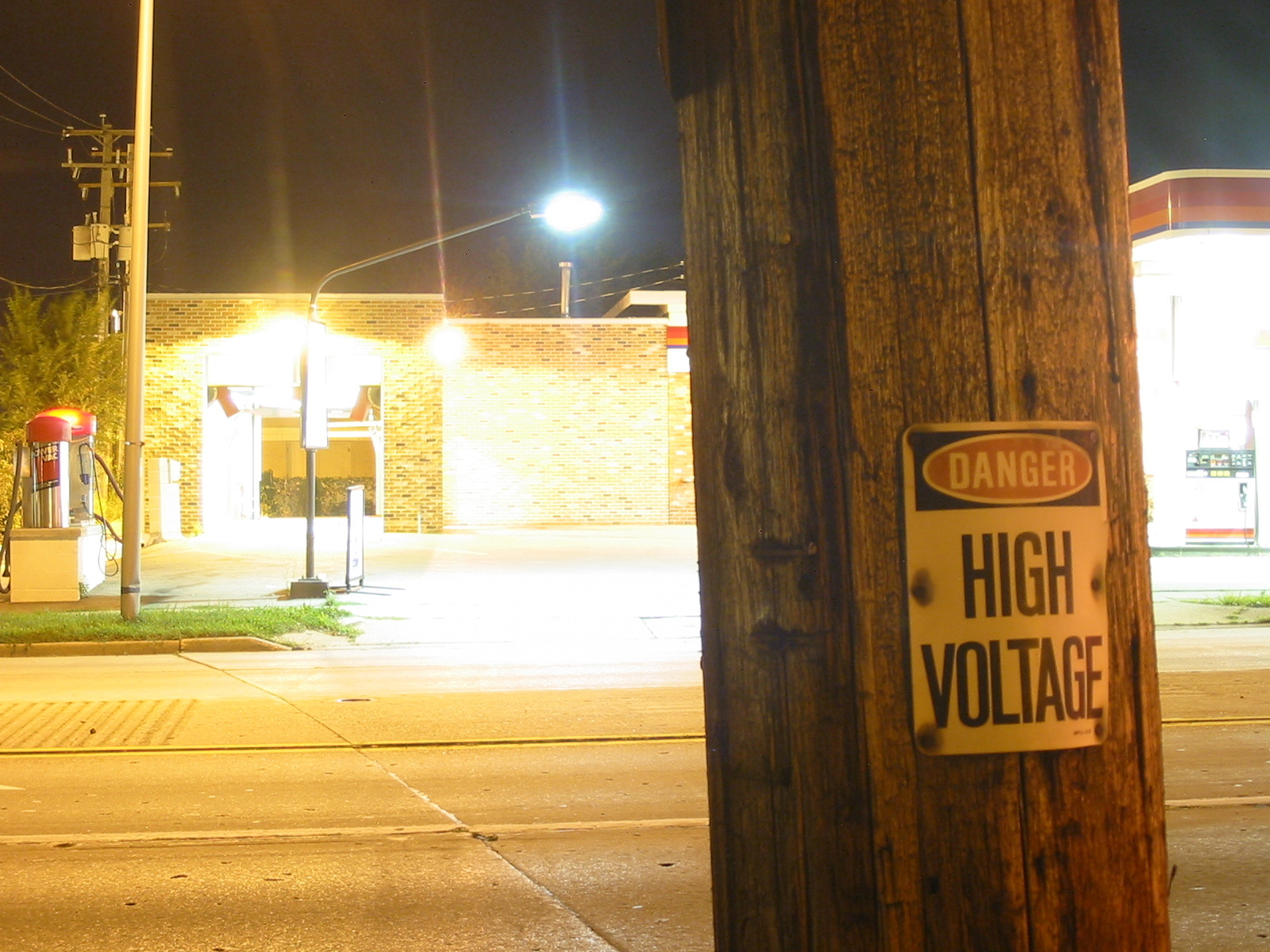
High Voltage
© KingIan
(copyright information)
Uploaded: 03/27/06 7:21 PM GMT
High Voltage
Views: 469
Dlds: 40
Status: active
Dlds: 40
Status: active
Gallery:
Photography->City
Well I've had people tell me that they don't like this picture, but I kinda do. What do you guys think? (I won't be offended if you don't like it, just be honest)
Comments
Post a Comment - Subscribe to this discussion
::snapshooter87

03/28/06 2:59 AM GMT
I like it too, Ian. I think I would have cropped it right into the pole, on thr right side, as that very bright area is distracting, and you can't keep your eyes from bouncing back and forth, between the two bright areas, and down to just above the light. It would also help keep the horizontal format. Try it and see what you think.
0∈
[?]
Staring....I kinda see the sign { High Voltage} linking in with the electrifying bright glares from the lights...and can see some appeal to it!
In a Stephen King kinda way...like his movie, Maximum Overload...?
In a Stephen King kinda way...like his movie, Maximum Overload...?
0∈
[?]
i'll be allright in a minute..just a bit stressed you might say...
I have to agree in kind with Snapshooter...crop to the pole then take away from the glare..focus on the main, which I think is the post!.........
0∈
[?]
I agree with madmaven. i think it's cool how the "high voltage" sign links in with the bright lights behind it. it makes for an interesting picture.
0∈
[?]