Caedes
Upload Images
Welcome guest
Log In or Register
User Stats
- 1 total users online
- 47 users active today
- 259297 total members
- +show users online
Blue/Green
© MeatMiracle
(copyright information)
Uploaded: 03/15/11 9:25 PM GMT
Blue/Green
Views: 487
Dlds: 33
Status: active
Dlds: 33
Status: active
Gallery:
photography->architecture
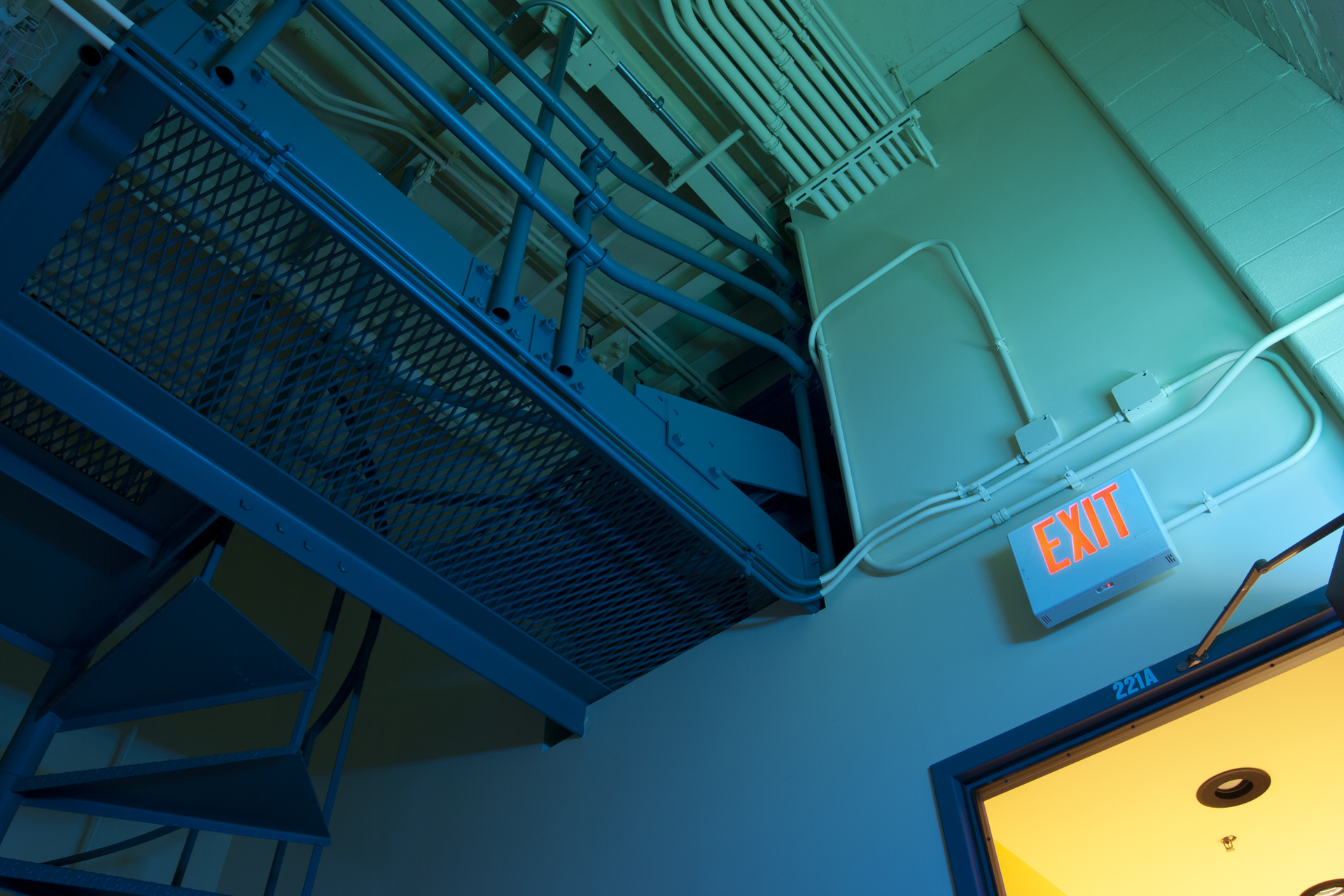
One of the many photos I took for an assignment for my photography class. This was taken backstage at my school's auditorium.
Comments
Post a Comment - Subscribe to this discussionFor a strange angle in a strange environment this shot works exceedingly well. I love the composition and unique colors.
0∈
[?]
People aren't going to remember the things you do. They're going to remember how you made people feel. Be kind, gracious, and appreciative.
Dan Winters - Photographer.
Caught my eye, in and amongst the new images. Good good composition. Unique image.
Caveats?
Suggestion, really. Play around with the hue and get that 'Exit' sign more 'red'.
(Minor caveat at best and nit picking on my part here.)
Annnnnd ... since I am here.. some reading material for you:
"Overview of Colour Management" ... courtesy of cambridgeincolour.com.
(/\ There are two more parts that follow from the above linked page, found at the bottom of the article. Namely; "Part 2: Color Spaces" and that of "Part 3: Color Space Conversion". Good good.. stuff.)
As I am not sure if the slight orange I am seeing in the Exit sign is due to my own monitor not being calibrated just so.
That said..
Nicely done.
And but of course, thank you for sharing this one with us. :o)