Caedes
Upload Images
Welcome guest
Log In or Register
User Stats
- 0 total users online
- 37 users active today
- 259228 total members
- +show users online
Nature's Portrait
© bfrank
(copyright information)
Uploaded: 08/29/06 11:55 PM GMT
Nature's Portrait
Views: 566
Dlds: 72
Status: active
Dlds: 72
Status: active
Gallery:
Photography->Flowers
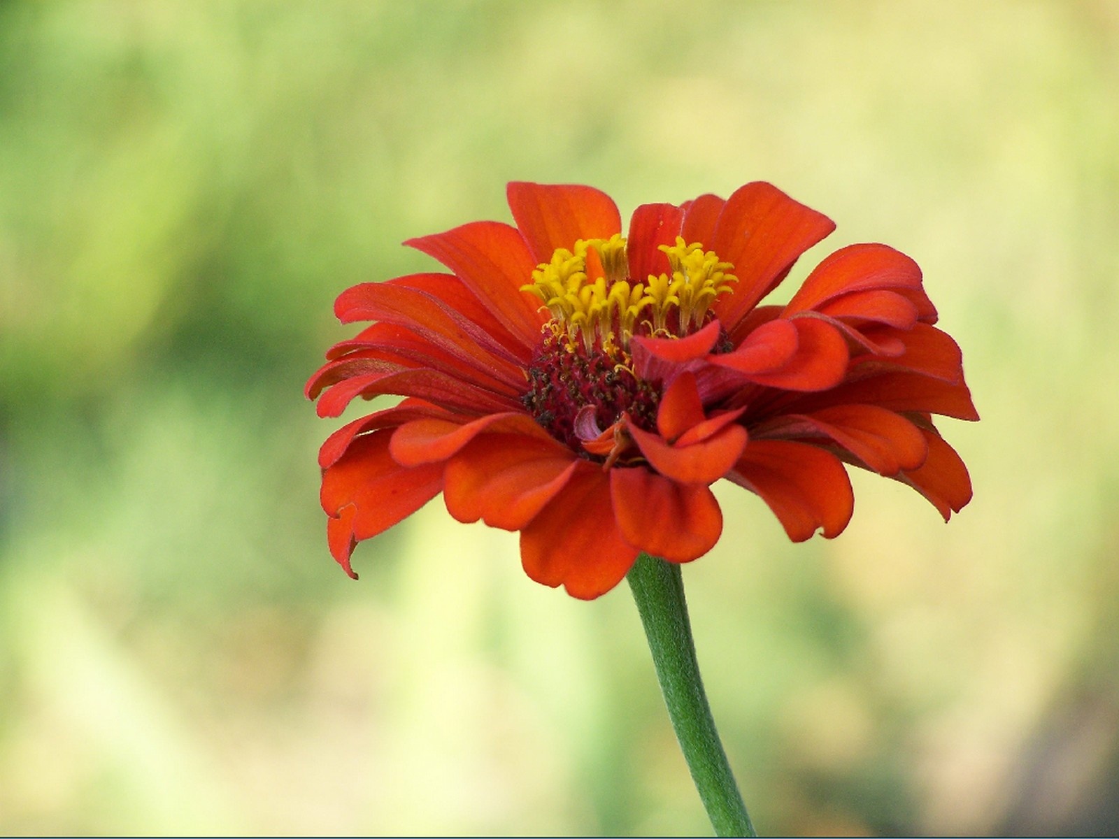
A simple pose but nature's designs are always a portrait in beauty.
Comments
Post a Comment - Subscribe to this discussion
::Scary

08/30/06 12:31 AM GMT
Yes Id say you brought out nothing but the best in this portrait.....flower is out and showing off her splendor....nice post.
0∈
[?]
A picture is worth a thousand words--that DOES NOT mean I will comment a thousand...It will be a Yay or Nay.
The positioning on this pic is very delicate...just off to the side the slightest degree, which only adds to the simple appeal. The color is beautiful and the background is a dreamy contrast to the vivid red. I like the petals and the way they are almost carelessly positioned in the flower themselves. It creates nice shadow effects for the viewer. If I have anything to say at all as a criticism it's that the very heart of the flower, the yellow, seems to be a bit blurred, but it could be because I'm on a different monitor than my own, and the colors on this one are darker than what I'm used to. This will make an effective desktop :)PJ
0∈
[?]
"Art comes to you proposing frankly to give nothing but the highest quality to your moments as they pass." Walter Pater
Frank, this is simple and very nice. I like the uneven look in the petals also - adds charm to it! I also enjoyed your other post, the bouquet of flowers for your lucky wife. Very nice! Well done! - Patty
0∈
[?]
It's all about perspective and perception.
Nicely done Frank. The bright rich color of the zinnia against the light blurred background is really effective. I also like the angle of the flower. anne :-)
0∈
[?]
Don't tell me it's good, tell me what is good about it. Don't tell me it stinks, tell me what I can do do improve it. Thank you for taking the time to tell me anything at all. Be blessed. anne :-)
Simple is sometimes best! This is really welll done.
0∈
[?]
Never rebuke while you�re still indignant about a fault committed�wait until the next day, or even longer. Then calmly, and with a purer intention, make your reprimand. You�ll gain more by a friendly word than by a three-hour quarrel.
-Josemaria Escriva
Lovely capture Frank with clarity and great colors. Wonderful post and thanks for sharing this beauty.
0∈
[?]
Seeds of contentment bring harvests of peace. Always glad to see visitors at My Gallery and thanks for your continued kind words and constant support. Anita
the flower is lovely and is set off well by the background. jen
0∈
[?]
not writing thank yous feels really strange. i guess i'll just say THANK YOU now!
Please Visit My Gallery
lovely shot Frank one more of these :)
0∈
[?]
You were my strength when I was weak
You were my voice when I couldn't speak
The soft background really brings out this beautiful flower..great job
0∈
[?]