Caedes
Upload Images
Welcome guest
Log In or Register
User Stats
- 0 total users online
- 49 users active today
- 259213 total members
- +show users online
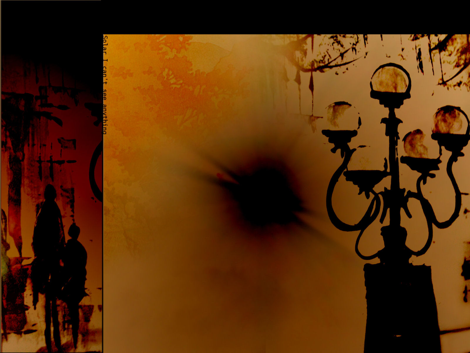
Solar
Comments
Post a Comment - Subscribe to this discussion
::soulspin

04/02/06 1:45 PM GMT
Oh gosh, I went and saw the other, but I like this much more! I love the colors and tones and the words...Is it about staring into the sun too long?
0∈
[?]
soulspin.
This time around I love the color hues... ;) Once again, I love what you did in the left border but don't think it worked out quite in the rest of the image. (I really love how the textures in the top of the light field turned out too.) It's the balance of the things like you say. For me this is a very important part of the image as you have noticed from my comments. This black "solar" (?) thing in the middle takes much attention from the rest of the elements in the image. I personally are very careful with strong visual elements in the dead center of an image.
That the lamp thing touches the right edge of the image and I'm afraid that detracts some from it's impact on the image. (This could be a matter of debate I think. I learnt from some comments made by experienced photographers, regarding photographic framing and composition that an object touching the edge of the image leads away attention from the whole, and for me this is true at large. But I'm very touchy on details. :P)
Ok, now you must be getting tired of my comments on petty details... I trust you know I'm not being critical for the sake of just "criticizing" (in the negative sense). I'm only doing it since I really like what you are doing. Keep developing your styles. You have great things going here. :)
A tip perhaps, I don't know how useful it would be. Use key elements of the image in a way that leads the eye around the image. (Edit: Perhaps not a good description... I usually call it to "create visual tension" if that is of any help. Perhaps I only made it worse. :p) Be aware of placing objects dead center. Keep them slightly off center or aim for the rule of thirds or other well known rules of how to compose images. (I don't know that many myself though. ^_^)
One last "good" advice though. Don't place too heavy weigh on what I, or anyone else tells you about your work. (I'm not suggesting you do, but anyway.) Let your own guides rule (or rules guide ^_^) your ways to create. Only take advice if you feel it's suiting your own way of thinking and creating. ;) And don't let anything, like "votes" or "ratings" or comments get you down.
Cheers for now. :)
0∈
[?]
Hello. Very nice pic. The solar part is so cool the color is so cool. Great work!
0∈
[?]
This is a very intriguing image! I love the colours, and IMHO, the balance is just fine!
0∈
[?]
To get a friend you have to be a friend!
I'm not sure why but I really like this image. I love the colours I think it makes a nice desktop wallpaper. It suits my mood today! :D
0∈
[?]