Caedes
Upload Images
Welcome guest
Log In or Register
User Stats
- 0 total users online
- 47 users active today
- 259261 total members
- +show users online
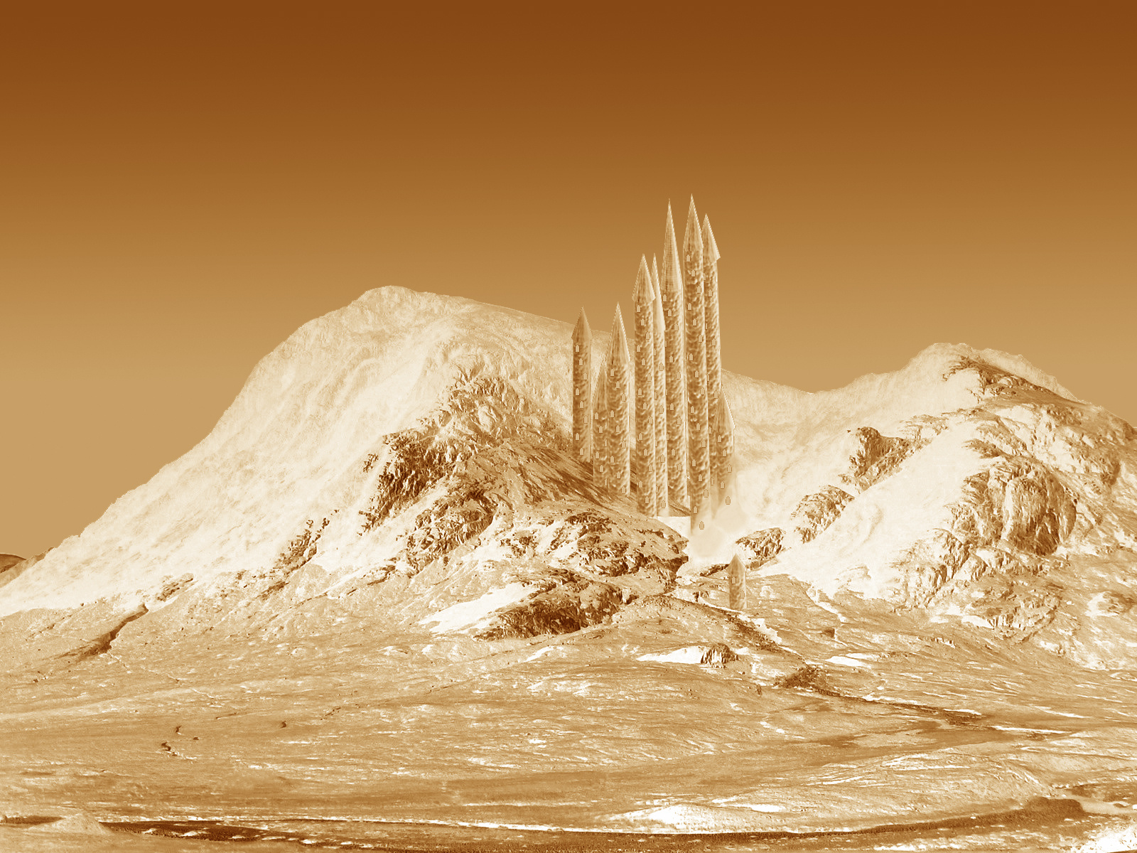
Crystal Ice Palace in Sepia - (from Cottage in Glencoe)
© jaecee666
(copyright information)
Uploaded: 02/04/06 2:12 AM GMT
Crystal Ice Palace in Sepia - (from Cottage in Glencoe)
Views: 3091
Dlds: 493
Status: active
Dlds: 493
Status: active
Gallery:
(Main) Contests->Fantasy Landscapes
Here is a sepia version of my Crystal Ice Palace. I hope you like it!!! Please vote and comment as always :D
Comments
Post a Comment - Subscribe to this discussion
.cgImagery

02/04/06 2:47 AM GMT
I really liked the original, the sepia does give this a different look, but imo, the original looks better :)
0∈
[?]
It's funny, in the sepia tones, your towers are clearer, more easily seen. But I'm afraid I have to agree with Andrew, I went back & looked at your other version & I really prefer the blue & white one. This one is interesting, I love how your churning out the ideas ! BTW, good luck in the contest !
0∈
[?]
Ask Not For Whom The Bell Tolls .......Let The Machine Get It ........
MY GALLERY
I like this one better Jemma :) It has more of a fantasy/sci-fi feel to it....excellent job and good luck!!
Moe
Science officer's station
Moe
Science officer's station
0∈
[?]
-"The needs of the many,outweigh the needs of the few or the one".-Spock
Great job Jemma! I like the sepia tones in this, very subtle, yet very effective. Good job!..=)
0∈
[?]