Caedes
Upload Images
Welcome guest
Log In or Register
User Stats
- 4 total users online
- 47 users active today
- 259191 total members
- +show users online
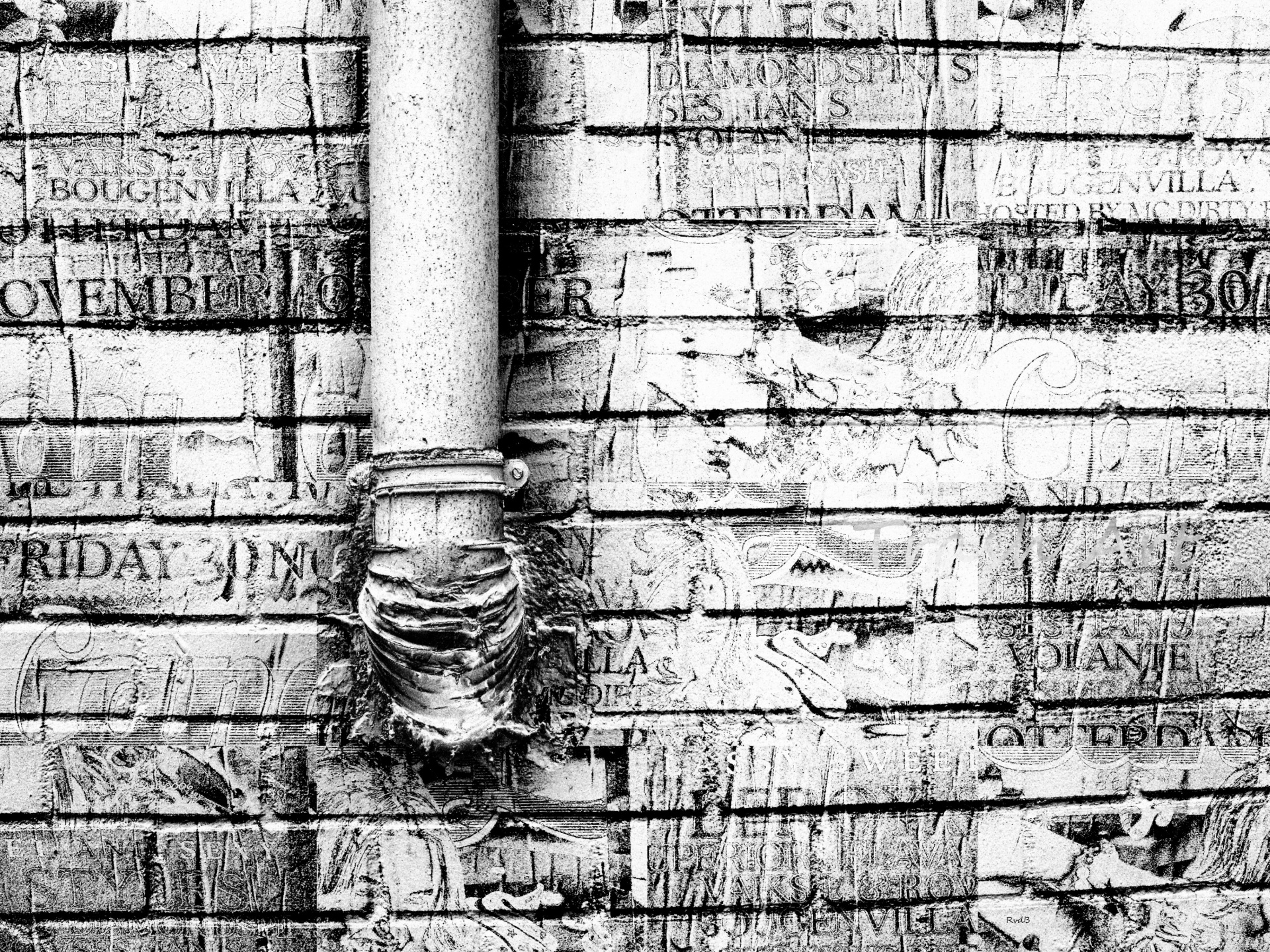
Trash Art 0006
© rvdb
(copyright information)
Uploaded: 12/01/12 4:34 PM GMT
Trash Art 0006
Views: 429
Dlds: 19
Status: active
Dlds: 19
Status: active
Gallery:
photography->manipulation
Trash Art are recycled pictures of photos I have taken in Rotterdam buildings, street art, flowers, trees and brickwork grinding and pounding them into what I call Trash Art.
Comments
Post a Comment - Subscribe to this discussion
.gizmo1

12/01/12 6:45 PM GMT
I always find you work fascinating and Intruding ,this as lovely textures and lines,plus nice layout too.
7∈
[?]
Wonderful lines and textures, Rob.
Excellent work.
Excellent work.
6∈
[?]
I would travel only by horse, if I had the choice. ~ Linda McCartney ~
Well this is a switch from the others in your series...to be honest, Rob, I prefer the darker toned ones...somehow the darker tones just seem more appropriate to me with the idea of trash art but it's always good to mix things up and I do like the texture and all the hidden and revealed words here.
10∈
[?]
Change is inevitable, except from vending machines.
Another unparalleled work of Trash Art Rob! The textures of the lettering are just as intense as that of the bricks and the elbow on the pipe. I think the tones you chose work perfectly to give the layered images just the right amount of clarity while still leaving a bit of mystery as to exactly what they had once been or what was 'torn' from which. I'm really enjoying your new avant-garde style and I can tell that you are too!
13∈
[?]
Spend a few minutes each day being grateful for what you have and who you have to share it with.
The message here seems to be that everything is going down the drain. Which might explained the washed out and worn nature of the image. Great work.
8∈
[?]
Criticism, like rain, should be gentle enough to nourish a man's growth without destroying his roots. — Frank A. Clark