Caedes
Upload Images
Welcome guest
Log In or Register
User Stats
- 0 total users online
- 53 users active today
- 262596 total members
- +show users online
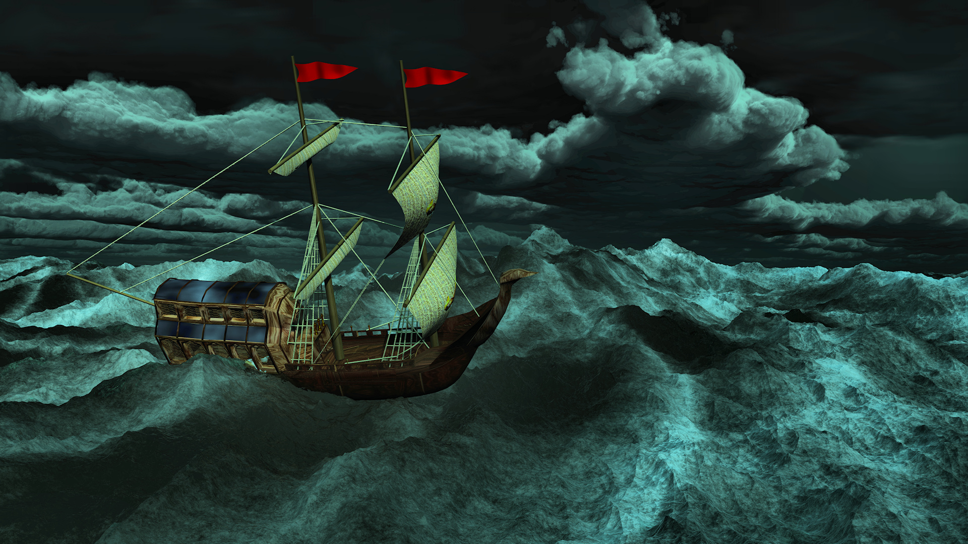
A Wild and Stormy Sea
© Akeraios
(copyright information)
Uploaded: 11/19/11 2:15 AM GMT
A Wild and Stormy Sea
Views: 1938
Dlds: 95
Status: active
Dlds: 95
Status: active
Gallery:
computer->landscape
Created in Vue Esprit+, with color adjustment and tone mapping in Paint Shop Pro.
Prints of this and other works are available at RedBubble and Zazzle.
Comments
Post a Comment - Subscribe to this discussion
::lmass

11/19/11 2:21 AM GMT
Well now, this is quite a powerful production, creative and well-composed. Nice work.
0∈
[?]
------Lynne M.
Nicely done, Hannah.
Been coming back to your image here a few times and would echo the above comments.
Caveats?
The two red flags.
It seems apparent that you definitely took into consideration the direction of the prevailing wind(s). However, they appear to my eyes as slightly incongruous to your image overall.. on the notes of size and colour.
I might have been tempted to simply leave them out of the visually evocative equation.
Or, at the bare minimum.. reduce their relative size.
Still, and foremost ... a well composed piece and again, very nice work.
1∈
[?]
I can't claim credit for the flag direction, since they were part of the model - though I did know not to turn them around! The original had another design on them. I tried several colors and pictures before finally settling on just red - the piece was looking too monochromatic and I liked the flash of color. Oh well ...
0∈
[?]
"In the beginning, there was nothing. Then God said, "Let there be light". And there was still nothing but you could see it." -- Groucho Marx
Strong piece, very good. I like the brooding greens!
PS Found this when going through the Tag section. :-)
PPS You could add this image to the tag 'greenwater' too. :-)
PS Found this when going through the Tag section. :-)
PPS You could add this image to the tag 'greenwater' too. :-)
0∈
[?]