Caedes
Upload Images
Welcome guest
Log In or Register
User Stats
- 1 total users online
- 40 users active today
- 259297 total members
- +show users online
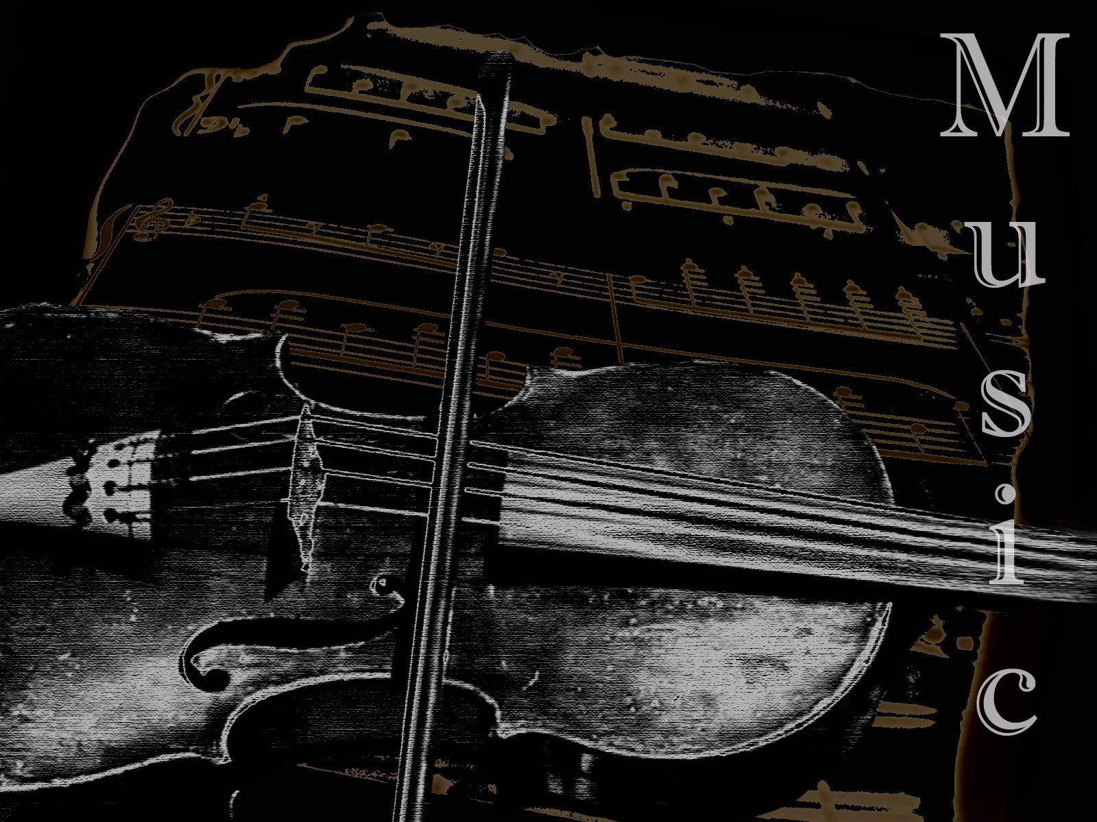
Music of old
© Danita
(copyright information)
Uploaded: 11/10/05 6:17 PM GMT
Music of old
Views: 587
Dlds: 130
Status: active
Dlds: 130
Status: active
Gallery:
Photography->Manipulation
Is the type to much? I've been staring at it so long I can't tell anymore, My dad plays the fiddle and was playing when I took this, so tell me what you think!
Comments
Post a Comment - Subscribe to this discussion
::laurengary

11/10/05 6:41 PM GMT
Can you soften the type at all ? I like the violin & the music & I like the type too, at least the concept, but the rest of your image is so soft that it kind of jumps at you. So if you could soften it, or make it smaller, something more in keeping with your image. Other than that, it's really nice & I like this.
0∈
[?]
I don't want to achieve immortality through my work...
I want to achieve it by not dying ( Woody Allen )
You have a wondeful poster type image here. Very classic indeed.
0∈
[?]
Art is the perception of the creator. Meaning is the perception of the viewer. acceptance is the perception of society.
I agree with Clayton above. I think you've got a nice classic poster style with this one. The bold font doesn't disturb me at all. I think you needed something to balance out the composition and I like your placement of it. I also like the muted different tone of the notes. If I played the fiddle, I would welcome this piece of art into my music room. I hope your dad is impressed with it as well.
0∈
[?]
When you get the choice to sit it out or dance, I hope you dance...
Leanne Womack
This would make a great large scale poster for libraries or music rooms at a school or anywhere else. I like the way you've treated his instrument as well, the glow of the wood really makes it rich and shows the age and loving wear
0∈
[?]
I like the text actually as it compliments the old style you have to the image. Good job.
0∈
[?]