Caedes

  Destruction  

Click here to view at full resolution.
Uploaded: 03/17/06 11:38 PM GMT
Destruction
Views: 9293
Dlds: 4703
Status: active

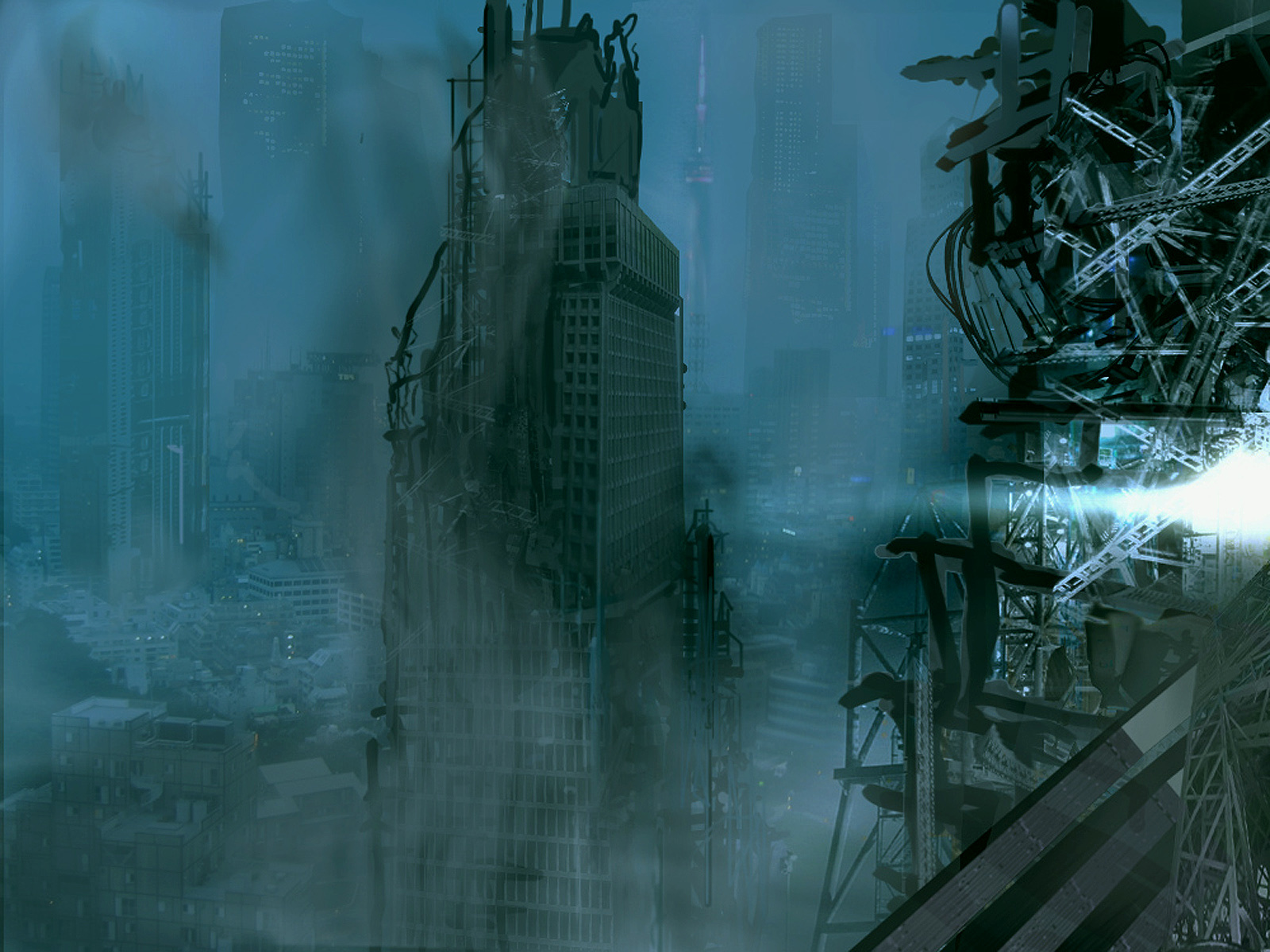
I've been studying digital matte painting and concept design. My mentor is Christian Lorenz Scheurer via his Gnomon Workshop training DVDs. After the third lession I painted this concept design for a bombed out city. this is what the Art Director might show the director before doing a full-on matte painting. It has almost 50 layers (some of which have been merged along the way.) I used just about every tool in Photoshop to achieve the effects. I know it's not ready for Hollywood, but I've enjoyed learning the techniques which are now to be perfected. Some of the buildings are painted using selections which then have gradients applied, the lights are grabbed from different photos I started with a very mundane shot of a Tokyo suburb which served to set up perspective and provided a few of the background buildings and some starting light values. I incorporated all sorts of bizare images from bridge structures, to a cruse ship, Air craft carrier bridge, motor cycle parts and pieces of a robot, and a gantry from the space center. Hopefully you'll get a kick out of it.

Comments

Post a Comment  -  Subscribe to this discussion
+Samatar
03/17/06 11:42 PM GMT
Pretty cool. Perhaps a little dark but very convincing.
0∈ [?]
-Everyone is entitled to my opinion-
::philcUK
03/18/06 1:09 AM GMT
i think there is an excellent level of detail here Peter - If i had to pick up on anything it would be that the primary colouration and lighting is a little uniform in the mid to background areas but I guess thats a minor point to make in an otherwise fine piece.
0∈ [?]
"Some mornings, it's just not worth chewing through the leather straps"
*caedes
03/18/06 1:33 AM GMT
I really like the mood that you've set up here. One problem though is that the use of transparency ruins the effect of realism (most notably in the foreground right). There are quite a few parts which are partially transparent and just scream (Photoshop!) to me. =) Too bad the obvious fix (more detailed masking) requires quite a bit more work.
0∈ [?]
-caedes
.cgImagery
03/18/06 2:09 AM GMT
holy crap this is frikin cool lol :D only problem is the right side that caedes mentioned...other than that perfect :D +fav
0∈ [?]
&prismmagic
03/18/06 3:14 AM GMT
Outsatnding Peter. A effort worth the wait. very realistics in form and depth. You trully are on the way to be the master. If this is not the completed image , I will be sitting on eage waiting for the completion. excellent.
0∈ [?]
Art is the perception of the creator. Meaning is the perception of the viewer. acceptance is the perception of society.
.PrettyFae
03/18/06 10:59 AM GMT
Oh...my...god! Peter, that's amazing!
Love the colour, love the mood...love all the effects, too!
I don't really mind the transprency...it kinda adds to the effect if you ask me ^_^
Great work! I hope to see more like this! :]

Fae x
0∈ [?]
...join me in the world of Vampire Freaks for all your goth and rock needs! >:[...
&DigitalFX
03/19/06 12:00 AM GMT
Yup, you're all right...especially PrettFae of the Fae folk. <grin> Caedes, you caught me...lazyboy. and Phil you're right too. originally I had a very large difference between the foreground and midground tones and between the midground and background as well, but as I added smoke and crap that difference disappeared. In some ways I like it better the old way and in some ways I like the new. BTW the transparency on the right comes from painting in the bg and then compositing images using a luminance transfer mode which let's things underneath show throught at times. But this mode is so handy for imposing the shading from photos on your painting efforts. Love you all...especially you little Fae.
-P-
0∈ [?]
-DFX -
::assfarst
03/19/06 12:46 AM GMT
I wish the image was a bit sharper. Not as indicative of its title as it might have been. Lacks the nightmarish quality it might have had. I've seen some images of Dresden and Stalingrad after the war - now that's destruction.
0∈ [?]
.moodflow
03/21/06 6:16 AM GMT
Nice matte! I had seen your image somewhere else a while back and loved it.
0∈ [?]
.Digital_Angel
03/22/06 2:17 AM GMT
I love the concept behind this Peter. I do agree with the critiques on the detail, but I also think where there's a lack of detail, there's almost a painting-like quality. Keep working on it - I'll be keeping an eye out for more of your stuff =)
0∈ [?]
*~Faith is the substance of things hoped for and the evidence of things not seen~*
Bobski
03/25/06 1:48 PM GMT
Fantastic .....love the overall effect ....very emotive and moody, love this kind of "futureshock" type imagery ...keep up your excellent work
0∈ [?]
::stuffnstuff
03/28/06 7:43 PM GMT
It looks pretty close to Hollywood-ready if you ask me. A sweep of the whole city with this quality would be breath-taking to watch. I especially like how you turned a cruise ship into a bombed-out skyscraper. Classy. :-)

I don't know if you saw War of the Worlds or not, but one common element throughout the movie was the presense of multi-colored strobes. In just about every scene, there are bright flashes of varying hues coming from just about everywhere, all randomized in the timing. I can just imagine the director saying "Alright, we are ready to start filming the scene. Cue the strobes." and all of a sudden the dismal set turns into something scary and yet dreamlike. To make a long story short, somebody somewhere liked the idea of using different colors in different places to give depth. I imagine that you could work wonders along the same idea. Keep working...no shame in becoming an artistic hermit...
0∈ [?]
... File not found. Should I fake it? (Y/N) - Southern DOS: Y'all reckon? (Yep/Nope) - Smash forehead on keyboard to continue... - All computers wait at the same speed. - Enter any 11-digit prime number to continue...
.CapitainCoconut
06/03/06 7:13 PM GMT
Pretty neat.
A very destructive picture...
Keep it up!
10/10
0∈ [?]
.cockney
06/04/07 9:23 PM GMT
good work. keep it up!
but I wouldn't like to have it on my desktop - I like everything positive and praising life :))
0∈ [?]
.DTwiegraphics
10/31/07 3:04 PM GMT
AWESOME!
0∈ [?]
Famous last words: "Hey, watch this!"........ My Gallery
crazycrowson
02/02/08 12:08 AM GMT
you have a great eye for detail. it is a bit dark for my tastes, but i noted how you left things in the background intact. to me that says that there is hope to move and build--human nature defined.
0∈ [?]
"more men fail for lack of purpose than lack of talent." billy sunday
.BloodyRoots
08/30/08 12:48 AM GMT
Great Urban Nightmare lol.10/10.Just love it.Keep up the good work dude.YOU ROCK
0∈ [?]
.Jhihmoac
08/06/09 6:41 PM GMT
Saw this in the "Featureds"...Cool art...a bit scary, if ya ask me...Yiiii...faved it, though...
0∈ [?]
"There's inspiration...then art...then inspiration again..." - Don't know who said that... Visit Jhihmoac's Gallery
.Chase18
08/06/09 6:49 PM GMT
very cool except the building in the backround and the ground (likethe smaller building) have no damage on them...it wouldve made it more convincing but otherwise great picture
0∈ [?]

Leave a comment (registration required):

Subject: