Caedes
Upload Images
Welcome guest
Log In or Register
User Stats
- 1 total users online
- 31 users active today
- 259282 total members
- +show users online
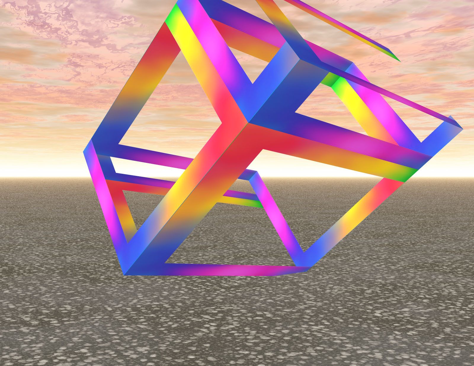
Psycube
© Donna68
(copyright information)
Uploaded: 10/25/06 8:09 AM GMT
Psycube
Views: 485
Dlds: 75
Status: active
Dlds: 75
Status: active
Gallery:
Computer->3D
Bryce 6. Thanks for looking :-)
Comments
Post a Comment - Subscribe to this discussion
Vanguard

10/28/06 3:27 AM GMT
I like the effect in the sky. The cube looks unfinished though. Cheers!
0∈
[?]
Interesting cube...I like the color gradients. Did you mean to include the "Escher Effect" on the bottom interior crossbar? If so, then I wish you had emphasized it more with shadows, etc. I love the colors and the "unfinishedness" of the cube...but I wish you had selected a different sky and maybe a different ground. To me, the "primary colors" mood of the cube doesn't fit with the "dreamscape" colors of the sky. I hope you do more of this sort of thing, since I think you're on to something good here!
0∈
[?]
"The lyf so short, the craft so long to lerne,
Thassay so hard, so sharp the conquering..."
Chaucer
Thank you, I chose the sky as it did not dull the colours of the cube but you are right a different one could have made it look better. Yes the effect was intentional and I think you are right shadows would have made it a little better. I will be trying more of these in the future. :-)
0∈
[?]
My site
http://donnanut.tripod.com/index.htm