Caedes
Upload Images
Welcome guest
Log In or Register
User Stats
- 0 total users online
- 49 users active today
- 262478 total members
- +show users online
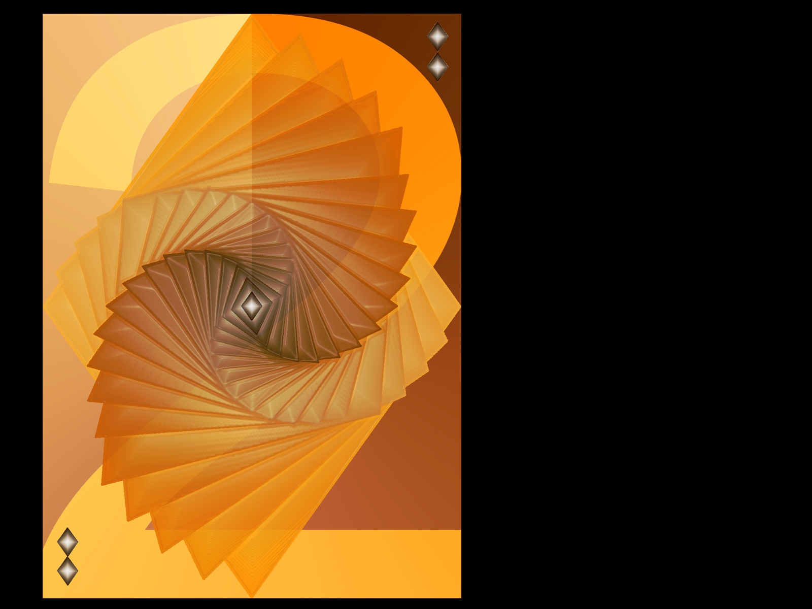
Two of Diamonds
© Samatar
(copyright information)
Uploaded: 11/20/05 8:06 AM GMT
Two of Diamonds
Views: 5165
Dlds: 900
Status: active
Dlds: 900
Status: active
Gallery:
(Main) Caedes->Cards
My first attempt at my chosen card.
More images and prints available in my Deviant art and Redbubble galleries. DO NOT DISTRIBUTE THIS IMAGE.
Comments
Post a Comment - Subscribe to this discussionUnique work here- I like how it takes a bit to see the two. I think I like the blue, but with this texture and clarity. :)
0∈
[?]
Have to agree with Kodo - This has the edgier (sp?) quality of the two.
(lol - I think that was a pun? groan.)
(lol - I think that was a pun? groan.)
0∈
[?]
Never give up. Obstacles don't have to stop you. If you run into a wall, don't turn around and give up. Figure out how to climb it, go through it, or work around it. ~~ Michael Jordan
I like the blue but this one appears much cleaner. The design is top-notch in my opinion. I like that large two background. It doesn't interfere, but it adds depth and definition.
0∈
[?]
When you get the choice to sit it out or dance, I hope you dance...
Leanne Womack
I prefer this color over the cooler blue you've shown....while the more conventional of the cards to date, it also has a very subtle edginess that's attractive. Sorry to repeat mum's word, but it's apropos
0∈
[?]
Two wrongs don't make a right,
three lefts do.
Hard to decide if I like the blue one better, or this one. Hmmmmmm. I think I like this one a little better. Can't define why (because blue is my favorite color) - but this one has a better 'gut feel' to it.
0∈
[?]
well its all been said i think! very stylish image! clean and crisp! im not sure what colour i would go with! i prefer the image here with the dark center! but i do like blue tones!
0∈
[?]
- 'Insert witty quip here'
oh, this one looks good too, & i hear what Grims saying, the texture looks better on this one. nice work :~)
0∈
[?]
Beware the anti-cinnamon stare!!!
I really like the color in this Sam. Very well choosen. And an exellent design to boot.
0∈
[?]
Art is the perception of the creator. Meaning is the perception of the viewer. acceptance is the perception of society.
I think i like this one better then the shades of blue... it jumps out more, has more of an edge...
0∈
[?]
Great work, awesome colour, i love it...i probably prefer the colouring of the blue, but i like the way the light is on the left and the dark on the right in this one, instead of the opposite on the blue...dunno if that makes much sense...either way, awesome, a 10/10 from me
0∈
[?]
.`ñ ♥.¡.ñÇ
¡.ñÇ¡.ñÇ´) ¡.ñ*´)
(¡.ñ♥Ç (¡.ñÇ♥αвsσlutєlч fαntαstÚc `ñ ♥.¡.ñÇ
¡.ñÇ¡.ñÇ´) ¡.ñ*´)
(¡.ñ♥Ç (¡.ñÇ♥
¡.ñÇ¡.ñÇ´) ¡.ñ*´)
(¡.ñ♥Ç (¡.ñÇ♥αвsσlutєlч fαntαstÚc `ñ ♥.¡.ñÇ
¡.ñÇ¡.ñÇ´) ¡.ñ*´)
(¡.ñ♥Ç (¡.ñÇ♥
0∈
[?]
αттιтυ∂єѕ αяє Âσитαgισυѕ. ιѕ уσυяѕ ωσятн ÂαтÂнιиg؟
Really, this is a very interesting and well thought out image. A definate 10 by me.
Learn from yesterday, live for today, hope for tomorrow. The important thing is not to stop questioning.
Albert Einstein