Caedes
Upload Images
Welcome guest
Log In or Register
User Stats
- 1 total users online
- 57 users active today
- 262595 total members
- +show users online
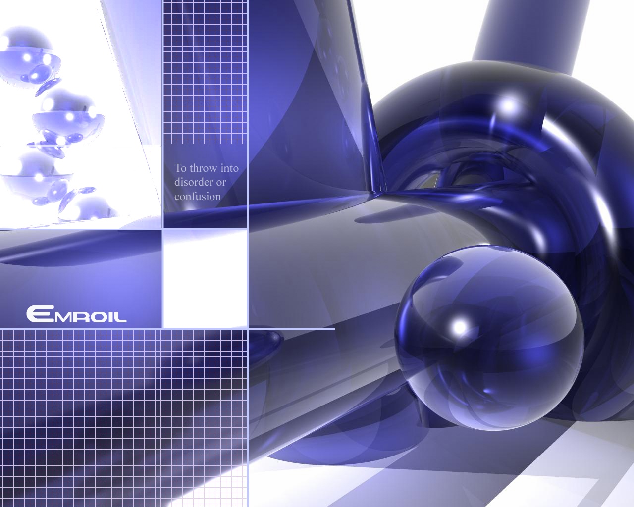
Embroil
© Shiznet
(copyright information)
Uploaded: 03/11/04 12:17 AM GMT
Embroil
Views: 11872
Dlds: 6047
Status: active
Dlds: 6047
Status: active
Gallery:
(Main) Computer->3D
somthing wrong in this pic but Tracy liked it so here it is.. lalalalalalalala zippo do da
Comments
Post a Comment - Subscribe to this discussion
411op

03/11/04 12:34 AM GMT
Very nice. Well, whatever's "wrong" with it, I can't tell. Very clear and crisp. Of course, I am partial to blue :)
0∈
[?]
Should i stop putting the def's on i need text but i dont know what to put so i put the def lol..... WHAT YOU THINK?
0∈
[?]
You only live once take it to the extreme -_-
�^�(�_�)�^� Shiznet �^�(�_�)�^�
nice pic, i think that you should find a better font for the definition there though. its very...regular, it seems out of place with the other text, which I think fits well in the pic.
0∈
[?]
The lines are reminiscent of fifties cars.
The definition of the word is a cool idea.
One question though, were you talking about the typo when you said there was something wrong in the pic?
The definition of the word is a cool idea.
One question though, were you talking about the typo when you said there was something wrong in the pic?
0∈
[?]
-- A one that is not cold is scarcely a one at all. - Strong Bad --
typo where is the typo
0∈
[?]
You only live once take it to the extreme -_-
�^�(�_�)�^� Shiznet �^�(�_�)�^�
I am EXTREMELY partial to digital artwork of this fashion. I would really like to know how you did this so I can give it a try.
0∈
[?]
The typo is: Look at the title of the photo on Caedes: "Embroil" vs. the word on the photo: "Emroil". One has a "b" and the other does not.
0∈
[?]
this is a very good image, y don't u just change the name to "Emroil" in edit under the c-index thingy.
0∈
[?]
what did the traffic light say to the car? Hey don't look, i'm changing!
I love this shot! I love how you take the render and edit it - very clean line and well balanced, great work!
0∈
[?]
A thing is not beautiful because it is beautiful...it is beautiful because one likes it. (Bruno Munari)
Very good work Shiznet. agree with JOHANNA
0∈
[?]
If it were any less reliable, it would be called a ford
a great wall Nick. great light and deep dark blue color^^ good job
0∈
[?]
This is neat, I am currently working on my bryce skills, you may have a fair competitor! =P
0∈
[?]
The only species that is cruel just for fun is the human.
It looks like some sort of off-gravity psychadelic water. I like it.
0∈
[?]
if the word was spelled right it'd definitely be a 10/10, as it is I gave it a 9/10 and put it in my favorites. I agree with oliveim about the font of the definition being out of place. if the spelling was fixed and maybe even the definition font changed I'll give it a 10 and put it up on my desktop for sure.
ps: for what it's worth....this is the first time I've taken the time to post a comment for anything on this site before (in fact, I rarely post any messages on sites--and I'm online a lot), so your work has definitely caught my attention. you'll find more comments from me on a couple of your other works as well. thanks for sharing your work!
ps: for what it's worth....this is the first time I've taken the time to post a comment for anything on this site before (in fact, I rarely post any messages on sites--and I'm online a lot), so your work has definitely caught my attention. you'll find more comments from me on a couple of your other works as well. thanks for sharing your work!
0∈
[?]
I could copy and paste what vajynos said, but what would be the point in that? In any case, I agree wholeheartedly.
Any chance we'll see another version with a few changes?
Any chance we'll see another version with a few changes?
0∈
[?]
SWEEET Render very very well done and professional. I agree with Embroil Awesome. The featured image is well deserved.
0∈
[?]
Whatever you imagine is reality.
i love your work, you do a great job, i've downloaded a lot from you. keep up the good work! :)
0∈
[?]
This background is awesome but the grid lines and words killed it for me again - can we get a clean version without that cluttler please? - otherwise it rocks
0∈
[?]
Oh My! or words to that effect. Almost appears back-lighted it's so clear and clean. A powerful image can carry the text.
0∈
[?]
It like it, the only thing I dont like is the font of the where it says to throw into confusion or something like that. Also if you use "crisp" (it's a little drop down menu I think) rather than normal font in photoshop it looks clear and...crisper. (hence the name). Good work, all of your stuff was fun to look at.
0∈
[?]
Me @ devART. <-- Modified/new images there...and of course you can join Timmy's Caedsian's Club.
Use this classic font demonstrator instead of the def: "Lorium Ipsum Dolor Sit Amet" We web developers use this all the time :)
0∈
[?]
1 + 1 = 2, 1.5 + 1.5 = Missing Operator - Command Prompt