Caedes
Upload Images
Welcome guest
Log In or Register
User Stats
- 0 total users online
- 51 users active today
- 262536 total members
- +show users online
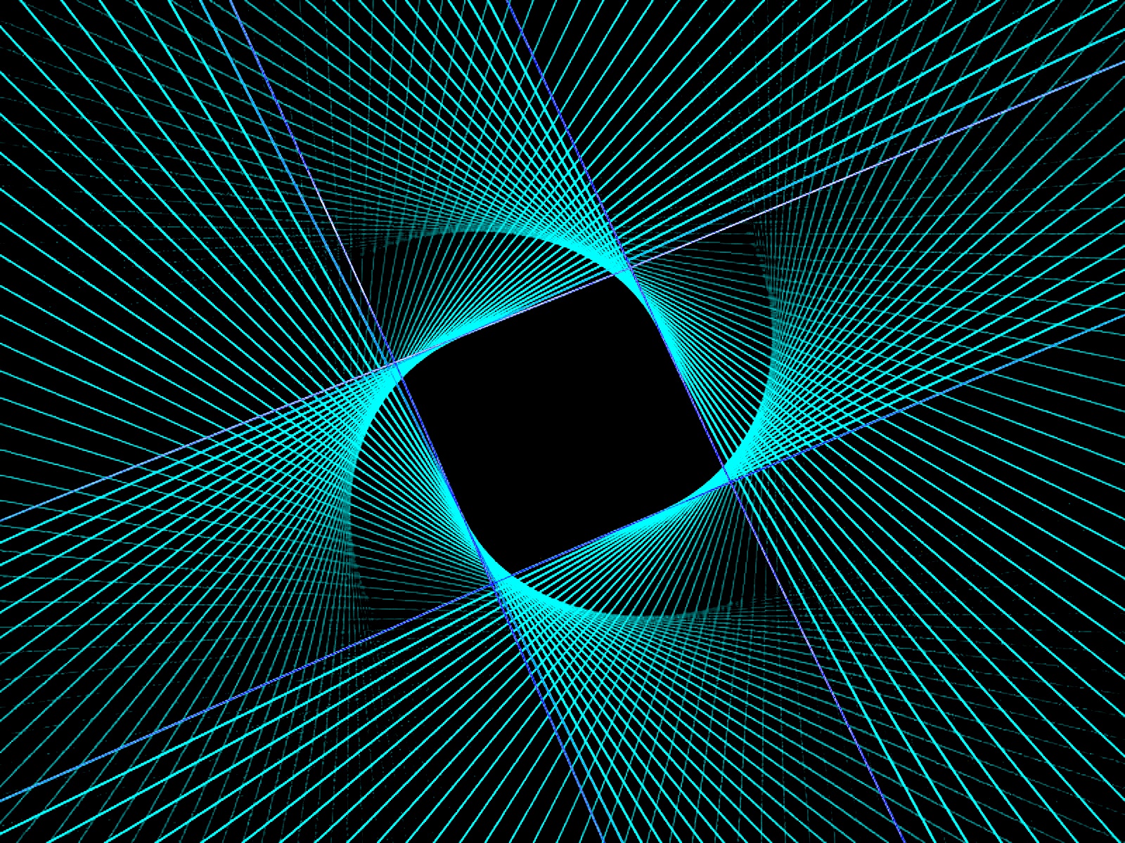
An Opening
© WENPEDER
(copyright information)
Uploaded: 07/29/05 7:00 AM GMT
An Opening
Views: 8560
Dlds: 4180
Status: active
Dlds: 4180
Status: active
Gallery:
(Main) abstract
Apophysis and Photoshop CS..
Comments
Post a Comment - Subscribe to this discussion
::lgmac

07/29/05 7:24 AM GMT
Very, very cool. Awesome colors and amazing design!!
0∈
[?]
"Little dreams cost the same as big dreams, so why not dream big"?
Interesting. Nice work.
0∈
[?]
'Study the past, if you would divine the future.' - Confucius
.................
Please vote on these: The Cage 2, Strange Dreams 2, Orb 3, Glowball Stylised
Gorgeous Wendy.. Love this one.. I hope you didn't burn your fingers doing all that weaving.. That flame looks rather hot..
0∈
[?]
One bead at a time..
Thanks all! Actually, Ann, this flame was red when I downloaded it from Apophysis and I've never worked with an image quite like this... It has something to do with its symmetry but, no matter what I did to make adjustments in brightness, contrast and shadowing in photoshop, very little changed except the brightness level. In addition, this flame looks great in every hue in the spectrum. I wrestled with what hue to upload, but really like this color. It looks very pretty in orange red too, however (as well as purple and lots of shades of blue, etc.) <G>
Wen
Wen
0∈
[?]
Top design, unique and intricate. Couldn't work out what program was used from the thumbnail, which always gets me interested:)
If I was in a picky mood though, which I am:), when viewed at max' resolution, the lines seem to lose their smoothness and get quite bumpy and squarey. What settings were used for rendering?
Cheers............
If I was in a picky mood though, which I am:), when viewed at max' resolution, the lines seem to lose their smoothness and get quite bumpy and squarey. What settings were used for rendering?
Cheers............
0∈
[?]
A strong design and pattern. Nice, Wendy. I'd like someday to find some software that will anti-alias the jaggies in the lines without blurring the whole thing.
0∈
[?]
Thanks, all! OK, Ben and Nathan...I decided to re-render this, cranking up the oversample and resolution settings. I've now got the settings at 1600X1200, resolution at 2000 (up from 1500) and oversample at 4 (up from 3). Let's see if that makes a difference. If it seems to, I'll pull this one and upload the "smoother" image. Thanks for the feedback. BTW, what settings do you use to render Apophysis images??
Wen
Wen
0∈
[?]
Beautiful! Reminds me of the black hole in space! If I don't quit looking at it, I might get sucked in! I really like the colors.
0∈
[?]
The colour the design..the whole darned thing is magnificient!!!!!!!!!!!!!!!!!!!!!!!!!! oh my!!
0∈
[?]
We like someone because.
We love someone although.
Just voted an 8 on this- very nice work. Like the symmetry and movement.
0∈
[?]
A fanatic is someone who can't change his mind and won't change the subject. -Churchill
37!!! People are crazy to vote so low! This looks great! I like the fine lines, not so complex look, very nice! 9 from me!
0∈
[?]
Nice flame! Well, this is very nice, the colors you've used for it stand out against the black, I do like the spiral square center, nice job Wendy!
0∈
[?]
Very sharp design and color choices here Wendy...I particularly like how the weaving all comes to a conclusion by circling around that solid black square...rather unique and striking...great work.:Pat.
0∈
[?]
If you want a place in the sun, prepare to put up with a few blisters.
wow does this image stand out. especially the color, it's what i first noticed. great job!
0∈
[?]
Reminds me of something I saw at the mall.
0∈
[?]
Thinking is hard when you don't know how to do it.