Caedes
Upload Images
Welcome guest
Log In or Register
User Stats
- 2 total users online
- 31 users active today
- 259197 total members
- +show users online
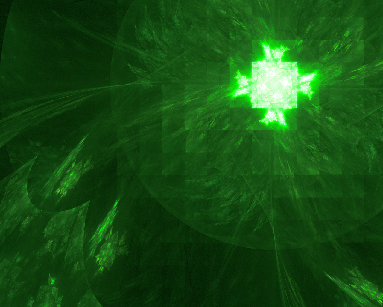
Zenergy
© austinnorris
(copyright information)
Uploaded: 10/11/09 11:58 PM GMT
Zenergy
Views: 509
Dlds: 40
Status: active
Dlds: 40
Status: active
Gallery:
Abstract->Fractal
Created with Apophysis 2.06 3D Hack;
Minor touch-up in GIMP 2.6.0.
All constructive criticism is welcome and highly appreciated!
Comments
Post a Comment - Subscribe to this discussion
artlvr

10/12/09 3:59 AM GMT
Sorry to say this, but it looks like a pixelated version of a drawn supernova explosion. However don't quit keep trying,you'll get better I'm sure of that!
0∈
[?]
Wow... Wonderful first post! I really like the square elements and sense of movement! Personally, I think the white area is a bit too bright...but that's just me. A most apt title, and I love the cool greens! Keep 'em coming!
And welcome to Caedes :)
btw, there is a newer version of the 3D hack.
And welcome to Caedes :)
btw, there is a newer version of the 3D hack.
0∈
[?]
*Tea is a cup of life*
huh, I'd have never thought of putting such elements together, very fresh and unexpected. The green's a bit too aggressive on my monitor, but I think it's necessary for it to be so. And I like the highly detailed bright object opposing the smooth textures of the squares and the circle. Absolutely bizarre! :)
0∈
[?]
Hey Austin! I dont know about this image being pixelated! It is heck of a lot better than I could ever do! I think the green you used works great. A very good post!
Paul
Paul
0∈
[?]