Caedes
Upload Images
Welcome guest
Log In or Register
User Stats
- 4 total users online
- 44 users active today
- 259206 total members
- +show users online
DeadEnd
© btyk
(copyright information)
Uploaded: 06/28/09 7:50 AM GMT
DeadEnd
Views: 383
Dlds: 45
Status: active
Dlds: 45
Status: active
Gallery:
Photography->Macro
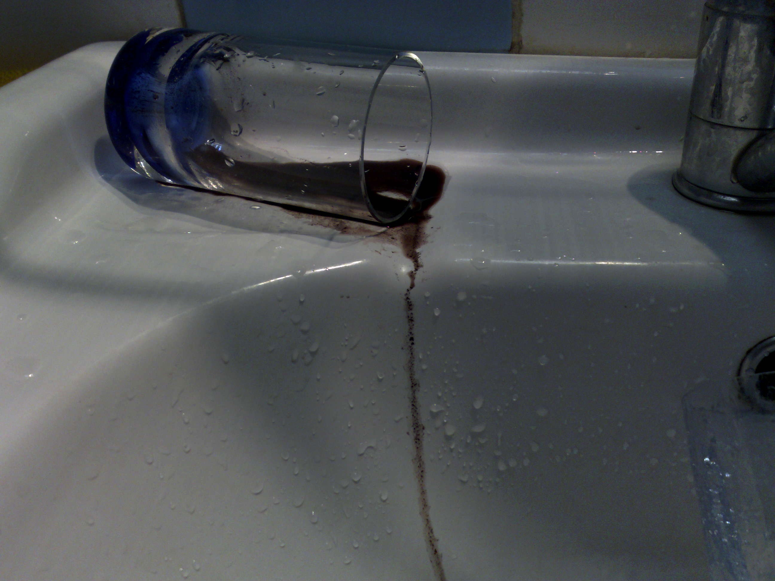
deadEndV1.
Comments
Post a Comment - Subscribe to this discussion
.coram9

06/30/09 5:45 AM GMT
A dark and rather disturbing picture, even though it is just a picture of a dirty drinks glass. Not sure the composition works here. The glass is too close to the top of the frame, and the cut off tap and glass draw my eye away, or perhaps at least help me avert my eyes from the main scene. Lighting and contrast works, but a better arrangement would have been better.
0∈
[?]
The idea is ok but there's extraneous detail that could be removed and provide more impact.
The taps are not needed and cropping out the background right through the glass doesn't affect the primary subject material. Nor does straightening the image.
Simpler is almost always more effective.
Just don't give up on experimentation. There'll always be distracting elements.
The taps are not needed and cropping out the background right through the glass doesn't affect the primary subject material. Nor does straightening the image.
Simpler is almost always more effective.
Just don't give up on experimentation. There'll always be distracting elements.
0∈
[?]
Please tell me thats not blood lol. Great pictue though =)
0∈
[?]
I am not interested in money. I just want to be wonderful. ~Marilyn Monroe