Caedes
Upload Images
Welcome guest
Log In or Register
User Stats
- 0 total users online
- 51 users active today
- 262536 total members
- +show users online
GRiMcaedes
© grimbug
(copyright information)
Uploaded: 03/17/04 3:53 AM GMT
GRiMcaedes
Views: 2818
Dlds: 397
Status: active
Dlds: 397
Status: active
Gallery:
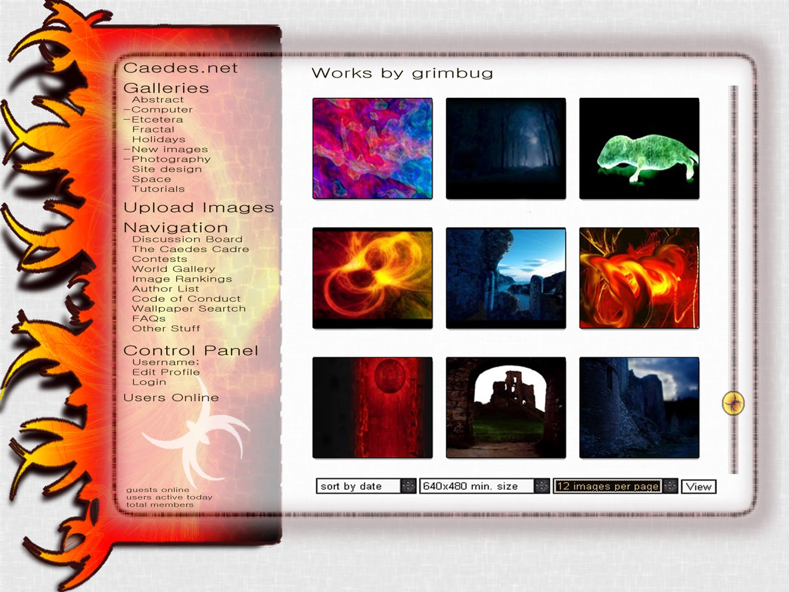
(Main) Contests->Site Design
Im stuck on doing these site designs now... will i ever make another desktop?? well if not, at least this is something a little bit more in keeping with my GRiM desktop style... as before, features an in-site scroll and floating menu :D
Comments
Post a Comment - Subscribe to this discussion
+camerahound

03/17/04 4:04 AM GMT
I like this, Grimy. More color and graphics, less text. Not too sure how or why you picked the photos on the home page, but excellent selection.
0∈
[?]
"Success is getting what you like. Happiness is liking what you get." -anonymous
lol.. i was doing the view from my user gallery :D
0∈
[?]
- "I dont have my own opinions, i just get them from the huge sums of cash i recieve"
Yeah very nice, only one minor thing is there are no names beneath the images, but i think this is one of the best!
0∈
[?]
O_o o_O
lol.. when i cut the images out i originaly had intended to ut he names back on in my font.. bnut i got caught up in finishing the image and forgot i meant to do it :D
0∈
[?]
- "I dont have my own opinions, i just get them from the huge sums of cash i recieve"
I think I like the left side spider arms even more than in the first design. The transparent nav bar works much better with this one. One thing that's unrelated to the design. The white are looks kinda "dirty" to me. Have you put something there or is it just my computer? (the computer here at work has a bad video card).
0∈
[?]
-caedes
i like the arms on this one even more too... its the old FiREBUG GRiMBUG.. just give me a box of matches and im a happy man :D... the white is ever so slightly textured.. its fairly subtle so on some systems it may well just look 'dirty' in fact the white isn't actually white the background is grey.. with the subtl;e textures being white... so infact it's not a 'dirty white' but a 'clean grey' ;)
0∈
[?]
- "I dont have my own opinions, i just get them from the huge sums of cash i recieve"
This is really nice but not as enticing as Stereotypical GRIMsite or Caedes Sphere. I like the general layout and I like your detailed touches.
0∈
[?]
Cheers!!!
I like this design, it looks sharp and clean to me. I think the red and orange graphic is too bold for many of the pictures on the site, but it definitely looks good with the ones you chose. Maybe something sublter or more neutral might work better.
0∈
[?]