Caedes
Upload Images
Welcome guest
Log In or Register
User Stats
- 1 total users online
- 77 users active today
- 262374 total members
- +show users online
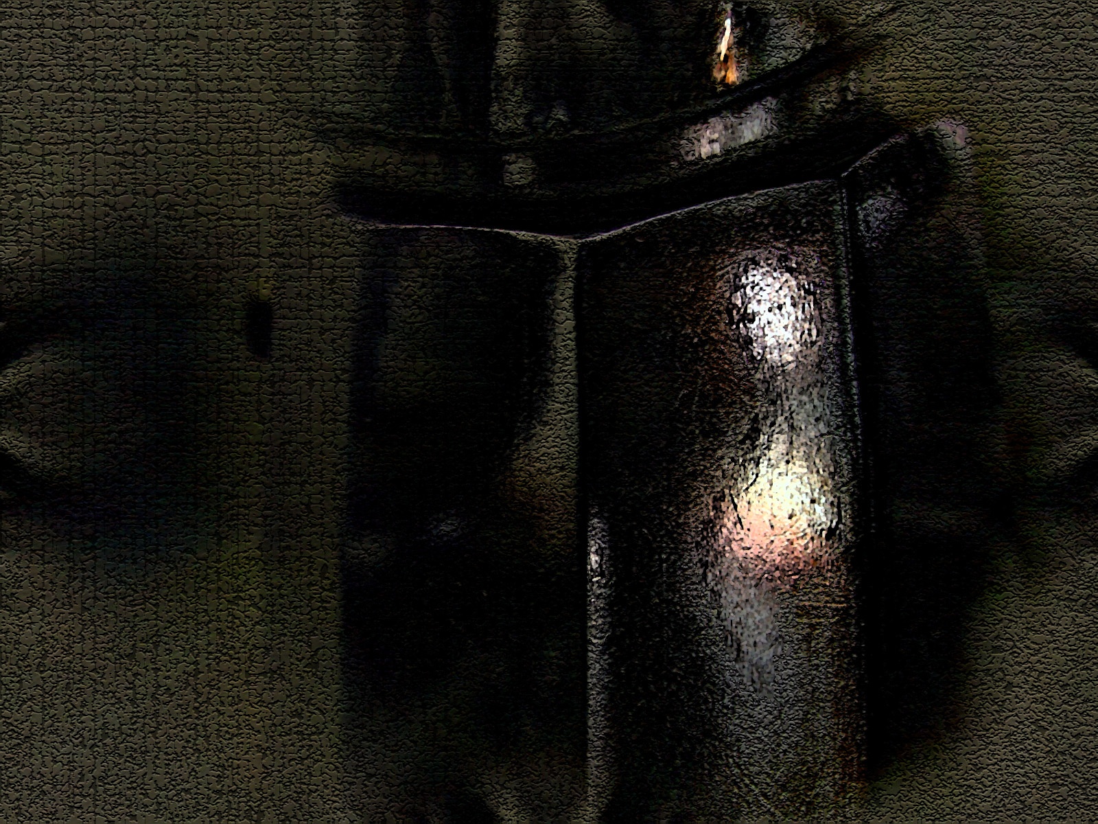
Ghost in a bottle
© kazadoodle
(copyright information)
Uploaded: 02/11/04 1:08 PM GMT
Ghost in a bottle
Views: 3765
Dlds: 824
Status: active
Dlds: 824
Status: active
Gallery:
(Main) Contests->Manip Contest
I used image A. I didn't think the manipulation waas that different until I put the two images together. I actually much prefer this work to my other entry. I really like the gothic feel of this.
Comments
Post a Comment - Subscribe to this discussion
::Marideath

02/11/04 2:13 PM GMT
Another good job, Kaza. Is it just my imagination or does that ghost have some really sad eyes? =)
0∈
[?]
Mary, the Caedes-addicted-BarGnat
Interesting approach. I like this feeling you created. I see more than one ghost though, but that's maybe just me. :)
0∈
[?]
thanks Mary, Joost and Klas. there could possibly be more than one ghost, I created this around midnight, so the possibility is there ;)
0∈
[?]
"The job of the artist is to deepen the mystery."
– Francis Bacon
i LOVE the image of the person in the reflection, both the shape and colors of it. the texture that you 1-clicked on top of everything wasn't needed so much, it takes away from it. when you put a texture on top of everything like that, it makes the image look really flat. bravo on the figure in the reflection tho its awesome.
0∈
[?]
http://www.kingsofchaos.com/recruit.php?uniqid=8v8xaap4
Please click that link once each 24 hours, it helps me win a game! Thx!
Thanks - I was going for an aged canvas sort of look too
0∈
[?]
"The job of the artist is to deepen the mystery."
– Francis Bacon
Wow, Karin, I thought maybe this was one of Philippe's dark works but it's not. You have done a beautiful piece of art here. It keeps me searching and asking. Wonderful use black and white with just a hint of color and the highlights are brilliant. I'm not a fan of abstract so for me to give an abstract 10 is saying something. anne :-)
0∈
[?]
Don't tell me it's good, tell me what is good about it. Don't tell me it stinks, tell me what I can do do improve it. Thank you for taking the time to tell me anything at all. Be blessed. anne :-)