Caedes
Upload Images
Welcome guest
Log In or Register
User Stats
- 0 total users online
- 37 users active today
- 259267 total members
- +show users online
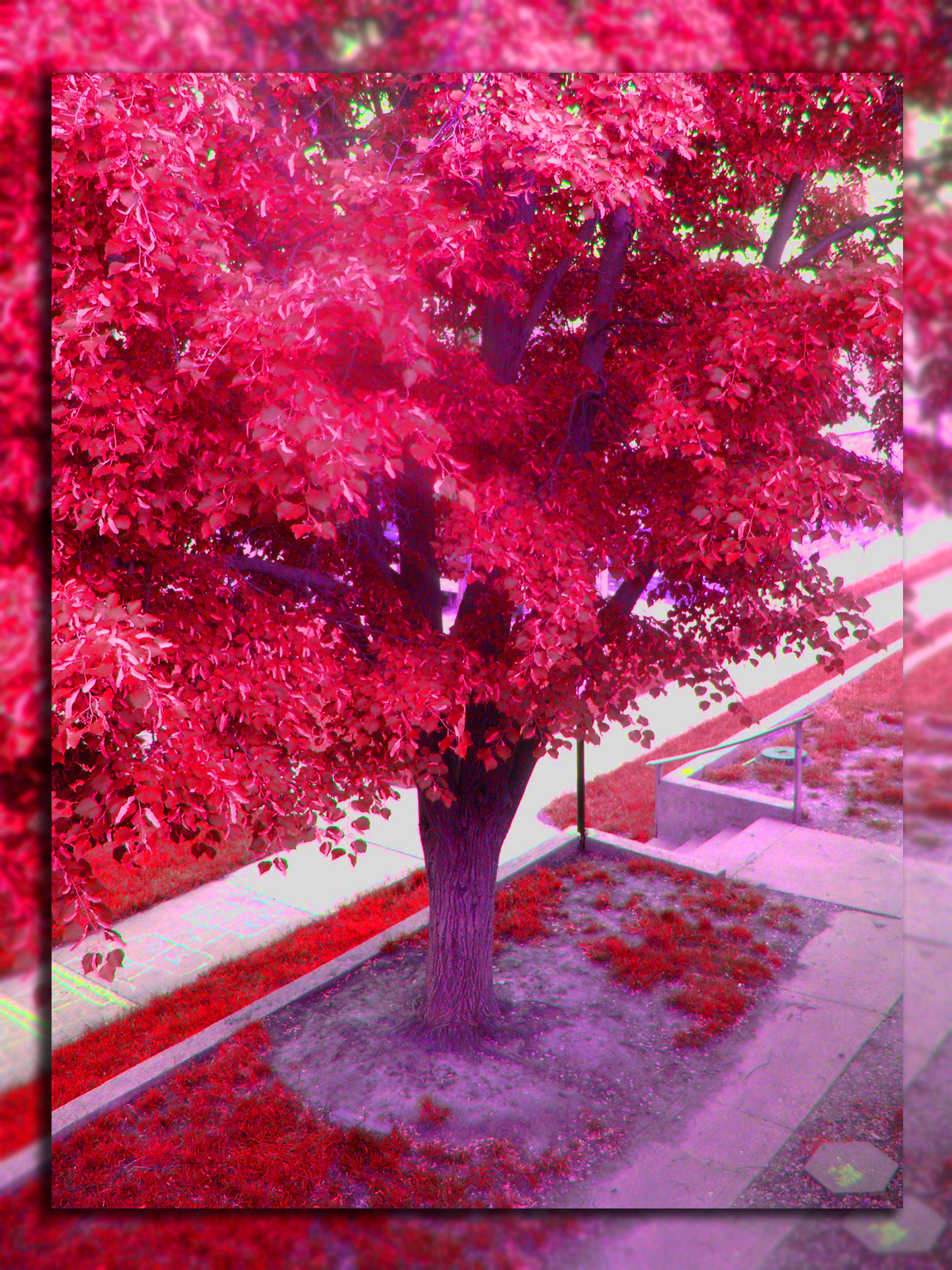
Red Trees
© lokigrl616
(copyright information)
Uploaded: 06/06/08 4:12 PM GMT
Red Trees
Views: 483
Dlds: 49
Status: active
Dlds: 49
Status: active
Gallery:
Photography->Manipulation
playing with photoshop again
Comments
Post a Comment - Subscribe to this discussionWow Saima
Its Red
Its Crazy
But its Lovely to look at
Excellent
Its Red
Its Crazy
But its Lovely to look at
Excellent
0∈
[?]
Uhhh...no!! Sorry!! It's interesting to some degree, but, the over-saturation leaves little to be desired!! Keep'em coming as we always wanna see more!!
0∈
[?]
A NOTE TO ALL MY FRIENDS: I WILL BE COMMENTING LESS ON PEOPLE IN MY �FRIENDS� LIST SO AS TO MAKE TIME FOR VIEWING ALL �NEW IMAGES� AND ENCOURAGING OTHER PEOPLE OF WHOM I MAY NOT KNOW OR ARE NEW TO THE SITE. I WILL STILL VIEW EVERY IMAGE OF MY FRIENDS AND STILL COMMENT ON SOME IF I CAN GIVE A GOOD CRITIQUE OR MENTION WHAT I LIKE OR FEEL IS REALLY WORKIN� WELL IN THE IMAGE. AS FAR AS MY IMAGES IF YOU HAVE A COMMENT ON HOW I CAN IMPROVE AN IMAGE I REALLY WANT TO HEAR ABOUT THAT SO AS TO LEARN AND BETTER MYSELF.
First, I really ... really like your composition. The perspective is good and you captured some great leading lines within. The angular lines of the sidewalk work particularly well in my mind.
Colourations and Caveats. In my humble opinion, had you been able to tame the pink and fluorescent green that creeps in in the cracks of the sidewalk ... or, in other words, there is a 'save' possible here (hope you don't mind me being bold with my words) ... this could work.
Perhaps, too much of a good thing? Is the moral to your Photoshop experimental story presented to us here?
Be curious to see the original with an understated border/framing treatment. And that may just be personal preferences. The proportions of drop shadow in relation to the overall size, again, in my humble opinion, overwhelms your photo/image somewhat.
Just some thoughts.
Took a tour of your galleries and this one indeed jumped out at me. The composition, as mentioned, is great. Had the thought that a B & W presentation might be interesting to try as well.
Allll that said ... a revisit would be definitely be in order. If you wish to keep some of the original elements, take a look at Selective Colour adjustments.
Here is a tutorial that covers that subject in Photoshop. A bit indepth, however, screenshots accompany the explanations. I am sure you can work your way through it.
And another tutorial on Selective Colour adjustment addressing the basic functions. Both are good. :o)
I'll wait here to see your results, while you perform your editing magic ...
*nibbles on an apple*
:oP
Just kidding, of course. However, give this one a makeover. I think the base image is strong and deserving of one. As is, good experiment. Nothing wrong with pushing the envelope at times. :o)
0∈
[?]
"Think what a better world it would be if we all, the whole world, had cookies and milk about three o'clock every afternoon and then lay down on our blankets for a nap." - Robert Fulghum
Oh WOW, hun!!! That looks awsome! Looks like a shot out of The Outer Realm.
0∈
[?]
Nice manipulation!