Caedes
Upload Images
Welcome guest
Log In or Register
User Stats
- 1 total users online
- 58 users active today
- 262595 total members
- +show users online
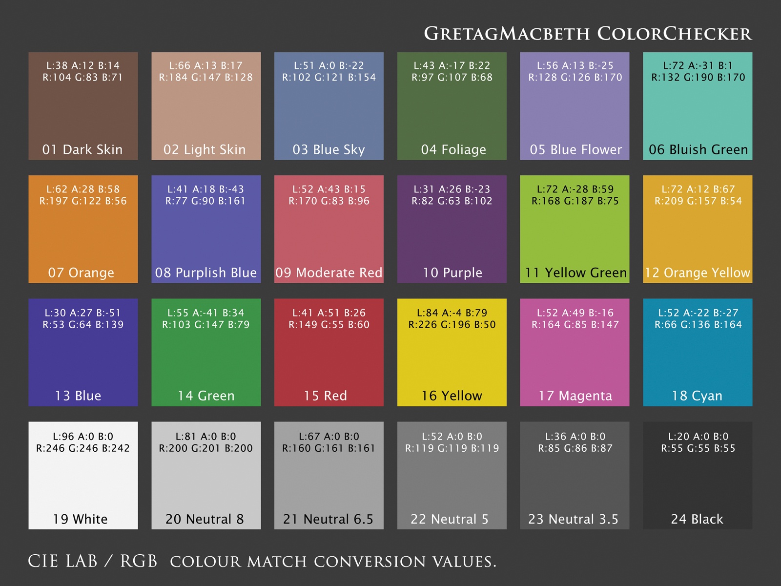
GretagMacbeth Calibration Chart
© philcUK
(copyright information)
Uploaded: 01/05/06 4:13 PM GMT
GretagMacbeth Calibration Chart
Views: 6267
Dlds: 1921
Status: active
Dlds: 1921
Status: active
Gallery:
(Main) Tutorials
A GretagMacbeth colour checker chart recreated digitally to help you calibrate your monitors and colour output.
Comments
Post a Comment - Subscribe to this discussion
::philcUK

01/05/06 4:22 PM GMT
I created this chart originally in LAB colour mode as that is the most accurate colour table for print and then added the closet RGB values as well. Obviously, print colour is a lot less saturated than screen colours but by tweaking your screen and calculating your colour values in LAB you can achieve quite accurate colour renditions of even the most vibrant colours including Pantone specials. Before uploading this, it was profile converted to sRGB, which should give the best representation on screen. If you’d like to test the match between your screen and printer accuracy, you could print this out in RGB and also try printing it in LAB colour space if your printer supports that and compare the differences between the two.
0∈
[?]
"Some mornings, it's just not worth chewing through the leather straps"
I'll certainly give it a go. I'm forever looking for ways to improve the calibration of my monitor without forking out for it:) Thanks very much.
Cheers...........
Cheers...........
0∈
[?]
Thanks Phil...saved to my h/d...great idea.:Pat.
0∈
[?]
The new year is full of time. As the seconds tick away, will you be tossing time out the window, or will you make every minute count?
Thanks for all your hard work on this Phil. I am goign to try it. I will PM you if I get stuck :))
Thanks :~)
Thanks :~)
0∈
[?]
~ Mimi~
if the fact that the RGB conversion has caused any problems - let me know and I will make a hi res version available in its original LAB colour space on a server somewhere for any of you to download.
cheers.
cheers.
0∈
[?]
"Some mornings, it's just not worth chewing through the leather straps"
Thanks Phil, I’ve been looking for one of these.
0∈
[?]
There are three colours, Ten digits and seven notes, its what we do with them that’s important.
Ruth Ross
I have dual monitors, i still can't figure this out. Can someone walk me through it? One is a ViewSonic and the other is a Dell.
0∈
[?]