Caedes
Upload Images
Welcome guest
Log In or Register
User Stats
- 0 total users online
- 37 users active today
- 259202 total members
- +show users online
taketwo revised
© playnow
(copyright information)
Uploaded: 11/19/05 11:34 PM GMT
taketwo revised
Views: 422
Dlds: 42
Status: active
Dlds: 42
Status: active
Gallery:
Abstract->Fractal
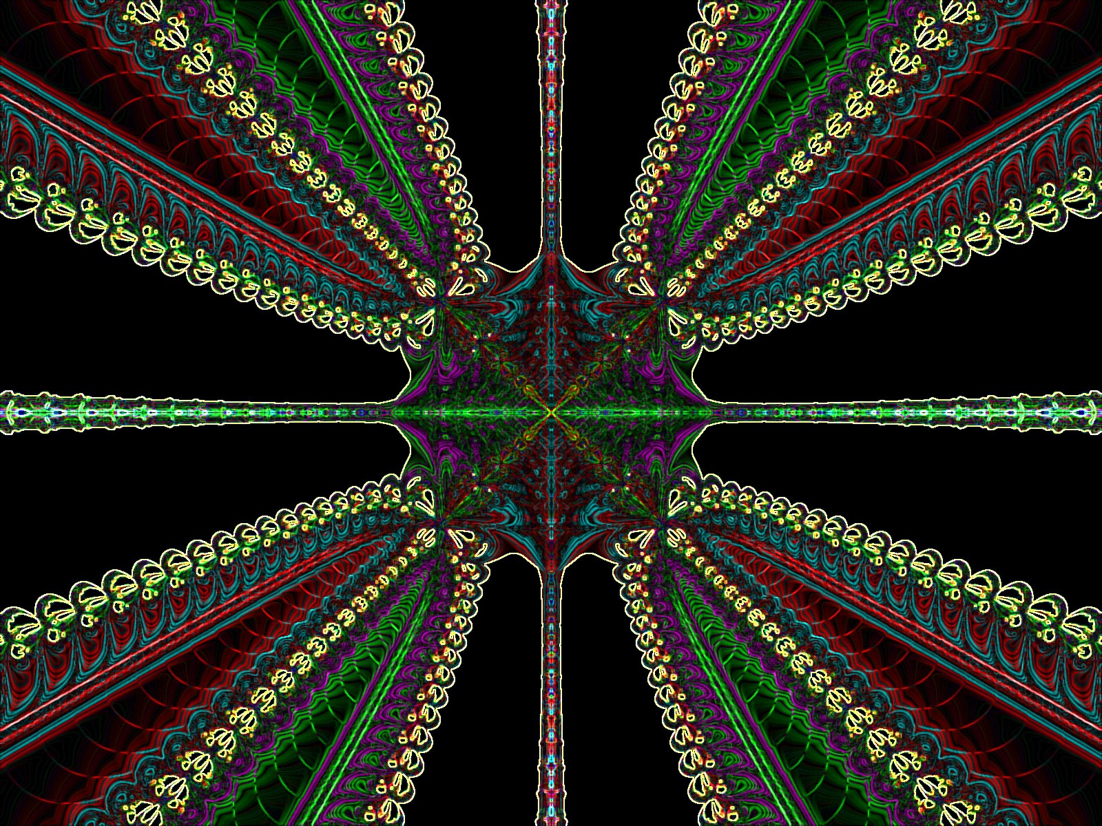
This is a revised edition of my last upload, taketwo. Per the suggestions of several members, I have removed the plastic wrap , and fooled around with some photoshop filters plus a little color enhancement. Thanks for the helpful advice and I hope you like this better...Please let me know what you think. l Looks best full screen!Thanks!!!
Comments
Post a Comment - Subscribe to this discussion
::laurengary

11/20/05 1:06 AM GMT
You're right, it does look better full screen. The detail in the center shows up. I looked at both your images & I think I like this one better, I like the jewel tone colors you used. Nice job !
0∈
[?]
Two wrongs don't make a right,
three lefts do.
That's better, I sort of miss the soft color pallette of the first edition but I like these jewel tones as well. I like the highlighted 'pearl' edges too.
0∈
[?]
Wow great work Gary.. it looks like crochetted thread good colours and nice fractal work... well done
0∈
[?]
"I cannot change the direction of the wind, but I can adjust my sails to always reach my destination" / Jimmy Dean
Beautiful work! I really love the colors and design, quite awesome!
0∈
[?]
In this is love: not that we loved God, but that He loved us and sent His Son to be the atoning sacrifice for our sins. 1 John 4:10