Caedes
Upload Images
Welcome guest
Log In or Register
User Stats
- 3 total users online
- 44 users active today
- 259223 total members
- +show users online
Misery
© xyccoc
(copyright information)
Uploaded: 01/21/06 10:55 PM GMT
Misery
Views: 2324
Dlds: 499
Status: active
Dlds: 499
Status: active
Gallery:
Computer->3D
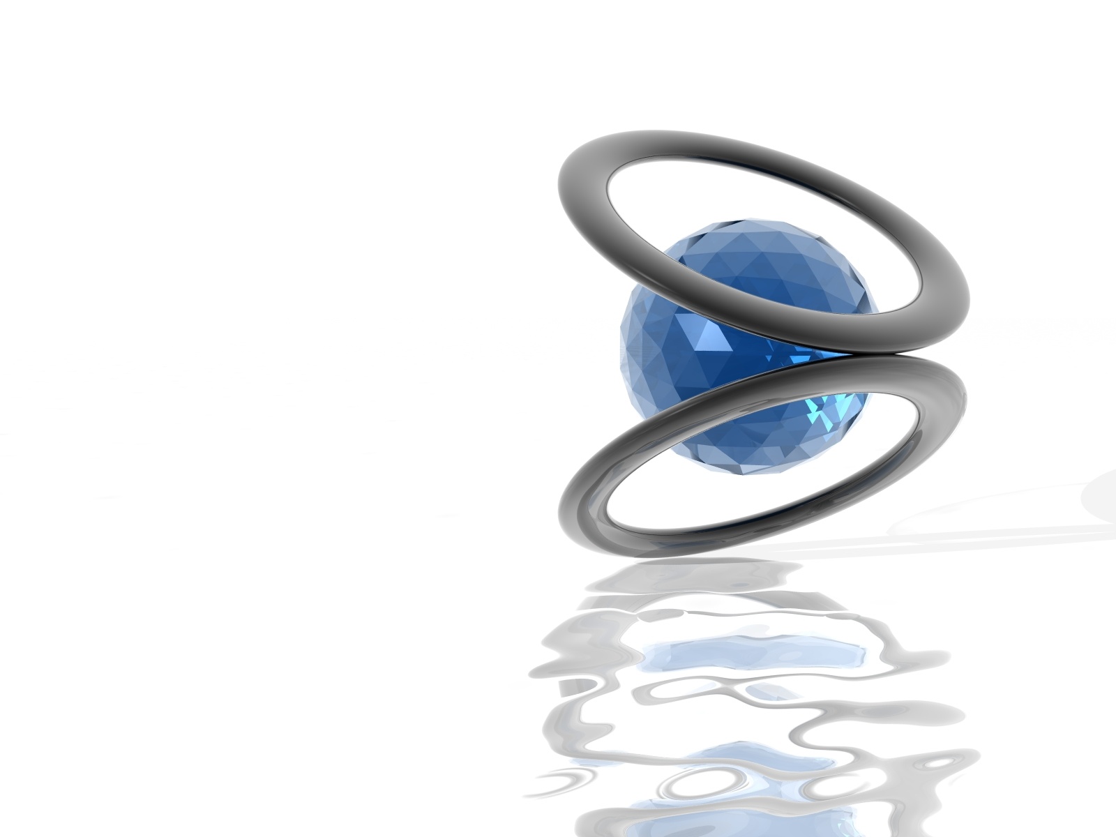
My first image in Bryce in a long while. Its a very simple image, but I like it. I know some of you wont like the starkness of the white background, but Im not sure what direction to take this image. Comments and suggestions are more than welcome.
Dj
Comments
Post a Comment - Subscribe to this discussionThat's nice work. The white works well. I like the jewel cut ball.
0∈
[?]
'Study the past, if you would divine the future.' - Confucius
The whole thing works perfectly just the way it is...wouldn't change a thing. Really great graphic design.
0∈
[?]
"...while meaness is a function of the insensitive, grumpiness is merely a function of the dissatisfied."
Tom Robbins
Great design, especially with the reflections. Suggestion: since the reflections suggest water, set it in a realistic or surrealistic lake scene
0∈
[?]
Nice job! I like this, simple...but the simple ones are usually the best :D Just like this :D Nice job!
0∈
[?]
Hey there Dj....gosh it is so good to see you psot again. It seems like such a looooong time :)
This is a neat, clean and simple creation. I like the cooler colors that you used. I especially like the fact that you left enough room on the iamge for all of my icons and they won't affect the iamge at all! Yea! Guess where this image went?....looks good there too!. Thanks :~)
This is a neat, clean and simple creation. I like the cooler colors that you used. I especially like the fact that you left enough room on the iamge for all of my icons and they won't affect the iamge at all! Yea! Guess where this image went?....looks good there too!. Thanks :~)
0∈
[?]
~ Mimi~
I actually, like the white background.....that really brings out focus on the subject which by the way is rather interesting...I really like the reflection! Kewl!!!
0∈
[?]
-Budding Photographer
Hello, i spy dj's work!!! Would recognise your style anywhere and it helps that you havent lost that magic touch!! Great piece
0∈
[?]
He who dwells in the shelter of the Most High will rest in the shadow of the almighty. I will say of the Lord, "He is my refuge and my fortress, my God in whom i trust". Psalm 91: 1 and 2
Beautiful!!!...just beautiful!!...simplicity...F/X...color coordination...themeing...Beautiful!!!
0∈
[?]
"Let us forever cherish and hold sacred these moments...for it is our undoing ...should we forget..." -William Shakespeare
You have two shadows that don�t mach up, that bugs me a little, but that�s just me. Good work though.
0∈
[?]
I don't like the starkness of the white background, it's like you didn't know what direction to take your image.
No, wait! ... I do. someone jumped in and substituted THEIR shamelessly incorrect opinion.
;)
Great stuff Dj... more!
No, wait! ... I do. someone jumped in and substituted THEIR shamelessly incorrect opinion.
;)
Great stuff Dj... more!
0∈
[?]
You're invited to tour my gallery ���
��������������������������������
Well .. they say .. "misery loves company" .. so I'm gonna sit here with it ...
(*holds out half eaten sandwich to the image*)
(*holds out half eaten sandwich to the image*)
0∈
[?]
Very nice render! Subtle....leave it alone!
I'm a big fan of Bryce myself!!!
I'm a big fan of Bryce myself!!!
0∈
[?]
Interesting, pretty and not-very-miserable image. I would like to see it moved up a bit so the reflection isn't chopped off. I don't mind the white that much, except it means the reflection doesn't show up that well.
It has a very medicinal feel to it.
- cfr
It has a very medicinal feel to it.
- cfr
0∈
[?]
Rye