Caedes
Upload Images
Welcome guest
Log In or Register
User Stats
- 1 total users online
- 60 users active today
- 262592 total members
- +show users online
King of Diamonds IV
© monkeypuzzle
(copyright information)
Uploaded: 12/15/05 1:45 PM GMT
King of Diamonds IV
Views: 5023
Dlds: 964
Status: active
Dlds: 964
Status: active
Gallery:
(Main) Caedes->Cards
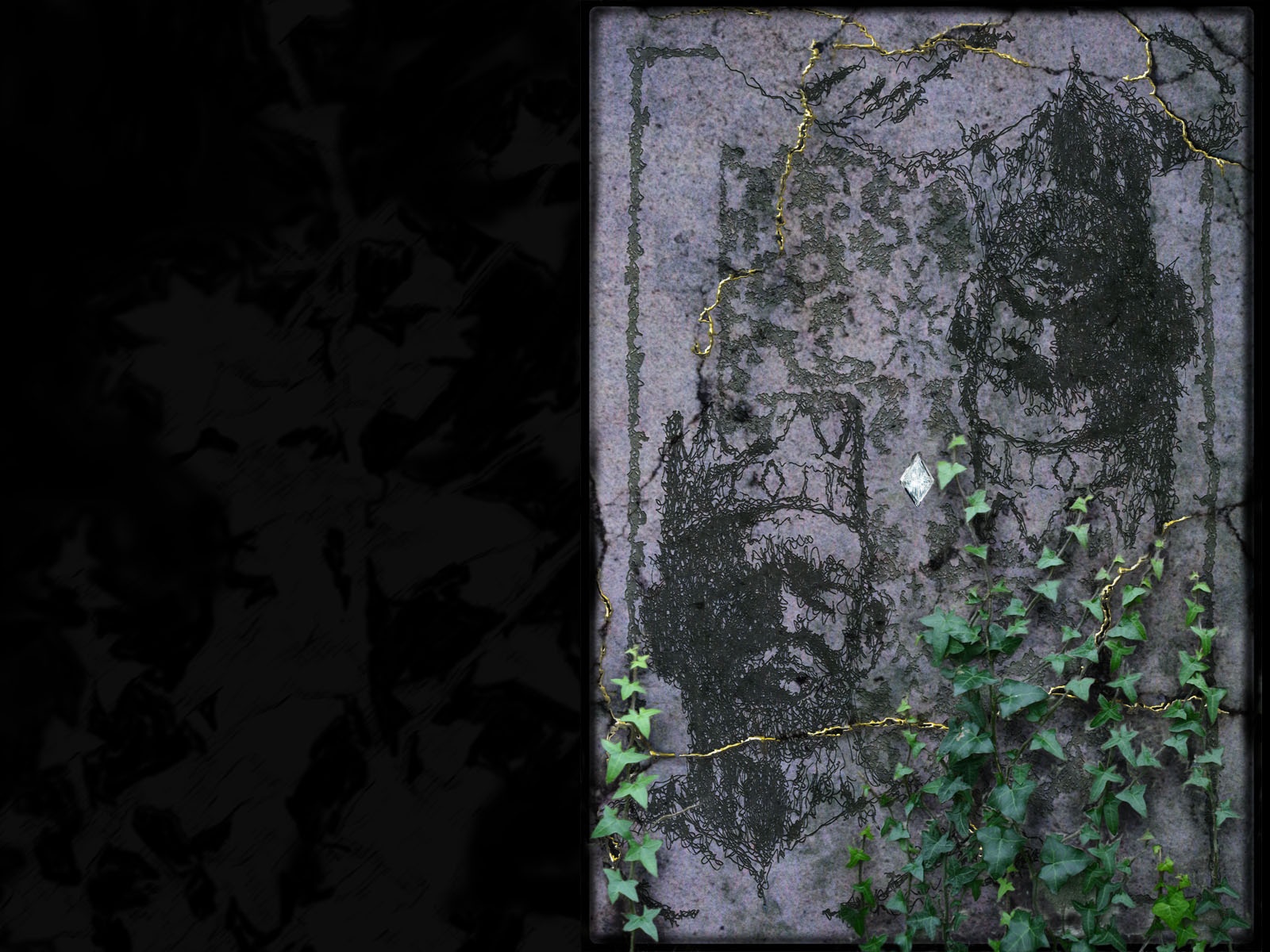
Heres version 4 with added gold veins and ivy & the king's head made more prominent. Heres version 3 for comparison. theres a link in version 3 for version 2. so tell me what u think...any comments welcome :~) hope u like
Comments
Post a Comment - Subscribe to this discussion
::Morwyn

12/15/05 3:33 PM GMT
I like this version.. It has all the best of your features and none of the things I didn't like about the others.. Wonderful..
0∈
[?]
One bead at a time
I would like to see this one without the rips/cracks. It might be a tad too busy with that much vines on it.
0∈
[?]
The work of art may have a moral effect, but to demand moral purpose from an artist is to make him ruin his work.
(Johann Wolfgang von Goethe - 1832)
hmmm u mite be right on that, Tom, i did rush it through today before work, so i mite do another version with less vines on it, but i like the shattered stone, i cant let go of it that easy :p thanx for ur comments
0∈
[?]
Beware the anti-cinnamon stare!!!
I like this version best so far...(in case you make more) I like the little crackled lines, I think they add some drama, after all he IS the King...I like the ivy very much, but I feel there should be something to 'balance' the other side..not sure if it should be ivy or some other thing...or what. I find the card just a bit dark, but not much, just enough to make the King etc all stand out a bit more, I mean, he IS King..and deserves the best, right?..am looking for a tad bit of touch up on this car, but on overall l think this is a winner.
0∈
[?]
We are shaped and fashioned
by what we love..............
I love the look of the vine photo on top of the illustration. That highlighted diamond is a classy touch as well.
0∈
[?]
Hmmmm Very interesting work Avi. The cracked rocks and the brushed faces are awesome.
0∈
[?]
Kindly visit my gallery and comment on my photos.
I'm not sure what to say here... I'm not really crazy about this version. It's too many elements competing for attention now. The gold and new diamond are #1 on my hit list. The cracks in the stone are super though. You don't need to change anything there from your last post IMHO. The darker hue on the kings head is looking good. The vines (ivy?) looks like a good idea but maybe some less would do the trick to make it less busy (and maybe like Verena said with something on the other end of the card, since it's very bipolar in it's basic layout in all other respects). On the other hand I liked that it looked more like an illustration (throughout) before and not as much of an image manipulation... Such things are so hard to give advice on. Better not listen to me this time maybe. I'm not that supportive it seems. ^_^
0∈
[?]
yeah i'm inclined to agree, i'm thinking less ivy, maybe extending upto the top left as well as i cant think of any balancing acts for that corner :~) thanx folks for the suggestions
0∈
[?]
Beware the anti-cinnamon stare!!!
I agree in extending the Ivy into the corner and lessening it down the bottom, but this is a great image: it looks aged and I think the gold thread is great. I love it how you've etched some parts of it but not all of it: so that it looks like a cross between digital and reality, just like Caedes :)
0∈
[?]
"Be kind, for everyone you meet is fighting a hard battle"-Plato
What an amazing concept for a card. I'm a texture nut and I absolutely love what you've done to make this card look like it came right off the wall of an old castle. keep up the great work!
0∈
[?]
Ari, I checked out the other versions and think this is the best. The aged cracked appearance is very effective with the rough texture feel. I like the bright shiny diamond, after all he is the KING of DIAMONDS! The ivy is lovely going across the card, and adds a zing of color. I like the muted color used on the rest of the card. I guess I just plain like this image - Thanks! :))
0∈
[?]
I need to catch up on things so can't comment too much. But I love all of your fine images. I might be lurking in the background :)
How interesting, I can't quite place it...
I do love the Ivy as it is however. Great texture there.
I do love the Ivy as it is however. Great texture there.
0∈
[?]
Crazy doesn't even begin to cover it..
My signatures, wallpapers, avatars and other graphics can be found HERE