Caedes
Upload Images
Welcome guest
Log In or Register
User Stats
- 1 total users online
- 44 users active today
- 259186 total members
- +show users online
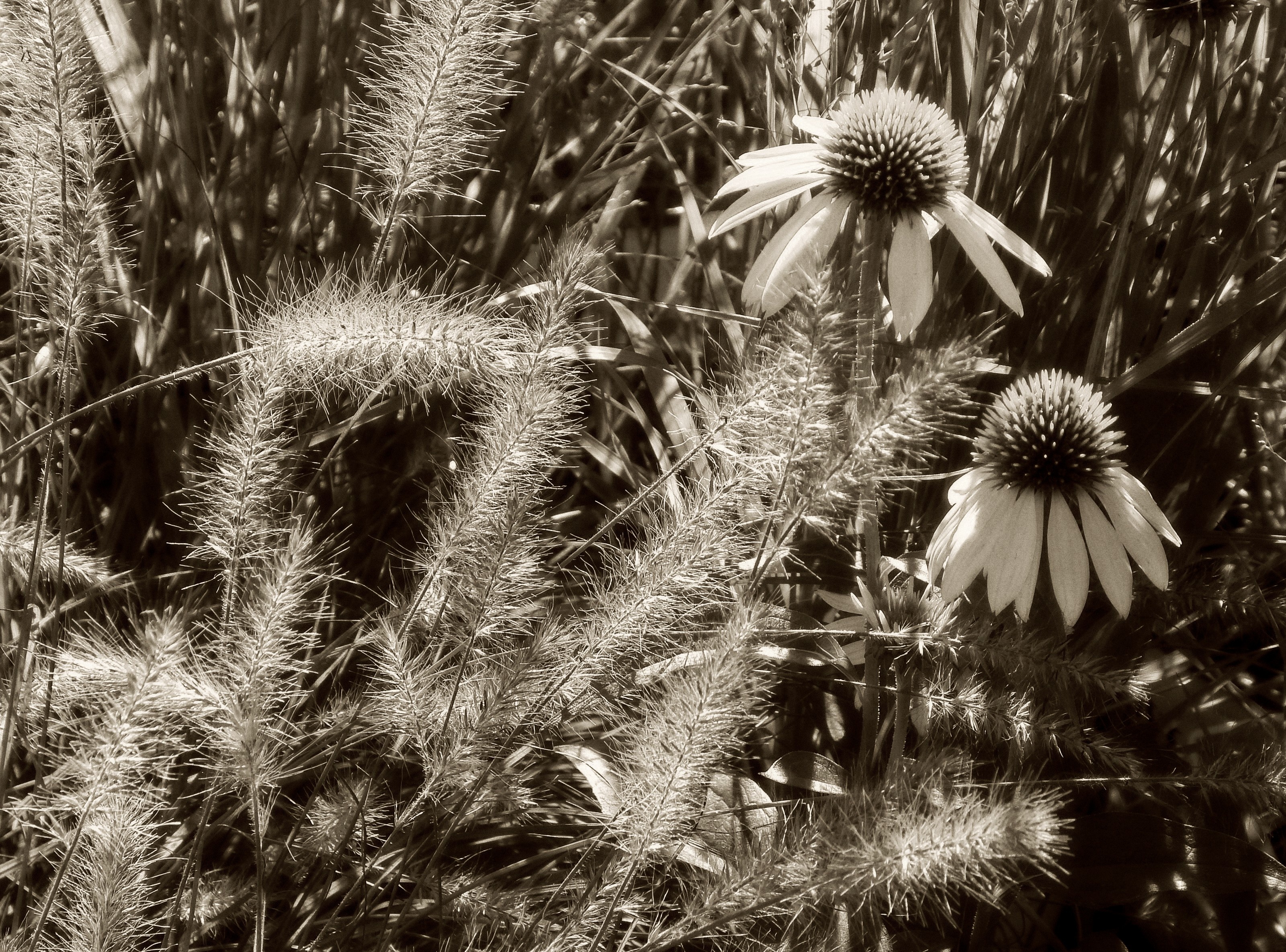
Late Summer -B&W
© trixxie17
(copyright information)
Uploaded: 09/13/16 4:13 PM GMT
Late Summer -B&W
Views: 1335
Dlds: 508
Status: active
Dlds: 508
Status: active
Gallery:
(Main) contests->b/w challenge
Did a B&W of my post today for the BWC - thought the light in it would give a good result.
Comments
Post a Comment - Subscribe to this discussionReally nice, Kathy.
The sepia toning works well. As to my eyes and mind, the coneflowers are now given a lil' more visual prominence as a result in this version.
With the removal of colour your image is reduced to that of lines, forms and shapes.. and is more balanced (in my humble opinion) on the note of visual weight.
Your composition is strong and appealing.
Good good job.
And.. but, of course, thanks for sharing these with us.
5∈
[?]
This is so cool and makes a wonderful challenge - it seems to glow but I just love the coloured version.
3∈
[?]
VIEWED IN FULL
This is outstanding, it has a more powerful feel to it. It should do very well in the challenge. tigs=^..^=
5∈
[?]
Nature in all her glory is my uplift on life and so is my love of photography. sandi ♪ ♫
The sepia tones give a warm summer feel to this image and the detail in the feathery grasses is splendid.
Thank you for putting it in the B&WC Kathy and my apologies for missing your pm about it yesterday.
I shall add it right now :)
Thank you for putting it in the B&WC Kathy and my apologies for missing your pm about it yesterday.
I shall add it right now :)
3∈
[?]
My thanks to all who leave comments for my work and to those of you who like one enough to make it a favourite. To touch just one person that way makes each image worthwhile. . . . . . . . . .. . . . "The question is not what you look at, but what you see" ~ Marcel Proust
This is lovely to look at -- I have a particular soft spot for desktops of ornamental grasses!
5∈
[?]
Anyhow a perfect entry for the Wednesday B&W challenge, my friend.