Caedes
Upload Images
Welcome guest
Log In or Register
User Stats
- 0 total users online
- 47 users active today
- 262478 total members
- +show users online
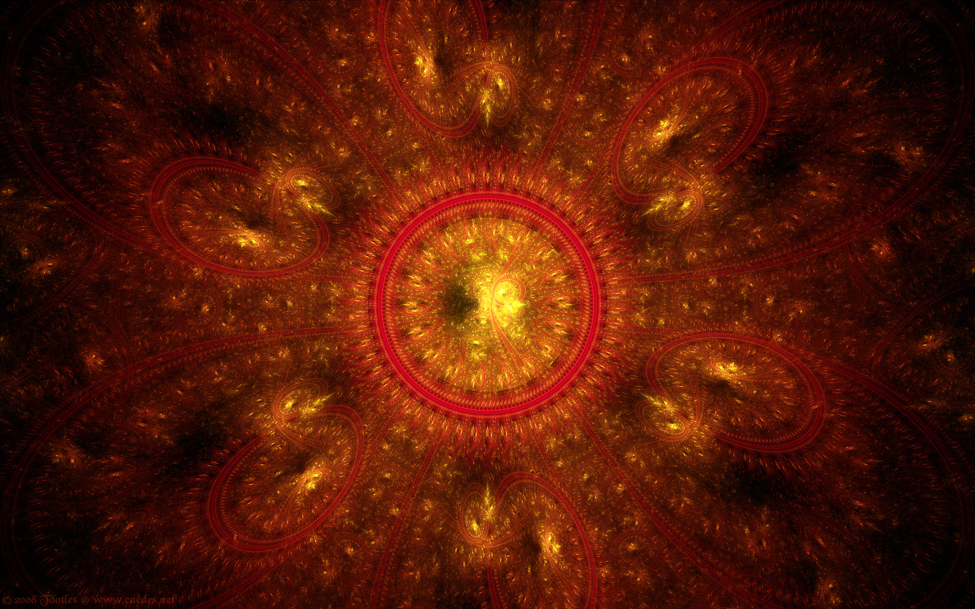
Lost Sun
Dlds: 110
Status: active
The Lost Sun: created in Apophysis 3D 2.06c hack, using eTech Julian script by Cabin Tom (the 3D version is available in his Total Script Package).
I lost this flame for a while, along with several others which were created using various different 3D scripts in the 3D hack. They were created and saved, then later I returned to find a dot in the preview.
Solution appeared to include:
(1) enabling all the variations in 2.07 beta Apophysis (Options>Variations tab)
(2) enabling these variations in the 3D hack (they only showed up in the list after doing the above)
(3) disabling the final transform in the affected flames (FX button on the top right of the Editor window)
Many thanks to Les (Purmusic) and ThomasLB for their advice and support. :-)
This was a difficult design for me as, when processing it in Photoshop Elements, it was too stark, too dark, too bright, too cold, too hot, too small, too big, too fuzzy, too jaggy. Hard to find the right balance. Any suggestions appreciated.
Comments
Post a Comment - Subscribe to this discussionAdditionally, you've created some nice dimensionality. Perhaps, some small added values of pre_ztranslate, as well as, pre_ and post_rotate_x ... might kick that up a tad? And I do mean small, as in 0.1 or 0.2 or thereabouts. Experiment. Pitch and yaw as well.
Alright, now you've done it, lol ... stimulated my thoughts. It's a good good thing. :o)
Compositionally ... off center placement, right hand side on the intersecting lines of the right thirds ... with some adjustments as mentioned above. Or not.
Thinking that the visual impact of the suggestions would add to the movement of the 'swirls' already present. The off center placement alone would accomplish that in my mind.
And forgive me here, caveats? As is ... nice, but perhaps a tad too static?
Really difficult flames to work with, colour palette et al. I think your results, are not only commendable on the perseverance front that preceded them ... the artistic results are unique and intriguing. Again, a good good thing. Or ...
This one is about colour and feel and interpretation. Which is present in spades. Good good stuff.
p.s. Last thought ... and as painful as it might be for your pc, Oversample of 2. And an overnight render for you.
Casechaser, I hadn't thought of it being like a painted ceiling, but I see it now that I look at it again. It's always interesting to view a picture from another's eyes.
Les, some great suggestions; much appreciated. I'm a little mystified by those pre-z thingies you mentioned, but I played with them a bit -- the pitch and yaw helps to take the main edges of the design away from the edges of the wallpaper. I also got a few 'variations' along the way that I rather liked.
Last night I was thinking about the placement myself. 'Centred' is not necessarily best or even easiest for a widescreen format. I have pushed it over to one side (left, to suit my Mac :o). )
Trouble is, there is a lot of grain around the image to deal with, which was why I didn't use the 'zoomed-out' image on its own.
Oversample... eeee!!! (Can't tell if that was me or the computer screaming). You are right that it would help calm the outbreak of the fuzzies that this design is prone to, and possibly the grain too? I can push my PC, but not that far. Only thing to do, I admit, is cave in and render for a smaller size of wallpaper. Next time I'll try it for a 1440x900. Or smaller. (Grizzle).
Right now I've got it at 1920x1200, rendering at oversample 1. The PC was offering me 50Mb (unusually generous) so I hit the render button before it could back out...
-Nik
Thanks for the comment, Nik... it's nice for the old Lost Sun to get a little love. :-)